A Queenslander Renovation With An Economical Undercroft
Architecture


Architect Hannah Waring chose to raise the existing home to allow for new spaces underneath.

The renovation meant the homeowners could keep their much-loved outdoor space.

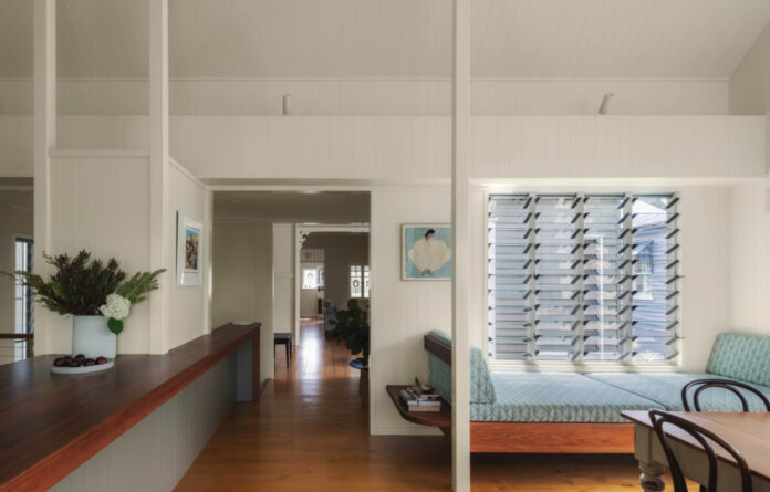
Operable windows on three sides create the feeling of a more spacious dining area.

The renovation is steadfast in its intention to achieve a cohesiveness with the original home by relating to the existing structural lines and continuing materiality, but where it differs is in volume.

The move to express the roof form over the kitchen/dining space, in contrast to the adjacent original flat ceilings is an example of subtle moves to identify the new works without changing materiality,’ says architect Hannah Waring.

Tasmanian blackwood timber is used throughout the joinery.

Except for relocating a few doorways, the verandah, two bedrooms and original living room were unaltered.

The internal staircase is located between the original house and rear addition, which holds the kitchen and dining area.

A small third bedroom along the western edge became the bathroom, and the original kitchen become a bedroom.

Original features including stained glass windows have been retained.

Spaces in the undercroft spill out onto the paved eastern boundary.

Concrete floors feature in the rooms.

‘By connecting the previously underutilised space that ran down the eastern edge to the backyard, it has made the ground plane feel a lot bigger, and provided a lot of space for play,’ Hannah says.

The updated house doesn’t opt for high contrast between ‘old’ and ‘new’, instead sitting quietly in its street.
Architect Hannah Waring grew up in a renovated Queenslander (renovated by her father) that influences the way she designs projects today.
Hannah explains, ‘It’s a home that’s very obvious in architectural thought when you experience it, but quiet to the street. It responds to orientation, cracked open endless sightlines, and the additions drew upon the existing form.’
The owners of this house in Wooloowin, Brisbane were familiar with Hannah’s childhood home and interested in exploring the same design intent.
Their 1930s house had the typical shortcomings of a Queenslander that is introverted, dark, and unrelated to the property’s orientation.
‘The original bathroom blocked morning light and cooling breezes from entering living spaces and the kitchen was in the south-western corner, with no outlook,’ says Hannah.
‘There was no separation between private spaces and entertaining areas, with the bathroom and all bedroom doors positioned off the main living, and no connection to the rear yard, so there was work to be done!’
The clients wanted to overcome these issues, without sacrificing too much outdoor space.
In response, Hannah chose to slightly raise the existing home to allow for new spaces underneath, while also activating a significant amount of land underutilised down the eastern side of the house.
The creation of this paved brick area opens up new outdoor space for the client’s children to play on that seamlessly connects to the new indoor spaces on the same level.
The renovation is steadfast in its intention to achieve a cohesiveness with the original home by relating to the existing structural lines and continuing materiality, but where it differs is in volume.
For example, ‘The move to express the roof form over the kitchen/dining space, in contrast to the adjacent original flat ceilings is an example of subtle moves to identify the new works without changing materiality,’ says Hannah.
The creation of sightlines between levels further enhances the sense of space.
‘This is something I feel is important when renovating Queenslanders — particularly if living areas are split over levels — as it begins to break down “rooms”, while keeping their character charm and improving the experiential quality of the home,’ says Hannah.
The updated house doesn’t opt for high contrast between ‘old’ and ‘new’, instead sitting quietly in its street. Its impact lies in how rooms have repositioned to best capture natural light and connections to the garden.
Hannah says there isn’t one moment of the day that feels better than others. The combination of the courtyard and undercroft space allows shadows to dance and evolve as the day passes, creating a lovely experiential quality.
‘I think it’s noteworthy that intentional “undercroft” spaces can be an economical addition for families. They offer a shaded, hardscaped area on ground level for kids to play in, or a space large enough to pull out a long table for Christmas lunch, without the cost of having to build larger internal spaces.’
thedesignfiles.wpenginepowered.com


