[ad_1]
A Quality Over Quantity Childhood Home Makeover
Interiors

The longtime owner of this Sydney period home engaged Amanda Barnett Design for a recent renovation. Photography – Maree Homer. Styling – Kerrie-Ann Jones

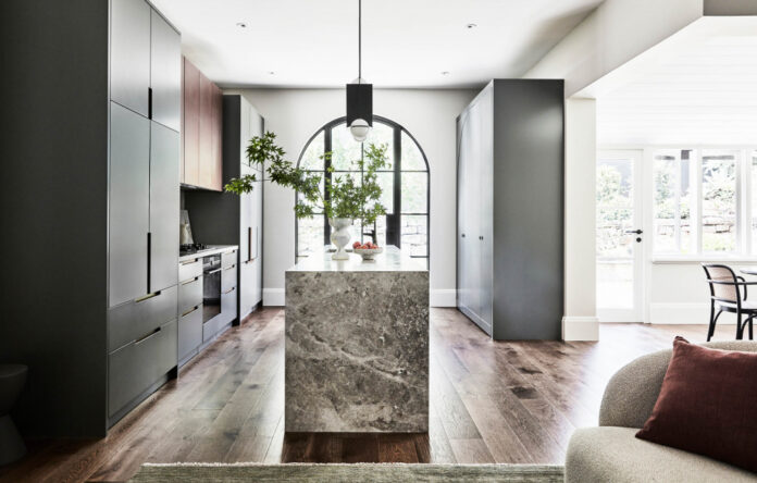
Amanda opened up the kitchen by removing two smaller windows and door and replacing with a central steel framed arched door. Photography – Maree Homer. Styling – Kerrie-Ann Jones

‘This created a focal point for the room and allowed us to run full depth cabinets right up to the edge of the room,’ says Amanda of the steel door. Photography – Maree Homer. Styling – Kerrie-Ann Jones

The juxtaposition of the asymmetrical lights on the very symmetrical kitchen creates a calming balance to the space. Photography – Maree Homer. Styling – Kerrie-Ann Jones

Antique bronze adorns the overhead kitchen cupboards. Photography – Maree Homer. Styling – Kerrie-Ann Jones

Creating the banquette seating and other custom joinery with makers including The Wood Room and Navan Sydney was a priority of the project. Photography – Maree Homer. Styling – Kerrie-Ann Jones

‘If we moved the dining space into the sunroom, we could create a beautiful banquette and a large uncompromised table that can seat up to 12 people,’ says Amanda. ‘As well as being beautiful, it was practical in allowing more room for the client’s wheelchair-bound brother to be able to access the space.’ Photography – Maree Homer. Styling – Kerrie-Ann Jones

The existing dining room was transformed into a smaller snug sitting area set around a cosy fire. Artwork by Emily Imeson. Photography – Maree Homer. Styling – Kerrie-Ann Jones

Artwork by Emily Imeson from Saint Cloche. Photography – Maree Homer. Styling – Kerrie-Ann Jones

Artwork by Matilda Michell from Art2Muse. Photography – Maree Homer. Styling – Kerrie-Ann Jones

The bathroom features grey microcement wall finish and Spanish handmade tiles. Photography – Maree Homer. Styling – Kerrie-Ann Jones

Artwork by Bronwyn Woodley Graham from Art2Muse. Photography – Maree Homer. Styling – Kerrie-Ann Jones

Artwork by Kerrie Oliver from Curatorial+Co. Photography – Maree Homer. Styling – Kerrie-Ann Jones

‘There is an amazing ginkgo tree right outside the kitchen and having the large steel frame arch door centred on the kitchen and the tree really captured my vision for the home, adding the new design elements to highlight the beautiful existing bones,’ says Amanda. Photography – Maree Homer. Styling – Kerrie-Ann Jones
This period home in Sydney’s Longueville has been in the one family for 60 years, including 20 years in the hands of the current owner, Lisa, who grew up in the home. After multiple small renovations, it was time for a larger overhaul.
The initial brief provided to Amanda Barnett Design was to update the kitchen including the removal of a wall, but more potential was shortly realised.
‘After meeting with Lisa on site and getting a feel for the home, she proposed a more extensive makeover including the removal of external small windows and a door to connect the kitchen to the garden; and remaining transforming the existing sunroom into the main dining area,’ says Amanda.
‘If we moved the dining space into the sunroom, we could create a beautiful banquette and a large uncompromising table that can seat up to 12 people. As well as being beautiful, it was practical in allowing more room for the client’s wheelchair-bound brother to be able to access the space.’
In its place, the existing dining room was able to become a smaller snug sitting area, set around a cosy fire.
Creating the banquette seating and other custom joinery with makers including The Wood Room and Navan Sydney was a priority of the project. ‘We were not prepared to compromise on the materiality of the joinery,’ says Amanda.
A combination of honed marble, black oak, antique bronze, and handmade Spanish tile imbue spaces with subtle texture, complemented by 2Pac kitchen cabinetry in Dulux Bottle Green that references the leafy garden outside.
‘There is an amazing ginkgo tree right outside the kitchen and having the large steel frame arch door centred on the kitchen and the tree really captured my vision for the home.’
Practical features are integrated into the custom cabinetry and storage, including credenza containing a wine rack and pull out drink trays with brass detailing.
Flooring and skirting was replaced throughout the entire home, and every wall was repainted, mostly in Dulux Rottnest Island. ‘We kept the wall colour neutral to allow the joinery items to be the hero pieces in the home,’ says Amanda/
The modern elements of the renovation equal the beauty of the original period workmanship to facilitate a more practical, light, and open interior.
‘It’s a joy to visit and see Lisa use the space,’ Amanda says. ‘Her favourite place to sit is on the end of the banquette, where she can look across to the beautiful kitchen, or out into the amazing garden while enjoying a cup of coffee, and I have to agree. It’s a really special place to sit to take in all the changes we have brought to her childhood home.’
[ad_2]
thedesignfiles.net


