A Productive Green Extension For A Reservoir Family Home
Architecture

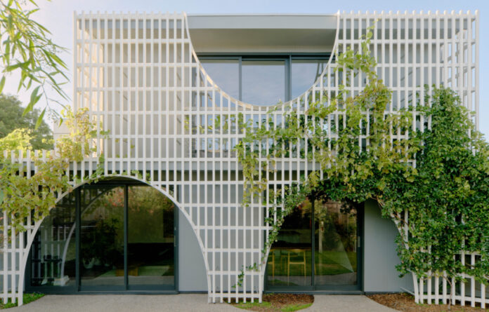
The retention of garden space was the key driver of this house renovation Reservoir that features a productive green facade in the form of a timber screen on the new rear facade.

The screen acts as a trellis for the owners to grow their garden up, over, and around the house, and creates a privacy screen for the new first floor.

The screen references the suburb’s nostalgic suburban streetscape of original brick houses with decorative balustrades, arched detailing, and backyard pergolas.

This white timber screen conceals a relatively simple and cost-effective material palette on the setback exterior.

By sitting out from the house, the screen also creates an eave to ensure the sun won’t hit the glazing in summer.

The screen’s positioning creates protected outdoor space underneath.

Winter sun reaches deep into the house, with the concrete slab absorbing heat through the day, including in the new sunken lounge.

The screen keeps the house cool and makes the garden immediately visible from the interior.

Vines are climbing their way up the lattice, weaving in and out of the screen to inhabit the space between the screen and the house.
The retention of garden space was the key driver of this house renovation in Reservoir, located 12 kilometres north of Melbourne’s CBD.
The clients desired more space without negatively impeding on this precious outdoor area cherished by their children, chickens, cats and bees.
A lean-to spanning the ground floor was demolished to make way for a two-storey addition. This new structure sits within the garden, serving to delineate the line between old and new, and allowing the clients to remain living in the home during construction.
‘We achieved this by designing the extension as a pavilion, which could be built independently, so the original part of the house could remain separate but was eventually connected back to the house with a corridor link,’ explains Sarah Lake, director of Sarah Lake Architects.
‘This became even more crucial during Covid with the owners kept separate from the builders throughout the build (when numbers on site allowed).’
The clients were very open to ideas and wanted to have some fun with the design. This thinking paired with their brief inspired the concept of a productive green façade in the form of a timber screen.
‘The approach was for the screen to be the main architectural feature, whereby the screen sits off the building and wraps around the two storey extension connecting it to the existing house at one end and forming an outdoor entertainment space at the other,’ says Sarah.
The screen acts as a trellis for the owners to grow their garden up, over, and around the house, and creates a privacy screen for the new first floor.
‘We also looked to the neighbourhood of Reservoir with the arches taking cues from the migrant modern brick houses, the timber fretwork arches on verandahs, the inverse arches of white picket fences, and the varied backyard pergolas,’ says Sarah.
The timber screen is white for maximum visual impact when ensconced with greenery. It sits before the structural wall of the home clad in grey painted fibre cement sheets selected for their cost effectiveness.
By sitting out from the house, the screen also creates an eave to ensure the sun won’t hit the glazing in summer. Winter sun reaches deep into the house, with the concrete slab absorbing heat through the day.
The screen is working as intended. Passionfruit is dropping down off the façade, and other vines are climbing their way up the lattice, weaving in and out of the screen to inhabit the space between the screen and the house.
‘It keeps the house cool and makes the garden immediately visible from the interior,’ Sarah says.
‘As it is an active facade it is something that requires tending and this is reflective of how the client wanted to spend their time and is now directly tied to the architecture of the renovation.’
The garden by Paul Sampson Landscapes ties the project together with the native plantings.
Only minor modifications have been made to the remainder of the house. This was partly to keep costs down and ensure enough budget would remain for a sunken lounge.
Construction therefore minimised steel, minimised spans, kept ceiling heights low, used low-cost cladding, and a strategic extent of glazing.
‘The house construction and layout needed to be simple,’ Sarah says. ‘The kitchen ended up as an IKEA hybrid kitchen with some custom items to integrate it into the overall design.’
Sarah says the clients couldn’t be happier with their updated home nicknamed ‘No Rezzavations.’
‘It has given them the extra space they were seeking as well as that direct connection to the garden. It has almost doubled the size of the house but left them with the same if not more productive garden as before,’ Sarah says.
The addition provides a clear contrast to the existing house, appeals to the clients’ sense of fun, and is a testament to their role in the process.
thedesignfiles.wpenginepowered.com


