[ad_1]
A Private Inner-City Melbourne Home That Embraces Understated Drama
Architecture

Cremorne House is an alterations and additions project of an inner-city Melbourne home.

Privacy and a sense of security were significant aspects of the client brief.

Beauty Bloody Bonza removed previous additions to the original period home and started over.

The new addition is divided into wings, with the private family areas in the original house, and the living and guest wing to the rear.

At the centre is a single-storey volume containing the kitchen and dining area that ‘spills’ out via large glass doors onto a new secluded internal courtyard.

The view of the kitchen from the courtyard.

Patterned brick screens create an ever-changing movement of dappled light throughout the day.

The first floor volumes of the main and guest bedroom suites mirror one another and work to ensconce and protect the courtyard below.

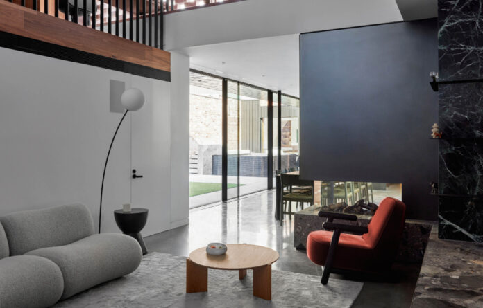
The cohesive material palette is an ode to the family’s connection with regional Victoria, evoking a familiar quality of peace and resilience.

Warm spotted gum is offset by mineral colours, brick, robust stone slabs, and cool metals.

Saturated green wet areas bring a heightened sense of intensity to the home.

The home embraces the idea of understated drama.


Period details in the original room including pressed metal ceilings, cast iron fireplaces, and brickworks have been preserved.

A bedroom frames outdoor views.


The light and bright main bathroom.


‘The solidity of the masonry walls are broken down, elevating them above ground floor and perforating the surface with a gradient hit and miss pattern,’ says Peter Scott, architect and director of Beauty Bloody Bonza.

When engaging Beauty Bloody Bonza to renovate their home, the clients requested a modern family home offering a secluded haven away from its busy location in Cremorne, Melbourne.
Privacy and a sense of security were significant aspects of the client brief. In response, Beauty Bloody Bonza removed previous additions to the original period home and started over.
The new addition is divided into wings, with the private family areas in the original house, and the living and guest wing to the rear.
At the centre is a single-storey volume containing the kitchen and dining area that ‘spills’ out via large glass doors onto a new secluded internal courtyard in the absence of a backyard.
Greta Mak, interior designer and director of Beauty Bloody Bonza, explains, ‘In the early stages of the project, there was a decision to remove the outdoor dining area and incorporate the space into the internal environment. To maximise the limited outdoor area, the courtyard is reserved for the pool and open space for the children to roam.’
All rooms focus back towards the courtyard, with perforated brickwork screening the living area from the adjoining rear lane. The first floor volumes of the main and guest bedroom suites mirror one another and work to ensconce and protect the courtyard below.
The simple angled forms of the second storey additions mimic the gabled roofs of the heritage house. ‘The solidity of the masonry walls are broken down, elevating them above ground floor and perforating the surface with a gradient hit and miss pattern,’ says Peter Scott, architect and director of Beauty Bloody Bonza.
Period details in the original room including pressed metal ceilings, cast iron fireplaces, and brickwork have been preserved. Emulating the craftsmanship of the original house, the addition reimagines these features in the form of twisting balustrades, textural stair runners, and intricate folded metal surfaces.
The cohesive material palette is an ode to the family’s connection with regional Victoria, evoking a familiar quality of peace and resilience. Warm spotted gum is offset mineral colours, robust stone slabs, and cool metals offering understated drama.
Emulating filtered light through the canopy of towering gums, patterned brick screens create an ever-changing movement of dappled light throughout the day.
Greta’s favourite elements of the project are the quieter, small gestures to be discovered within. ‘The quiet sitting nook with its loud red seat; the stepped stone thresholds between old house and new, and the intricacy of the folded metal work under the thick stone slab of the kitchen island.’
The completed home respects the existing streetscape, but inside feels a world away from the busy streets outdoors.
[ad_2]
thedesignfiles.wpenginepowered.com


