[ad_1]
A Playful, Sub-Tropical Take On A Mid-Century-Inspired Home
Interiors

Paddington House by CG Design Studio. Photo – Brock Breazley

‘Engaged as both building and interior designers, we were able to touch all areas and aspects of this project, culminating in a cohesive design resolution that encompassed the site,’ says Christopher Gyzemyter, director and head designer of CG Design Studio. Photo – Brock Breazley

The clients wanted a home that highlighted their appreciation for mid-century design. Photo – Brock Breazley

Patterned tiles feature throughout the communal areas of the home, tying together the colour palette. Photo – Brock Breazley

Built-in elements helped CG Design Studio create functional spaces. Photo – Brock Breazley

To counterbalance the lower ceilings, CG Design Studio raised the windows to roof height to allow more light in. Photo – Brock Breazley

The sunken lounge looks out to the garden beyond. Photo – Brock Breazley

‘The sunken living room… is probably the key space, it ties the home together, showcasing all the design ideas,’ says Christopher. Photo – Brock Breazley

Warm timber and pattered tiles feature in the main bedroom and ensuite. Photo – Brock Breazley

The ensuite has a nostalgic presence. Photo – Brock Breazley

The main bedroom. Photo – Brock Breazley

The material palette adds interest to the more pared-back walls. Photo – Brock Breazley

Where the rest of the house features white walls and concrete, the bathrooms are swathed in colour! Photo – Brock Breazley

The double-height entry features playful lights that pull on the rest of the colours of the home. Photo – Brock Breazley

Pockets of colour at the entry are a taster of whats to come inside. Photo – Brock Breazley

The original cottage is now perched at the front of the house. Photo – Brock Breazley

The pool is tucked away in the central courtyard. Photo – Brock Breazley

The back of the house leads out into the garden and is reminiscent of the underneath of the traditional Queensland cottage. Photo – Brock Breazley

The lower level opens to the garden. Photo – Brock Breazley
Believe it or not, this playful Paddington, Brisbane home used to be a small, dilapidated two-room cottage. While elements of the original house remain – the small timber cottage is now raised and perched at the front of the home – CG Design Studio have completely transformed the site into a unique Queensland take on mid-century design.
The brief from the clients (a couple with a young family) asked for ‘functional spaces’ to suit their lifestyle, but with a ‘unique and fun’ twist – something that would build on their appreciation of mid-century design, bold pattern and colour.
‘We had to find the right balance between contemporary and mid-century, as we did not want it to be a kitsch reproduction,’ says Christopher Gyzemyter, director and head designer of CG Design Studio.
The complexities of the steep, narrow site led them to design functional spaces, rather than large ones. Mid-century design elements, such as built-in furniture allowed them to achieve this.
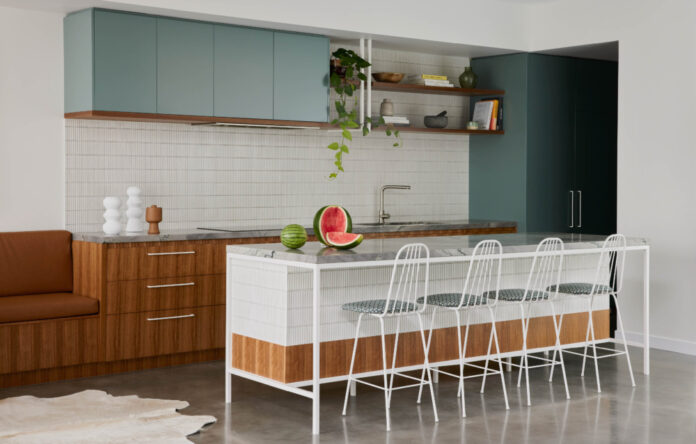
Colourful, retro-inspired tiles that feature throughout the communal areas are the balancing act; providing the base of the colour palette of the house, adding pattern, playfulness and intrigue to areas where built-in elements and hard surfaces couldn’t.
These colours; blue, orange, brown, are touched on throughout the house in kitchen cabinetry, rugs, soft furnishings and clever painted details in the entry recess and door. Together with warm timber features, this subtle nod to colour provides relief from the concrete and white walls, which would otherwise dominate the home.
Other complications on the building site – a sewer running through the middle of the property, for instance – dictated the location of the central courtyard space, as it turned out, for the better, Christopher says. ‘It actually made it more interesting and allowed us to feature the pool in the middle of the home.’
The sloping block and building heights also meant they couldn’t have high ceilings, so instead they used windows placed at ceiling height to capture the light and greenery hanging in the roof garden. Even where the ceiling is the lowest – in the main bedroom – the eye is still pulled through the room to the expansive roof garden and city skyline beyond.
In two and a half years, CG Design Studio have completely overhauled the ‘unliveable’ cottage set in the middle of this property, and created a tropical, mid-century-inspired family home that intrigues and delights – but still sits discreetly on its streetscape of neighbouring cottages.
[ad_2]
thedesignfiles.net


