[ad_1]
A Minimal Intervention Weatherboard Home Makeover
Architecture

Mischa’s Place by Circle Studio Architects. Painting on right by Minna Leunig. Other paintings throughout home by Mischa Merz. Photo– Jade Cantwell

This project was an exercise of minimal intervention for maximum impact. Painting by Mischa Merz. Photo– Jade Cantwell

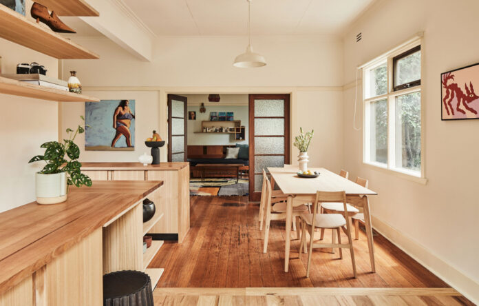
Opening up the kitchen wasn’t part of the original project scope, but was identified during construction to further improve the quality of space. Paintings by Mischa Merz. Photo– Jade Cantwell

In removing an existing wall between the kitchen and dining space, and adding a new island bench, improved north-facing light and storage space was immediately achieved. Painting on left by Minna Leunig. Other paintings throughout home by Mischa Merz. Photo– Jade Cantwell

The new bench top unifies the old kitchen with new joinery, which wraps around to the new part of the house. Paintings by Mischa Merz. Photos– Jade Cantwell

A bedroom with a pitched-roof volume and en suite ere added to the residence rear. Painting in left image by Minna Leunig. Photos– Jade Cantwell

Only 28 square metres was added to the existing 108 square metre home, but the impact has been dramatic. Photo– Jade Cantwell

TheA high level window brings greenery into the new bathroom. Photo– Jade Cantwell

The new bathroom and bedroom have created a private retreat. Photo– Jade Cantwell

The structure of an existing deck retained and extended off the kitchen. Photo– Jade Cantwell

A new deck off the bedroom opens to the west and is shielded by trees. Photo– Jade Cantwell
‘In renovations, old kitchen fittings and tiles are often the first thing to go. In this project, that was reversed,’ says Yvonne Meng, co-director of Circle Studio Architects, of her practice’s most recent project, ‘Mischa’s Place’.
Recognising the unique aesthetic qualities of the existing weatherboard home in Seddon (seven kilometres west of Melbourne’s CBD), the architects set about enhancing, not removing, its irreplaceable details.
The initial brief was to add a bedroom and en suite to the rear of the residence. An existing narrow sunroom was demolished in response, making way for the new pitched-roof volume.
Opening up the kitchen wasn’t part of the original project scope, but was decided upon during construction to further improve the quality of space. In removing an existing wall between the kitchen and dining space, and adding a new island bench, improved north-facing light and storage space was immediately achieved.
Much of the original kitchen otherwise remained intact, with only a new timber bench top added to tie new and old elements together.
‘Everyone was careful about not replacing things if they didn’t need to be, and being strategic with materials and resources to get the most out of the build,’ says Yvonne. ‘So many of the features such as the tiles over the cooktop nook, oven, and doors are things you just simply don’t get anymore, and it’s a shame to get rid of them when they are perfectly functional and still suit the aesthetic of the home.’
The provision of new and improved outdoor spaces was just as important to this project’s success. While an east-facing outdoor deck already existed, this was only accessible through a small door, and offered little connection to the interior. The structure of this deck was therefore retained and extended, alongside a new deck off the bedroom opening to the west.
‘Both decks are visible from the communal areas, so the indoor-outdoor living connection is always in view,’ says Amber Laing, co-director of Circle Studio Architects.
The overall project is a testament to what can be achieved through modest yet thoughtful updates. Only 28 square metres was added to the existing 108 square metre home, but the impact has been dramatic.
‘If there is something that can be retained, not only does it reduce material costs, but it is also more sustainable,’ says Amber. ‘There is a certain patina which comes with age that is impossible to recreate authentically with new materials, and being able to integrate this makes the home unique.’
[ad_2]
thedesignfiles.net


