[ad_1]
A Mid-Century Brisbane Home Redesigned For Modern Life
Architecture

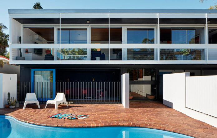
Kenmore is a subtle renovation of a mid-century home by Kin Architects. Photo – Christopher Frederick Jones

The new sunken lounge looking out to the kidney-shaped pool. Photo – Christopher Frederick Jones

‘The existing kidney-shaped pool evoked a Miami/California feel for us, which we echoed in the upstairs courtyard’s bright colour choices,’ say the architects. Photo – Christopher Frederick Jones

The downstairs was transformed, now containing a bathroom, laundry, additional storage space, and a sunken lounge inspired by the relatively low ceilings. Photo – Christopher Frederick Jones

The home was subtly reconfigured upstairs to celebrate its original features. Photo – Christopher Frederick Jones

The new bar area. Photo – Christopher Frederick Jones

The smallest bedroom was sacrificed for a dedicated hobby room — an initial catalyst for the entire project. The bathrooms were also remodelled, featuring terrazzo tiling in the place of previously monochrome interiors. Photos – Christopher Frederick Jones

A renovated ‘outdoor room’ to the east provides further living space, strengthening the home’s relationship to the garden and its Brisbane climate. Photo – Christopher Frederick Jones

Adjustable casements surround the outdoor room. Photos – Christopher Frederick Jones

Vibrant paint choices add character, ensuring an enduring homage to the house’s mid-century identity. Photos– Christopher Frederick Jones

The clients’ love of 1960s architecture remains at the heart of this home, only now, it also supports their lifestyle. Photo – Christopher Frederick Jones
This 1960s home Kenmore, Brisbane, was purchased in 2019 by two mid-century architecture enthusiasts.
When later engaging Kin Architects to renovate the home, the owners weren’t seeking a contemporary makeover, but considered changes that would allow them to meaningfully inhabit the space for years to come.
Director of Kin Architects, Leah Gallagher, explains, ‘Though the house remained liveable and reasonably functional, the renovations resulted in a lack of connection to the garden, and elements inconsistent with the original style.
‘Our clients wanted to create a consistent and high-quality aesthetic throughout the home, a more seamless relationship to the outdoors, and a higher level of functional storage.’
Maintaining and celebrating the house’s clean lines, and the relationship of the floating box form to the street, were both integral to their design. ‘From a broader perspective, the notion of protecting mid-century modern homes in suburban Brisbane was a common goal between client and architect,’ Leah says.
Renovations were undertaken within the home’s original footprint to improve its flow and function. The downstairs undercroft in particular was transformed, now containing a bathroom, laundry, additional storage space, and a sunken lounge inspired by the relatively low ceilings.
‘The lowered seating demarcates the lounge area, and affords a greater sense of volume in the space,’ explains Leah. ‘With views to the pool, the sunken lounge and adjacent bar area within the undercroft form an unexpected retreat that eliminates the previous disconnection between pool and house.’
Upstairs, the smallest bedroom was sacrificed for a dedicated hobby room — an initial catalyst for the entire project. A renovated ‘outdoor room’ to the east surrounded by adjustable casement provides further living space, strengthening the home’s relationship to the garden and its Brisbane climate.
The updated material palette takes its cues from the original modernist architecture and kidney-shaped pool outside. The bathrooms in particular have been completely remodelled, featuring terrazzo tiling in the place of previously monochrome interiors.
Vibrant paint choices elsewhere add character and work to delineate different spaces, ensuring an enduring homage to the house’s mid-century identity.
The clients’ love of 1960s architecture remains at the heart of this home, only now, it also supports their lifestyle. Leah says, ‘As a result, our clients are able to live in the house the way they want to — both now and into the future.’
[ad_2]
thedesignfiles.net


