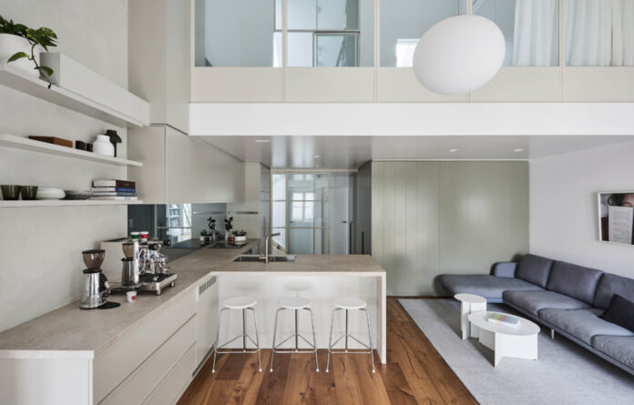
A Lofty Renovation Of A 1990s Melbourne Apartment
Interiors


Nexus Designs managed to unlock hidden space by completely reworking the apartment floor plan.

The open-plan kitchen and dining area is now the heart of the home.

A large fireplace encourages the family to come together.

The living area opens to the home’s private balcony.

Subtle variations in colour were introduced throughout the joinery, which ranges in shade from Laminex Pumice to Possum and Paper Bark.

The mezzanine was enclosed with steel-framed glazing and doors.

The upstairs level now hosts a spacious main bedroom, en suite, and a separate study.

Two further bedrooms are tucked in their own downstairs wing on the other side of the entrance lobby.

Bathrooms are now located on both floors.

By allowing Nexus Designs free rein to explore their apartment, the owners now appreciate its full potential.
There was always plenty to love about this apartment located within walking distance of the CBD and Melbourne’s sporting precinct.
The owners purchased the three-bedroom apartment to serve as their family home when moving back to Australia from San Francisco, but work was required to get it up to scratch.
Sonia Simpfendorfer, co-director at Nexus Designs, describes the plethora of existing issues starting with a ‘claustrophobia-inducing enclosed kitchen, minimal storage, inadequate acoustic separation from the neighbours, inefficient heating and cooling’… the list goes on.
The apartment was also poorly configured, resulting in wasted space and no privacy to the mezzanine level.
‘Our starting point was to shake off all the heavy-handed early ‘90s design and see how much harder we could make the spaces work, while making it feel effortless and intuitive,’ says Sonia.
Nexus Designs managed to unlock hidden space by completely reworking the apartment floor plan. Almost the entire interior was gutted in the process, leaving only a downstairs bedroom wall. ‘But nothing was done without purpose or reason,’ says Sonia.
The open-plan kitchen, dining, and lounge area with a large fireplace is now the heart of the home that encourages the family to come together.
Upstairs, the mezzanine was enclosed with steel-framed glazing and doors, and the rooms within were significantly reconfigured to house a spacious main bedroom, en suite, and a separate study.
‘It sounds a bit counterintuitive, but by separating the spaces with steel framed glazing and doors, and by closing in the mezzanine to make it private, the usable space increased, along with the perception of space,’ says Sonia.
‘The mezzanine bedroom is now acoustically separate from the noise of downstairs and has heating and cooling that actually works well, which makes the entire apartment so much more liveable.’
Two further bedrooms are tucked in their own downstairs wing on the other side of the entrance lobby.
Storage was integrated at every opportunity throughout the renovation, resulting in a secret pantry, bike storage under the stairs, and even a recessed cat toilet in the downstairs bathroom.
Visually, the clients wanted to avoid anything too ‘Scandinavian’ in feeling (such as an all-white kitchen and blonde floors)
This request inspired a more tonal palette encompassing mid-toned timber floors and a gloss painted ceiling on the underside of the mezzanine that reflects ever changing light.
Nexus Designs looked to eucalyptus to set the scene of the clients moving back to Australia, inspiring the deep olive wall panelling surrounding the downstairs bathroom.
Subtle variations in colour were also introduced throughout the joinery, which ranges in shade from Laminex Pumice to Possum and Paper Bark.
By allowing Nexus Designs free rein to explore their apartment, the owners now appreciate its full potential.
The renovated apartment functions as a family home needs to, featuring a balance of private spaces and areas to gather.
thedesignfiles.wpenginepowered.com


