[ad_1]
A Light-Filled Renovation Of A South-Facing Heritage Home In Hobart
Architecture

The brief for this South Hobart, Tasmania home renovation wasn’t for a multitude of additional rooms, but ‘light, bright and functional spaces’ with an improved connection to the garden. Photo – Anjie Blair. Styling – This Vacant Space

The new addition opens to a dramatic double-storey space containing the living, dining, and kitchen areas. Photo – Anjie Blair. Styling – This Vacant Space

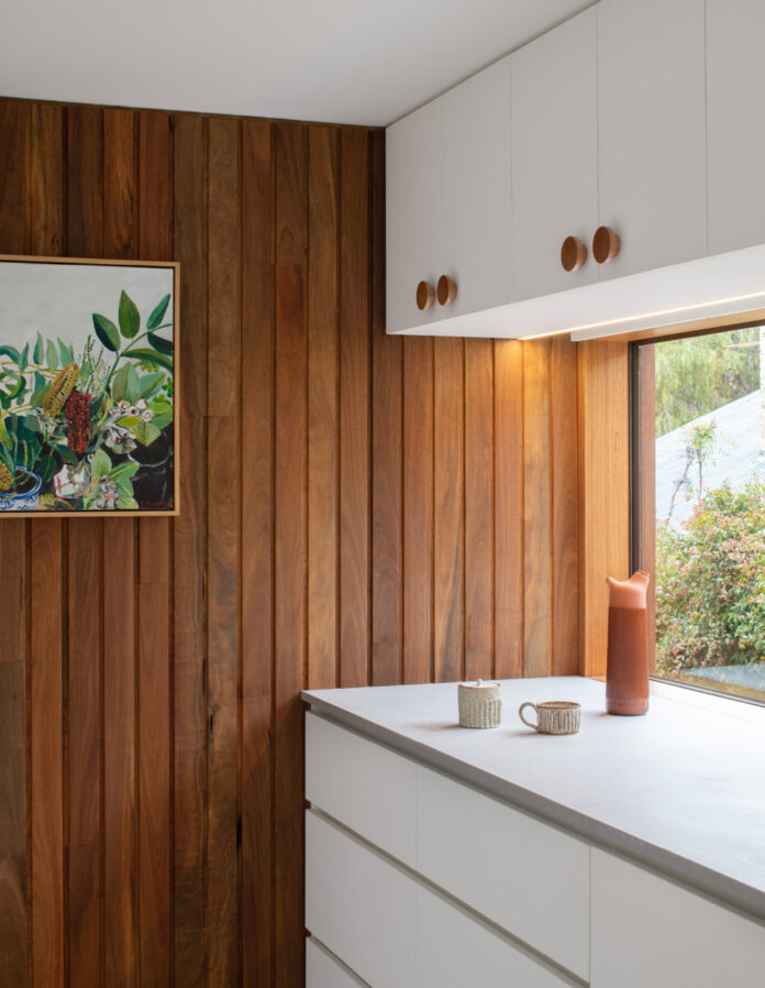
Spotted gum timber clad wall construction features both inside and out to instil the home with warmth. Photo – Anjie Blair. Styling – This Vacant Space

High level window apertures inject northern light into the space. Photo – Anjie Blair. Styling – This Vacant Space

Photo – Anjie Blair. Styling – This Vacant Space

The cosy new fireplace. Photo – Anjie Blair. Styling – This Vacant Space

The approach internally was restrained to retain the character of the original circa 1910 five-room cottage. Photo – Anjie Blair. Styling – This Vacant Space

The house benefits from a highly efficient design that offers boundless liveability and a deeper connection to the site. Photo – Anjie Blair. Styling – This Vacant Space

The sunny new bathroom. Photo – Anjie Blair. Styling – This Vacant Space

Materials are playful and warm. Photo – Anjie Blair. Styling – This Vacant Space

The second bathroom features olive green tiles. Photo – Anjie Blair. Styling – This Vacant Space

Photo – Anjie Blair. Styling – This Vacant Space

The new addition is tucked below the existing eave to be invisible from the street. The restricted ceiling height in this zone provides a logical location for amenities, laundry, bathroom, pantry, and storage. Photo – Andrew Wilson. Styling – This Vacant Space

The 1910 facade. Photo – Andrew Wilson. Styling – This Vacant Space

The home’s updated arrangement creates a feeling of expansiveness beyond what its 48 square metre addition suggests.An existing shed on the block’s west was also integrated into the reconfiguration, bookending the new extension and the cottage. Photo – Andrew Wilson. Styling – This Vacant Space
The brief for this South Hobart, Tasmania home renovation wasn’t for a multitude of additional rooms, but ‘light, bright and functional spaces’ with an improved connection to the garden.
The challenge was the site’s south-facing orientation exacerbated by narrow side setbacks and location in a heritage precinct.
Studio Ilk worked with the client’s strict budget to transform the home within these parameters and with minimal intervention.
The approach internally was restrained to retain the character of the original circa 1910 five-room cottage. Demolition was limited to a poorly-designed lean-to and pergola to the south, with materials salvaged for reuse at another site belonging to the extended family.
The new addition is tucked below the existing eave to be invisible from the street. The restricted ceiling height in this zone provides a logical location for amenities, laundry, bathroom, pantry, and storage.
Beyond this link, the home opens to a dramatic double-storey space containing the living, dining, and kitchen areas. High level window apertures flood the space with northern light, overcoming the addition’s south-facing orientation, yet still embracing the home’s rear garden.
Clear delineation is made between old and new areas through floor level and material changes that follow the site topography.
Spotted gum timber clad wall construction features both inside and out, to instil the home with warmth.
An existing shed on the block’s west was also integrated into the reconfiguration, bookending the new extension and the cottage. The shed is now a studio, housing the client’s permanent office.
Overall, the home’s updated arrangement creates a feeling of expansiveness beyond what its 48 square metre addition suggests. ‘Borrowed views of the garden, the use of simple open portal frames, continuous indoor to outdoor floor surfaces, and integrated landscape seating augment the connection to garden and place for the family,’ says Kate Symons, founding director and principal of Studio Ilk.
The house benefits from a highly efficient design that offers boundless liveability and a deeper connection to the site. Kate says, ‘New life has been breathed into a home which can sustain its growing family for many years.’
[ad_2]
thedesignfiles.net


