[ad_1]
A ‘Less Is More’ Extension For A Charming Coburg Home
Architecture

This period home in Coburg hides a new extension, designed to embrace the west-facing gardens!

The old lean-to was removed in favour of a new addition that was just 25 square metres.

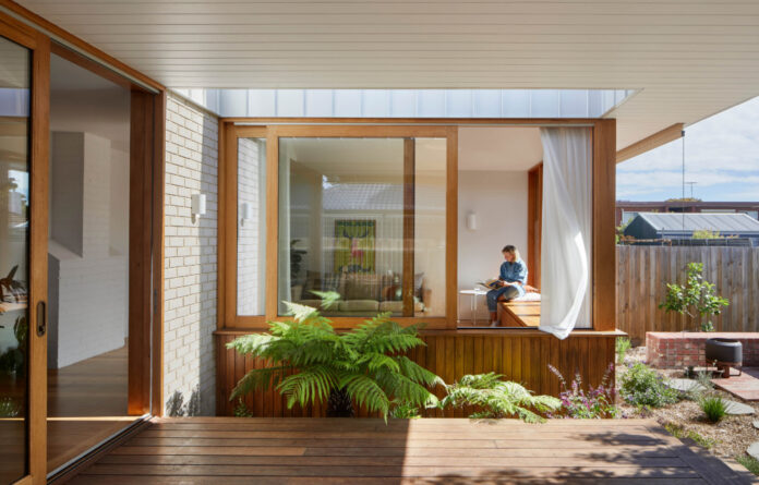
The new living spaces are oriented towards and around the garden, drawing plants in towards the heart of the home through the gap between the living room and deck.

Shielding the house’s rear from harsh western sun, a covered deck creates a protected threshold space to encourage outdoor play and interaction with the garden.

But the raised ceiling has brought in a new sense of light and airflow!

Sliding windows make the most of the new garden outlook while also providing lots of sun to support the owners’ indoor plants.

The material palette was been kept simple and sympathetic to the original home.

Inside the new bathroom.

Timber joinery is complemented with gold hardware throughout.

Bedrooms have retained their period features and ornate ceiling details.


The burgundy-coloured steel above the extension plays into the tones of the interwar-era brick build.


The charming facade nows hides a beautifully functional home inside.
Coburg Frieze by Mihaly Slocombe Architects proves good things can come in small packages.
The architects were engaged by owners Mark and Alisha, who had a lot of love for the endearing interwar home, and even more so for its gardens. But the house itself was ‘dark and closed off from the garden’, principal architect Warwick Mihaly says.
They were tasked with improving the property’s connection to the outdoors as well as its functionality to better support the family’s modern lifestyle. A big part of this was ‘questioning’ what was really needed and simplifying wherever possible.
‘We kept all but 14 square metres of the existing house,’ Warwick explains.
This 14-square-metres was, in fact, the lean-to at the back of the property. It was removed in favour of a new extension, containing the new living room, a refurbished kitchen and new dining room that looks into the back garden.
The remainder of the house was then carefully retained and ‘reprogrammed’ to marry each room with its best functional match, for example, reappointing the lounge as a new bedroom, or converting a bedroom into a new family bathroom.
Warwick says the renovation was all about prioritising quality over quantity, inspired by German designer Dieter Rams’ enduring philosophy of ‘less, but better’. And all up, the resulting house is just 135-square-metres.
‘We also gave lots of careful consideration to the windows, giving the home a richness in the way it opens onto garden spaces; large sliding doors and windows that open to the north or onto the deck, tactile casements, and louvres that open to the sky,’ Warwick says.
‘Our intervention has taken the seeds of Alisha and Mark’s love of craft and horticulture and created a place that’s much more attuned to their daily rituals. It’s warm, open and tactile, full of light and beautifully crafted.’
[ad_2]
thedesignfiles.wpenginepowered.com


