[ad_1]
A Flood-Prone Coburg Bungalow Uncovers A Silver Lining
Architecture

Architecture Architecture were brought on to reorient this Coburg house and extend its footprint.

The entirety of the original 70 square metre house — accommodating three bedrooms, two bathrooms, and a lounge — was retained in the renovation.

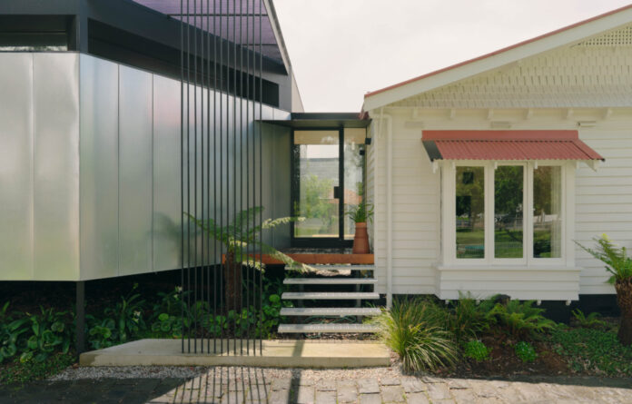
The main entry of the house was relocated to the side lane.

The new open-plan kitchen, dining, and living area.

The material palette has a ‘robust urban quality.’

Split levels provide a subtle distinction between spaces.

Galvanised sheet cladding provides a literal ‘silver lining’ to the home.

‘The scale is sympathetic and the street rhythm of house-entry-house-entry-house is satisfying. The garden ties them all together,’ says Michael Roper, director of Architecture Architecture
There was obvious untapped potential in this weatherboard bungalow in Coburg, Melbourne.
The home was in decent condition, but the interiors did little to appreciate its backyard, northern orientation on one side, and parkland on the other.
Architecture Architecture were brought on to reorient the house and extend its footprint.
The entirety of the original 70 square metre house — accommodating three bedrooms, two bathrooms and a lounge — was retained in the renovation.
Later additions (including another bedroom and bathroom cutting the home off from the backyard) were then demolished to make way for a new open-plan kitchen, dining, and living area covering 50 square metres.
Due to local flood levels, the extension needed to be raised 780mm higher than the existing house. Architecture Architecture embraced this challenge, inspiring visible distinctions between old and new, and elevated aspects to the park from communal spaces.
‘We decided to amplify this distinction and play to the parkland context by giving the extension a robust civic aesthetic, as well as expressing the height difference, by allowing the garden to grow in under the house,’ says Michael Roper, director of Architecture Architecture
‘The main entry of the house was relocated to the side lane (which really feels like part of the public open space) and the raised living areas now look out over the park and into the treetops.’
The material palette has a ‘robust urban quality’, drawing together cement sheet, and cyclone wire fencing, and galvanised sheet cladding that provides a ‘silver lining’ to the home.
‘The galvanised sheet shimmers and reflects the colours of the parkland, while the black cyclone wire falls into shadow, permitting views between the garden and the park,’ says Michael.
Landscaping by Straw Brothers creeps in and around the house to further blur the line between the house, park next door, and additional green space behind the home.
‘Completing the connection between public and private realms, the original side fences were completely removed and only partially replaced with transparent cyclone fencing where required,’ says Michael. ‘The overall effect is a true integration of public park and private home.’
At the very rear of the site is a new 15 square studio that appears as a mini version of the main addition. The studio can only be accessed via the backyard, providing a separation between work and home life.
‘The entry is located at the junction, providing breathing space between the two. The scale is sympathetic and the street rhythm of house-entry-house-entry-house is satisfying. The garden ties them all together,’ says Michael.
The extension has made a substantial difference to the liveability of this house, connecting living areas to the outdoors, introducing abundant natural light, and providing a new home office separated from the house.
Want to see more from The Design Files? Sign up to our newsletter for your daily or weekly dose of home and design inspiration.
[ad_2]
thedesignfiles.wpenginepowered.com


