[ad_1]
A Family’s Classic Mid-Century Beach House, Playfully Reimagined
Interiors

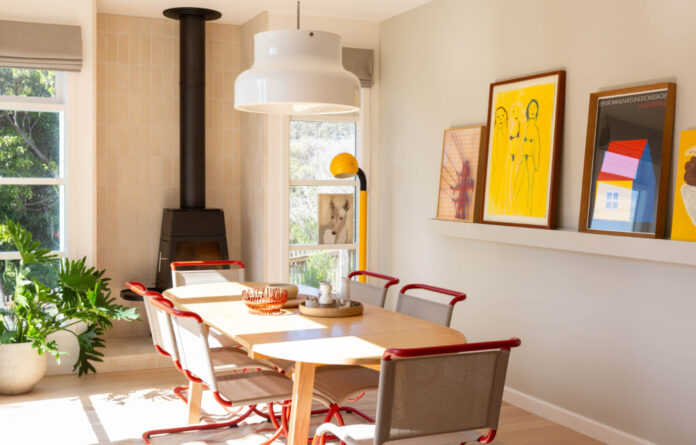
Sorrento House has been recently renovated by Sanders & King. Bumling Pendant by Anders Pehrson. OBLICA Shaker Fireplace. Artworks left to right: by Sam Tupou, Darren McDonald, House of Print, Emma Gale.

Vintage Thonet S533N dining chairs. Bumling Pendant by Anders Pehrson. OBLICA Shaker Fireplace.

Pale timber floors are paired with terrazzo benchtops in the extended kitchen.

The kitchen and bar area. InCommonWith wall scones from IN GOOD COMPANY. Yellow artwork by Emma Gale. Framed tea towel from Third Drawer Down.

The informal dining setting features a high table on wheels, which can be easily moved out to of the way when entertaining.

Japanese Inax glazed mosaics from Artedomus. The green splashback provided the perfect backdrop for the client’s eclectic mix of vintage glassware.


The new bar marks the beginning of the extension, in replace of the old kitchen.

The living room looks out the the deck and backyard. Sculptures by Emma Davies. InCommonWith wall scones from IN GOOD COMPANY. Bumling vintage red lamp.

‘Overall the new extension was to provide a subtle backdrop to showcase the client’s colourful curation of artwork and eclectic mix of homewares,’ Elissa says.

Burnt orange and red tones bring a summery feel to the interiors.

Framed print by David Band. Vase by Mirka Mora. Bitossi elephant.

Bowel by Tjanpi Desert Weavers. Bitossi bowl.

The bathroom was one of the rooms that was gutted and ‘completely reimagined’. FLOS Glo Ball.

The retro style of the Ottocento bath tub is another nod to the home’s past.

Artwork by Mirella Townsend. Lampe Gras Wall Light from IN GOOD COMPANY.


The two bedrooms have new timber bedheads and were re-carpeted as part of the updates.

USM Haller Storage Unit from ANIBOU. Mid-century chair.

The charming retro exterior.

The framed windows capture views of the backyard.
Sorrento House is one of those renovations that blends old and new so seamlessly, it’s difficult to tell where the original part ends, and the extension begins.
This was the ultimate goal for Sanders & King, who were engaged by the owners to extend the late 1950’s/early 60’s beach house to include a new kitchen, dining, laundry, and powder room. The well-loved and well-used abode is the holiday home for a family of five, and their friends, that flock to the Mornington Peninsula every summer.
It was also a bit of a sentimental project for Elissa King, as the owner is one of her closest and oldest childhood friends. ‘I already had an intimate relationship with this holiday home,’ she says. ‘[Having] stayed here many times, I knew how they interacted and the workings of their family dynamics.’
The owners were eager to maintain the ‘relaxed atmosphere’ and the integrity of the home’s original architecture, which had been relatively well preserved. They decided to leave the entry and the living area untouched, in addition to the original blue paint on the exterior that was ‘still proudly on display’, decades since it was built.
Inside, walls were repainted, existing timber floorboards refinished, and the bedrooms were given a ‘minor facelift’ in line with the new extension and new kitchen. Just 35 square metres of floorspace was added, making way for a new open-plan living, kitchen and bar area, complete with limed oak veneer joinery, light terrazzo stone and olive tiled benchtops.
‘It was imperative that the design should retain a nod to its 1950s/60s heritage but was to be contemporary in feel and layout,’ Elissa says. ‘The client was very keen to re-use the existing kitchen windows, and repeat the existing design detailing throughout.’
Inspired by the stone lining around the original fireplace, Sanders & King chose exposed brickwork for the inset of a new Oblica Shaker fireplace. This ethos to offer a ‘modern take’ on the home’s original elements throughout is part of what makes the renovation so successful, and cohesive.
‘There are so many lovely parts to this renovation that come to life with the client’s innate sense of style and their beautifully curated art, vintage mid-century lighting, and furniture collection,’ Elissa notes.
Hero pieces include the eye-catching vintage red dining chairs, and glossy pendant lighting, while a a playful selection of framed prints in bold primary colours lends a cheerful feel to this relaxed family getaway.
Want to see more from The Design Files? Sign up to our newsletter for your daily or weekly dose of home and design inspiration!
[ad_2]
thedesignfiles.wpenginepowered.com


