A Downsizing Couple’s Cleverly Renovated 1950s Apartment
Architecture


Kirribilli Downsizing Apartment is a recently completed renovation.

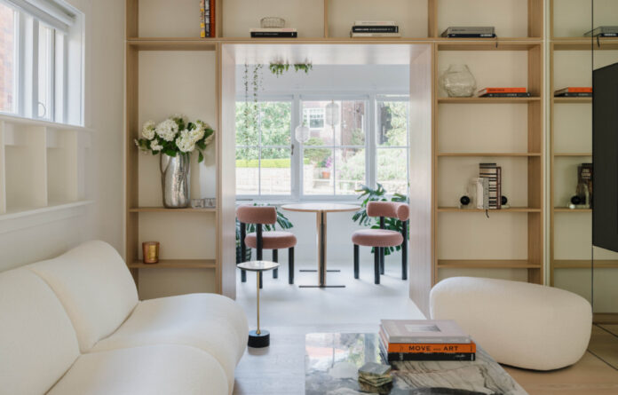
Double-sided bookshelves create a functional divide between the dining area and the living space.

The floating island bench features Patagonia quartzite. Polytec Legato Bone White cabinetry.

‘We experimented and paired the stone with a plywood veneer base, with custom details around the edge to bring plywood up to a high finish level not typically expected.’

Woodcut Bone Ash floorboards.

The show-stopping bench extends seamlessly across the living, kitchen, and hallway, even into the bathroom.

The bathroom wall has been replaced with frosted glass dividers.

The stone-topped bench serves also the vanity.

A central wardrobe divides the living room, bedroom, and a second living space.

A sliding door also conceals a study nook inside the bedroom.

The second bedroom has been repurposed as an additional living area.

The 1950s apartment block.
When a Sydney couple decided it was time to trade in their suburban family house for an inner-city apartment, it was clear their new home would have to maximise space in clever ways.
They engaged the help of tsai Design and architect Amandine Simonetti Architecture to renovate a two-bedroom apartment located in a 1950s apartment building in Kirribilli.
At 70 square metres, the new home was smaller than they were used to, but the location was ideal — they could even walk to work in the city just over the Harbour Bridge.
tsai Design director Jack Chen says the owners were quite flexible with the brief, asking only for relaxed spaces that balanced good design with functionality, lots of storage, and for a minimalistic interior palette.
‘As always whenever working on an existing house or apartment, we started with the constraints and try to overcome these in the design,’ Jack says. ‘The biggest challenge for us was the narrowness of the unit (just three-metres-wide in the living space) and the lack of good daylight.’
The redesign prioritised the living spaces and removed existing walls in favour of creating an open-plan layout that allowed sunlight to flood each room.
Mirrors combine with warm beige hues, detailed plywood veneer joinery, and blonde timber floorboards to create a light and airy atmosphere, almost reminiscent of a modern beach house.
A particularly clever update was replacing the segregated boundaries with custom joinery that serves as a partition or instead links the spaces together.
The floating island bench in the kitchen impressively curves around the corridor and into the bathroom, where the slab of Patagonia quartzite transforms into a luxurious vanity. There’s also a double-sided bookshelf that creates an inviting portal between the living and dining room, and a central wardrobe pod with a sliding door in the bedroom that opens to a hidden study nook.
Jack says these multi-purpose features took an ‘enormous amount of effort’ to coordinate and some careful craftsmanship from the team at Next Level Building who carried out this vision.
But they’ve brought a sense of surprise to the compact home that has exceeded even the owner’s expectations, who say they love the apartment so much they haven’t given their old place a second thought!
thedesignfiles.wpenginepowered.com


