A Country-Style Reimagining Of A Bayside Melbourne Home
Interiors

Pipkorn Kilpatrick were tasked with paring back and making sense of a period home with a disjointed extension added in the 1980s or ‘90s.

Optimising the existing kitchen — which remains at the centre of the extension — was the key element of the project.

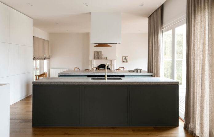
Two large island benches that face one another, rather than a typical standalone bench that looks out across the backyard.

Ceramics by Anna Skermer of Pipkorn Kilpatrick. Anna Varendorff brass vase. Gubi Daumiller Armchair from In Good Company.

The ovens and the cooktop are positioned on the dining side bench (which is deep enough to house bar stools for a breakfast bar) while the undermount sink is on the opposite bench facing the living room, allowing for a minimal and clean presentation on arrival into the space. Artwork by Hannah Nowlan.

The look of the updated interiors is country-inspired featuring pared back finishes. Ceramics by Anna Skermer of Pipkorn Kilpatrick. Mark Tuckey dining table.

Ceramics by Anna Skermer of Pipkorn Kilpatrick. Artwork on fireplace by Eileen Napaltjarri from Papunya Tula Artists. Artwork on right by Nicholas Harding. Mark Tuckey dining table.

Artwork on desk by Mel Lumb. Mark Tuckey sofa. Woud Sentrum Side Table.

‘The pared back aesthetic allows you to focus on the details and provides an inviting and calming backdrop for family life to take place.’ Artwork on desk by Mel Lumb. Mark Tuckey sofa. Woud Sentrum Side Table.
Pipkorn Kilpatrick are the masters of creating timeless interiors that enrich their clients’ lives.
In this project, they were tasked with paring back and making sense of a period home in Hampton, Melbourne with a disjointed extension added in the 1980s or ‘90s.
The space was ‘not functioning as it needed to for a busy, working family,’ says Anna Skermer co-founder of Pipkorn Kilpatrick.
‘The square kitchen with brown faux timber cabinetry and cream caesarstone benchtops had only one access in and out, and there were two additional bedrooms crammed into the back corner which overlooked the pool, compromising outlooks and the size of the kitchen, living and dining areas.’
Pipkorn Kilpatrick didn’t change the footprint of the home, but chose to reconfigure rooms within the existing exterior walls.
The two bedrooms (and the internal wall separating them) in the rear extension needed to go, allowing the entire addition to operate as the home’s spacious main living hub.
Optimising the existing kitchen — which remains at the centre of the extension — was the key element of the project. Anna explains, ‘The biggest challenge was making a central kitchen work without feeling like a thoroughfare.’
The design achieves this, creating two large island benches that face one another, rather than a typical standalone bench that looks out across the backyard.
The ovens and the cooktop are positioned on the dining side bench (which is deep enough to house bar stools for a breakfast bar) while the undermount sink is on the opposite bench facing the living room, allowing for a minimal and clean presentation on arrival into the space.
‘It’s an unconventional setup but it allows whoever is in the kitchen to feel very much a part of the happenings of the house and our clients love this,’ Anna says.
‘We like the way what appears to be an “all on show” kitchen, with connectivity between the living and dining areas, in fact has a concealed wall of joinery to the rear housing the fridge, pantry, appliances, a second sink, and breakfast bar with ample storage — making the elegant kitchen functional.’
The look of the updated interiors is country-inspired featuring pared back finishes. Busy materials were replaced with deep grey island benches, shaker cabinetry, and granite benchtops that blend beautifully with the warm simplicity of off-white walls and oak floors.
In the original part of the house, a rarely used formal dining room became a bedroom, allowing the house to retain four bedrooms in total.
Anna says making the rear extension one interactive living hub zoned by the central kitchen has made a huge difference to the client’s lives.
‘The pared back aesthetic allows you to focus on the details and provides an inviting and calming backdrop for family life to take place.’
Want to see more from The Design Files? Sign up to our newsletter for your daily or weekly dose of home and design inspiration!
thedesignfiles.wpenginepowered.com


