A Country Resort’s Eye-Catching ‘French Mediterranean’ Renovation
Interiors

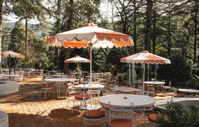
The refreshed courtyard is part of Lulu’s at The Lodge.

Terracotta pavers create winding terraces beneath the surrounding pine forest.

Scalloped edge custom furniture.

A blushing Murano chandelier is a centrepiece of the renovation.

The brick walls are painted light teal and white.

Timber, wicker, and marble textures feature throughout.

A close up of one of the playful dining settings.

Framed artworks round out the colourful interiors.
When Studio Barbara co-directors Benjamin Selke and Felicity King first visited Lulu’s Restaurant & Bar, it was ‘an isolated, and somewhat forgotten, restaurant’.
‘The existing space featured a white porcelain tile floor, trestle tables, a chaotic ceiling full of dark timber beams and awkward white plasterboard bulkheads along with hanging ladders and fake greenery,’ Benjamin says.
The venue on the New South Wales South Coast originally served as a German beer hall, which in the 1970s was reportedly bustling with visitors from Jamberoo and neighbouring villages like Kiama. Since its prime though, the space and its surrounding gardens had fallen into disrepair.
Felicity and Benjamin were eager to get their hands on the challenging property after being tasked with its transformation by the owners, who envisioned the riverside restaurant becoming the heart of their 39-room resort, The Lodge.
They decided to take a playful approach, using colour and pattern to ‘both conceal, and distract’ from the existing architecture. The ‘rough brick’ walls and dark timber panelling were made more refined with fresh white paint contrasted with varying shades of teal, while the unsightly bulkheads were cohesively incorporated into the ceiling thanks to an abstract mural by artist Sean Thomas Bell.
‘He had to work upside-down on a ladder for weeks [to complete it],’ Felicity says.
‘Our inspiration was to recreate the feeling of stepping into an eccentric holiday home somewhere in a little French town on the coast of the Mediterranean, where time has layered the walls.’
This beachy theme comes to life in fun ways, like the ocean motifs on the mural, the brass shell-shaped wall lights, and the scallop edges of the custom furniture.
A traditional plush carpet features a palette of peachy pink, burnt orange, and green hues that set the tone for the eclectic mix of trinkets throughout the space. And there’s something that catches your eye in each corner, from the ‘whimsical Murano chandelier’ overhead, to elegance of an art deco timber sideboard.
‘Our favourite part of the design is the layering of antique furniture with more custom, contemporary pieces,’ Benjamin explains.
In the garden, Studio Barbara pushed pastel pink aside in favour of a slightly earthier, terracotta theme. The existing dense greenery was reshaped to create multiple courtyard terraces, where white custom furniture and umbrellas invite guests to sit below the towering tree canopies of the surrounding pine forest.
thedesignfiles.wpenginepowered.com


