[ad_1]
A Classic Victorian Terrace, Reimagined As Three Light-Filled Pavilions
Architecture

Matt Gibson Architecture + Design designed a series of mews-like outbuildings to expand this Fitzroy terrace. Landscape design by Robyn Barlow Design. Photo – Derek Swalwell

Artwork, ‘The Orchid Collector’ by Richard Dunlop from James Makin Gallery. Photo – Derek Swalwell

The updated home features three separate volumes linked by a glass bridge above and walkway below. Photo – Derek Swalwell

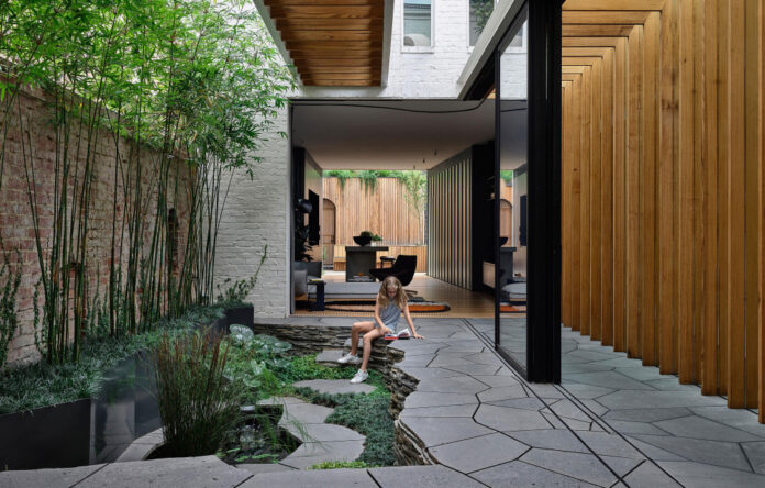
The home’s pavilions are separated by internal courtyards. Landscape design by Robyn Barlow Design. Photo – Derek Swalwell

Artwork, ‘La Lune Nourriciere’ by Caroline Denervaud from Otomys gallery. Photo – Derek Swalwell

Glass walkways allow appreciation of the outdoor spaces created by Robyn Barlow Design. Photo – Derek Swalwell

The central pavilion houses the main living areas. Photo – Derek Swalwell

The internal courtyards bring valuable added light and air into the narrow site. Landscape design by Robyn Barlow Design. Photo – Derek Swalwell

The second internal courtyard, separating the main living pavilion from the self-contained studio and garage. Photo – Derek Swalwell

Courtyards define various zones, while linking the indoor and outdoor, and softening the transitions between the original building and the extension. Photo – Derek Swalwell

The self-contained studio sits above the garage at the site rear. Photo – Derek Swalwell

Landscape design by Robyn Barlow Design. Photo – Derek Swalwell

All removed bricks from the demolished rear wing were salvaged and reused on the rear pavilions, ensuring any new work came intrinsically out of the old. Photo – Derek Swalwell

Bedrooms are located on the home’s upper-storey. Photo – Derek Swalwell

The house contains three bedrooms, in addition to its studio. Photo – Derek Swalwell

Timber panelling brings warmth to the interiors. Photo – Derek Swalwell

Artwork above the fireplace, ‘Spill #2’ by Andrew Browne. Artwork above the couch, ‘Moving Forward’ by Euan Macleod from Niagara Gallery. Brass sculpture bottom right, ‘Objects of free use’ by Anna Varendorff from Hub Furniture. White sculpture middle left, ‘Brick’ by Kristina Dam Studio from Design Stuff. Wooden sculptures left, ‘Geo #1’ and ‘Geo #2’ by Jamie Hayon for Fritz Hansen from Cult. Photo – Derek Swalwell

The laneway-facing exterior of the rear pavilion is clearly contemporary, while still derivative of the home’s classic street-facing facade. Photo – Derek Swalwell

The original terrace facade and entrance remains. Photo – Derek Swalwell
When engaged to renovate and extend this Victorian terrace, Matt Gibson Architecture + Design rejected the standard ‘box on the back’ approach.
‘We didn’t want the extension to sit in total contrast to the original home, because we wanted the movement between new and old spaces to feel smooth and harmonious,’ explains practice director Matt Gibson.
Instead, the architects looked to traditional ‘mews’ outbuildings for inspiration. Behind two front rooms (retained and updated to celebrate their existing period features) now sits two additional double-storey zones or ‘pavilions’, separated by internal courtyards. The central pavilion houses the main living areas, while the rear pavilion features a self-contained studio above a laneway-accessible garage.
The exterior of this latter volume is clearly contemporary, while derivative of the home’s classic street-facing facade.
A send of openness has been achieved through the intervention of an elevated glass-floored bridge connecting the upper levels, and a glass-roofed walkway below. These glass corridors unlock the courtyard to improve privacy, solar access, and appreciation of the outdoor spaces by Robyn Barlow Design.
‘The glazed bridge which runs over the central courtyard is a particularly special moment in the project,’ says Matt. ‘By maximising the upper floor footprint, we were able to reduce staircases in the design and achieve connection between the three volumes, without compromising on movement.’
Bricks from the demolished rear wing of the home have been painted white and reused on the pavilion masses. A similar colour palette is used inside, where pale timber panelling and white walls offer a lightness to the living spaces, contrasted with black steel in walkways and window frames.
The final design of this home respects and preserves its historic features and feel, alongside creative adaptations and insertions that allow for a contemporary way of living. Achieving privacy from the surrounding apartment buildings and flats, the home feels like an intimate hideaway, with surprising interactions between the built and natural environment.
[ad_2]
thedesignfiles.net


