[ad_1]
A Classic 1960s Australian Beach Cabin, Renovated With Soul
Architecture

Anglesea Cabin by Lian is a project deeply tied to its owners and the surrounding landscape in the Victorian beach town. Lian were engaged to ‘make good’ the 1960s home’s existing elements to enhance usability and the cabin’s spirit. Photography – Ben Clement

Spatial adjustments were made to slightly enlarge the main living space by removing the entry hall and reorienting the kitchen. Photography – Ben Clement

An original truss beam — previously covered by plaster was unveiled during construction — now forms the focal of the ceiling. Photography – Ben Clement

The interiors were relined to allow for added insulation. Photography – Ben Clement

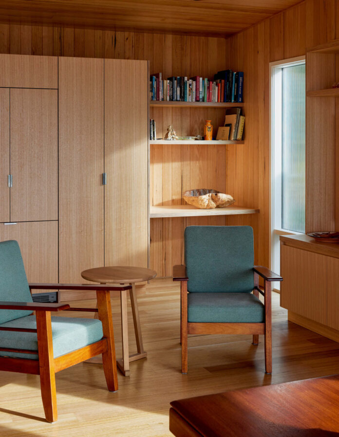
Victorian ash timber boards carry the exterior qualities of the retained Californian redwood cladding inside. Photography – Ben Clement

A family height chart drawn on the plaster that once lined the corridor is now framed and positioned beside the dining table. Photography – Ben Clement

The cabin is situated at the top of an Anglesea hill with a view across the town towards the cliffs and coastal reserve. Photography – Ben Clement

New bathroom tiles match the original sky blue scheme. Photography – Ben Clement

‘Our vision for the renovation was to strengthen the ties between the interior to the exterior and, in a way, draw the view back outside when stepping in, rather than feel like stepping in to an isolated interior space,’ says Andrej Vodstrcil, co-founder of Lian. Photography – Ben Clement
Anglesea Cabin is a project deeply tied to its owners and the surrounding landscape in the Victorian beach town.
The existing prefabricated kit home is a typical 1960s Australian beach shack that’s been in the client’s family since its inception. ‘The client was a child at the time it was originally built, and remembers planting the eucalyptus tree that now stands at 15 metres tall and provides shade to the deck,’ Andrej Vodstrcil, co-founder of Lian.
The home was in need of repair, with a large extension initially proposed, until architects Lian were engaged. Andrej explains, ‘The client was planning to dramatically alter the existing cabin, roughly doubling its size, which would have impacted the established landscape. As time went by and circumstances changed, the client reevaluated their priorities and we were engaged to reconsider the previous plans.’
The simplified brief outlined a home more suitable for longer stays through the colder seasons, and for hosting family gatherings over the summer. Rather than to majorly expand the home, the intent became to ‘make good’ its existing elements to enhance usability and the cabin’s spirit.
‘The best thing about the project is the site, not the building. The cabin is situated at the top of an Anglesea hill, with a view across the town towards the cliffs and coastal reserve,’ says Andrej.
This sympathetic approach was upheld by the entire project team, including the builder, Michael Russell, who lives on the same street. ‘He really reinforced this perspective, always repeating “the building shouldn’t compete with that” and pointing outside,’ recalls Andrej.
Spatial adjustments were made to slightly enlarge the main living space by removing the entry hall and reorienting the kitchen. Slight extensions were also made to a bedroom and the lower level rumpus room, while the bathrooms were completely redesigned (with an original blue ceramic bathroom basin retained and repositioned). A family height chart previously drawn on plaster in the original home now hangs beside the dining table in a further sentimental nod to its history.
The interiors were relined to provide greater insulation, with double glazing added to all the existing windows. Victorian ash timber boards carry the exterior qualities of the retained Californian redwood cladding inside, and in a way, ‘draw the view back outside when stepping in – rather than feel like one is stepping into an isolated interior space,’ as Andrej says.
An original truss beam — previously covered by plaster and unveiled during construction — now forms the focal point of the ceiling. Lighting has been deliberately moved from overhead so as not to interrupt the surface. ‘Wall lights have been used elsewhere wherever possible to further reduce the feeling of entering a typical interior,’ says Andrej. ‘Wall lights remind us a bit of camping, especially when adjustable ones are used.’
This cohesive yet restrained renovation is a quiet triumph – enhancing the home’s functionality whilst retaining its original charm, and ensuring its longevity for many generations to come.
[ad_2]
thedesignfiles.net


