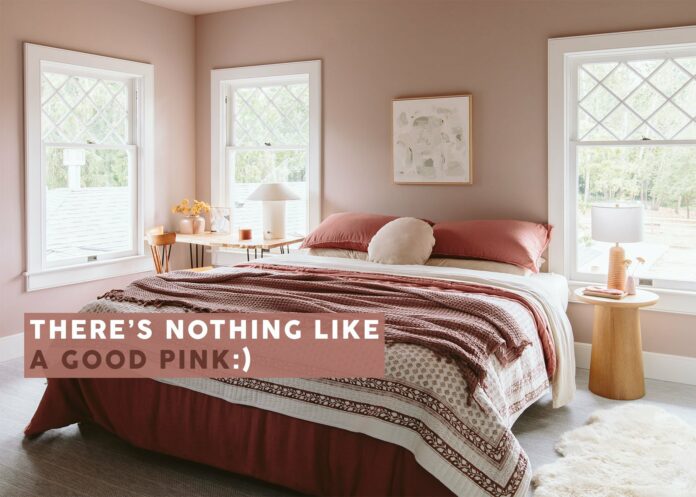

It’s Valentine’s Day so what better time to talk about pretty pink paint colors? Last year we painted our guest room Artistic Taupe and it created such a warm, cozy vibe. This warm mauvey nuanced pink couldn’t be more perfect. While you are about to see some bolder, more daring, pinks below, for my home I want/need something that has a more neutral undertone and one that makes me feel calm. So if you’ve been toying with painting one of your spaces a pink tone here are some that we’ve used and loved. The ones I’ve used I couldn’t be happier with!
Artistic Taupe by Sherwin-Williams


Once I painted this room Artistic Taupe I realized that I am far more of a pink lover than I thought I was – WHEN it’s the right pink. And since I loved this tone so much I felt confident in picking my next pink (the powder bath below) a darker rose/mauve that is two shades darker on the same paint stick.
Cocoa Berry by Sherwin-Williams

The color on the left wall (not under the light) is the most accurate – look how pretty it is! But first, before I chose Cocoa Berry I chose Glamour (only one darker) below:
Glamour by Sherwin-Williams

I caught the painter before he did the second coat and realized that this room didn’t have enough natural light (none) to have this tone – it just wasn’t reading in person. So we took it one shade darker. But this color, Glamour, is SO BEAUTIFUL and I would absolutely use it again in a room that has more light moving around. And we recently painted the lightest color on that same paint stick called White Truffle and it’s SO PRETTY.
El Mirage by Portola Paints

So Gorgeous. Portola Paints are extremely gorgeous (and cost more :)) I love how A 1000 x Better paired this pink with the yellow – so bold.
Wing It by Clare

Orlando has been using pink since we met – it’s almost like a neutral for him. I haven’t been in this pink room yet but V excited for a future EHD team excursion up to Yosemite soon. Also, you can rent it out now so if you are headed to Yosemite stay at his house!!
Yours Truly by Benjamin Moore

Another Orlando pink. His style is so eclectic, postmodern, and yet always looks like him (and always so cozy).
Sweet Pastel by Valspar

I totally forgot about this sponsored bedroom makeover we did with Stokke YEARS ago. Brady did it all, for his niece I believe. How sweet is that room and that soft pink?
Unspoken Love by Benjamin Moore

Our stylist friend Erik Staalberg (he was a frequent freelance stylist on my team for 7 + years) is one of my MOST favorite souls in the world. No one owns himself more than Erik and I so admire his attitude in every way. He is also clearly so bold with his choices and loves embracing color like in his old dining room with this pink.
Pueblo by Sherwin-Williams


I LOVE this almost coral that Caitlin used in her bedroom that everyone freaked out about (in a good way). Caitlin has such an incredible sense of style and I didn’t see this peach coming, but so glad it came.
English Scone by Dunn-Edwards

While the world was freaking out about the new Pantone color of the year (peach!) Arlyn’s English Scone is the warmer and more nuanced version of it. Again, I didn’t actually get to see this room but love how her bedroom turned out).
So those are our pink paints! I am clearly very partial to the mauvey end of the spectrum but whatever pink you choose and love will undoubtedly make it a happier space. xx

Opening Image Credits: Photo by Kaitlin Green | From: A *First Round* Farmhouse Reveal – Readying Our Guest Room For Family To Visit
The post A Bunch Of Really Good Rooms Painted Pink Because It’s Valentine’s Day And We All Deserve It appeared first on Emily Henderson.
stylebyemilyhenderson.com

