[ad_1]
A Brazilian-Inspired Update Of A 1920s Brisbane Cottage
Architecture

Bowen by Shaun Lockyer Architects elevates a 1920s cottage with a stunning Brazilian-inspired addition. Photography – Cieran Murphy

The brief was to take what the clients already loved about the Brisbane property, and add to its character in a sustainable and contemporary manner. Photography – Cieran Murphy

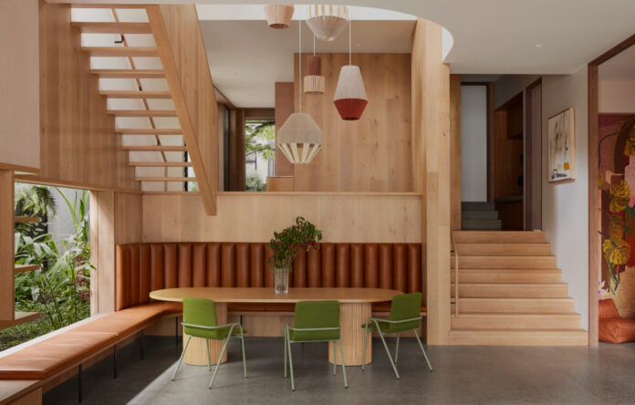
A central oak-clad void bridges the old and new areas of the home. Photography – Cieran Murphy

All of Shaun Lockyer’s work is heavily influenced by Brazilian subtropical architecture, which is most tangibly expressed in Bowen through the use of concrete and integration of landscape within the building. Photography – Cieran Murphy

A strong focus on the pool, backyard, landscaping and area for kids to play was at the core of the design brief. Photography – Cieran Murphy

‘The strong use of concrete and timber is intended as both a sympathetic, but also progressive, use of materials that not only references past history, but a new history that more appropriately considers climate, durability and personal taste,’ says Shaun. Photography – Cieran Murphy

Transitioning through the home, one experiences the older character of the cottage before the juxtaposing addition that embraces Brisbane’s subtropical climate. Photography – Cieran Murphy

Split-levels better connect the house to the garden, while introducing more light, air, and theatre into the interiors. Photography – Cieran Murphy

An expressive use of colour and interior finishes create distinct and varying personalities throughout the home. Photography – Cieran Murphy

The new upper living area. Photography – Cieran Murphy

The interiors designed by Carlene Duffy of Cedar and Suede are deliberately playful, with a strong use of colour and a desire to be a warm and engaging family home, rather than a precious object. Photography – Cieran Murphy

The retained cottage contains the kid’s bedrooms, bathrooms, and guest accommodation. Photography – Cieran Murphy

The upper-living area opens to additional outdoor space with landscape architecture by Green Care Project. Photography – Cieran Murphy

The elevated original cottage above the new garage. Photography – Cieran Murphy

The home entrance. Photography – Cieran Murphy
When approaching renovating and extending this New Farm home, Shaun Lockyer Architects were tasked with adding to, not detracting, from its original pre-war architecture. The brief was to take what the clients already loved about the Brisbane property, and add to its character in a sustainable and contemporary manner.
The project, nicknamed Bowen, started with the original cottage, which was raised and moved closer to the street to allow more space underneath and behind.
A new rear addition spans two storeys, made more engaging by the articulation of the floor levels. These split-levels not only better connect the house to the garden, but introduce light, air, and theatre into the interiors.
Transitioning through the home, one experiences the older character of the cottage before the juxtaposing addition that embraces Brisbane’s subtropical climate.
‘This element of surprise manifests as a progressive revelation about the home the further one moves through it, revealing the detail, volume, light, and ultimately connection to the landscape as one works from the front to the back,’ says Shaun Lockyer, director of Shaun Lockyer Architects.
All of Shaun Lockyer’s work is heavily influenced by Brazilian subtropical architecture, which is most tangibly expressed in this home through the use of concrete, and integration of landscape within the building.
‘The strong use of concrete and timber is intended as both a sympathetic, but also progressive, use of materials that not only references past history, but a new history that more appropriately considers climate, durability and personal taste,’ says Shaun.
A strong focus on the pool, backyard, landscaping and area for kids to play was at the core of the design brief.
‘This house is a fun, engaging and serendipitous sanctuary that embraces all that life is about,’ says Shaun. ‘The aim was to build less house and more garden to enjoy the environment around the house.’
The interiors designed by Carlene Duffy of Cedar and Suede are more deliberately playful, with a strong use of colour and a desire to be a warm and engaging family home, rather than a precious object.
A central oak-clad void bridges the old and new areas of the home, both sympathising and contrasting with the remainder of the interiors through period-appropriate colour and a softer material palette.
What was now a dark and cold home is now a light-filled, airy and functional home that makes the most of its substantial block. Additions and alterations have reinforced the home’s character, to form a stunning family haven for five.
[ad_2]
thedesignfiles.net


