[ad_1]
Hi friends, let’s talk about gallery art walls because they are still alive and well, which I didn’t really realize until I saw this post from Chrissy Teigen on Insta lately and how it literally broke the internet in decor land because everyone wanted to know how to have a gallery wall like hers. This made me think that I shouldn’t assume that everyone naturally knows how to create a gallery art wall, so I thought to do a two part series to help those of you who need it. Before I post about how to Plan and Install a Gallery Style Art Wall in 8 Steps, I want to share below how to select art and objects first because there is no need to get into installation tips and ideas until you have your art and other objects selected, or at least, have a clue as to the visual direction you want to take this.
Here are 4 steps to select art and objects for your gallery art wall:
1/ Pick art and objects with a set theme or vibe
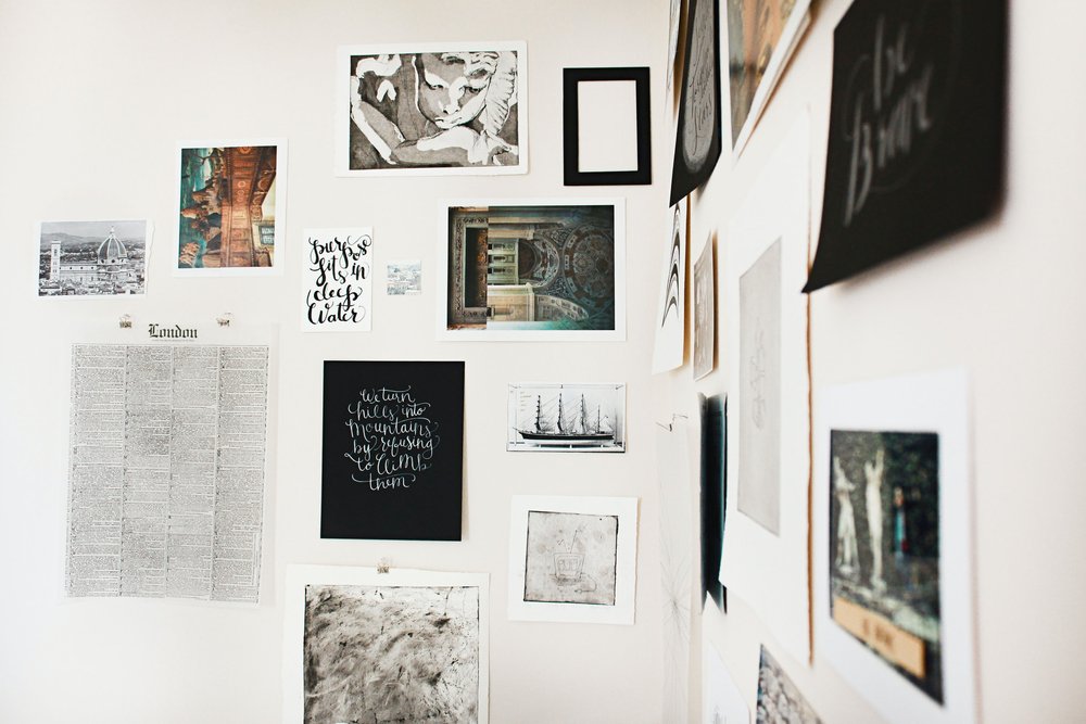
Think of your room colors and overall vibe, your style, the theme. Maybe you want to showcase your love of travel or your son’s school art mixed in with modern art and your ceramic dish collection. Perhaps it’s black and white photography you’ve been collecting for years or your love of abstract shapes and vibrant color. Whatever it is, try to find the red thread that goes through each piece which connects them in some way. Even if only YOU see the connection, that’s okay, but there needs to be some meaning to you on an emotional level because that is why we display things on our wall in the first place right? Because we’ve emotionally made some connection to it – we like it – whether that be the color, mood, subject matter, whatever… It evokes emotion and that’s good. In addition to emotion, the work as a whole should connect somehow visually. Does it make some sense or tell a story or is everything its own focal point and together, the story becomes terribly muddy or chaotic even (and not in a good way)? Art and objects that don’t fit together shouldn’t be displayed together.
2/ Mix art with with dimensional pieces
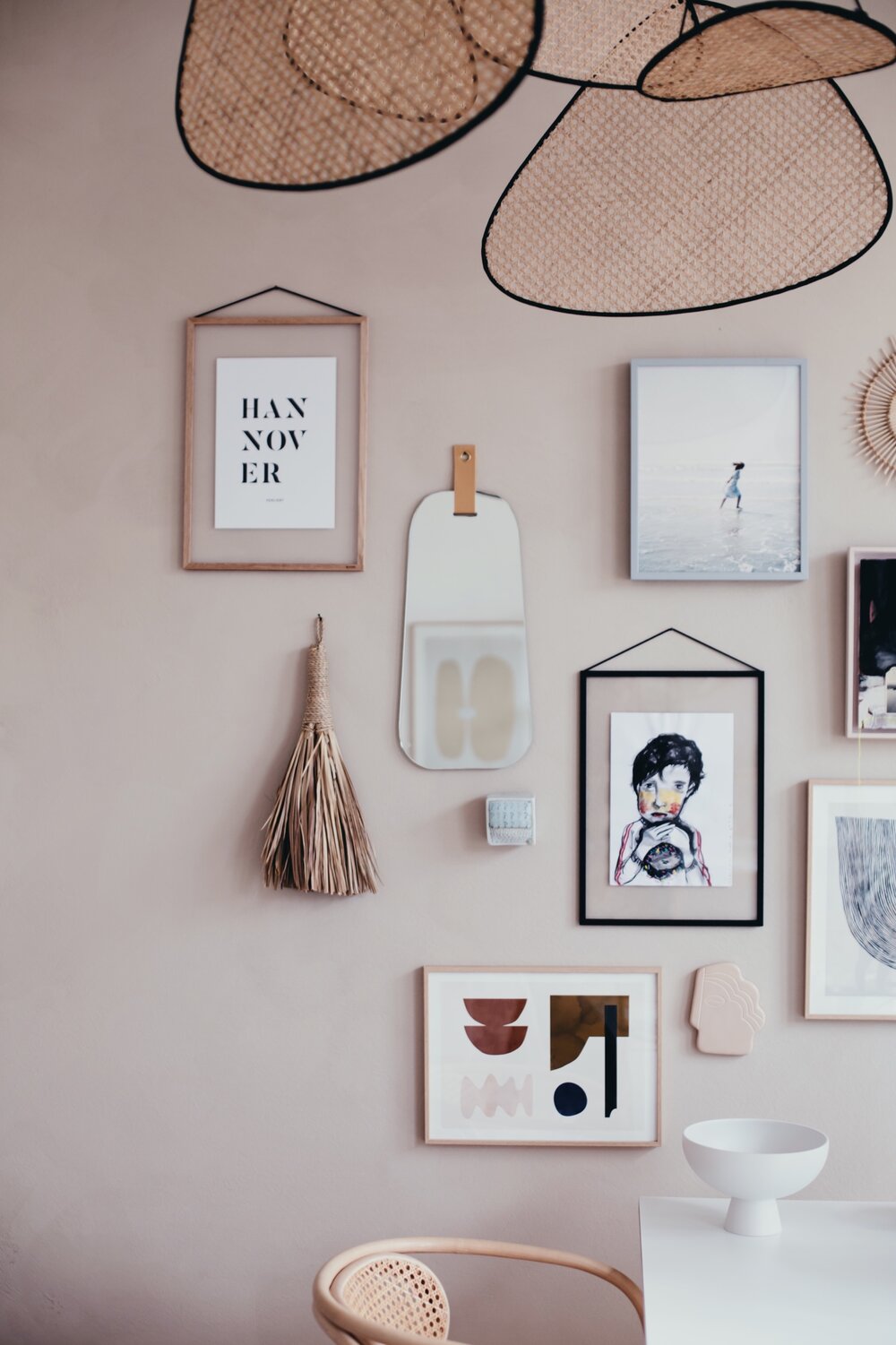
Art prints, paintings, kids’ artwork, Polaroids, photographs, drawings, sketches, personal photos of a family trip, and dimensional objects like mirrors, dishes, bowls, masks, wicker, baskets, a dried palm leaf, textile art, macrame, if it can be nailed to a wall, it can be considered! 🙂 Mix up the display – art and objects – and include what fits the story behind this wall of art that you’re creating.
3/ Decide on frames and mattes
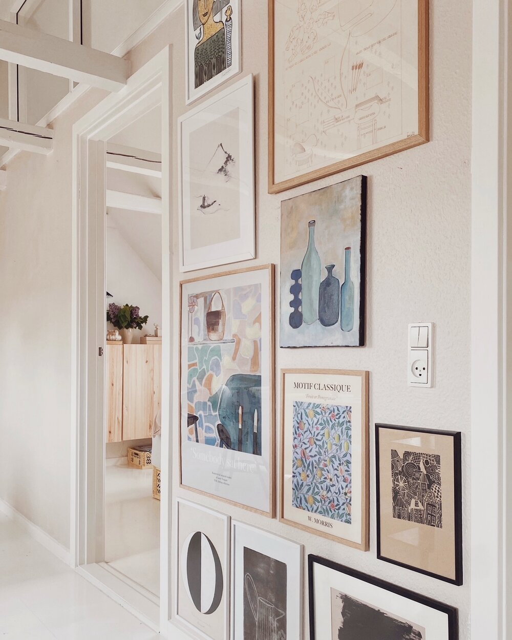
I’m not that bold with mixing frame styles, but perhaps you are. I like to stick to a few colors (white and natural wood) then throw in a few colored frames or black or something with a clean slim gold frame, as an accent. You do you. Maybe you want all black frames or only white. Or you want all of the frames to be in a different color of the rainbow, or only pink. But whatever you decide, decide! Also decide on mattes. I believe that all mattes should be the same color on gallery style walls just for the sake of unifying the overall arrangement, especially if you are mixing and matching frame colors, but then you’ll sometimes see a wall that breaks every design rule and it works beautifully. Yet, I tend to think those walls are done by the extremely stylish out there who effortlessly turn horses into unicorns, so who knows – if you have that magic – do it!
Photo: Holly Becker
Photo: Unsplash
Photo: Louise Herholt
Photo: Louise Herholt
4/ Lose the obsession with the perfect arrangement
If it fits on your wall, it can fit the arrangement. Salon style, or gallery style, is generally a really loose casual arrangement of art that grows over time. It doesn’t have perfect spacing between each piece. It isn’t perfect, at all! Which is why many tend to like it. Chrissy Tiegen’s was more or less perfectly arranged, that’s true, but you can still accomplish her look without become obsessed. A gallery art wall basically begins with a smaller grouping (like over a sofa or on a dining room wall or above or around a bed) and it expands over time, it spreads out as your life evolves. That’s the beauty of it. If you are fixated with frames all being the same size and color, and installed in a grid, or in Chrissy T style installed up her staircase, then you may want to really map out the arrangement, which I’ll detail in a post tomorrow. That is really up to you. But gallery art walls in lose arrangements can be really easy and fun, so I suggest trying it out and seeing what you can come up with. I’ve done them for years – since childhood (my mother taught me), and love the opportunity it provides me to share many types of beautiful things on a wall at home from ceramics to art, paintings to wicker, macrame and beyond.
I hope this post gave you some help with how to select art for a gallery wall! My next post will be all about how to plan a gallery wall (and install it!) in 8 steps. See you back here soon!
Love,
Holly
My New Episode – Listen Below!
decor8 · 07: Is Blogging Still Relevant In 2022?
[ad_2]
www.decor8blog.com


