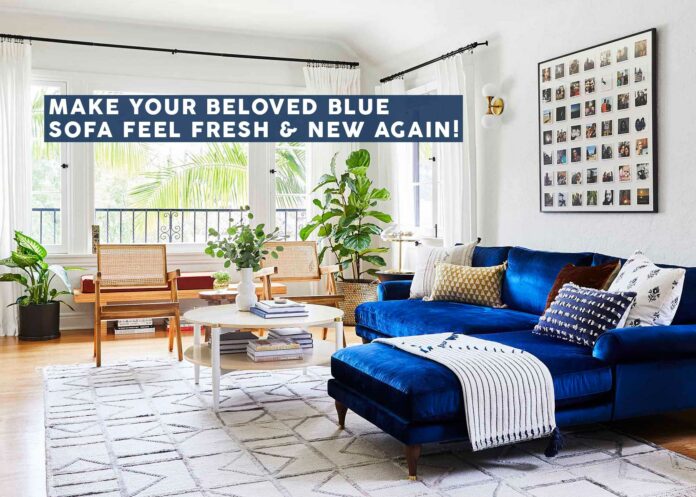

It’s been almost a decade since my heart first started beating for a cobalt blue velvet sofa. It’s been just short of five years since I made those sapphire dreams a reality with my Maxwell Sectional. The Internet tells me (at least based on how quickly it seems people redecorate) that it’s time to kick this baby to the curb in place of the colored sofa du jour, but yeah…I’m not going to do that. Don’t let TikTok make you think the lifespan of home decorating decisions lasts until the algorithm says there’s something new…48 hours later. Obviously, this is a gross exaggeration and no one is actually living their lives like this, but it sure does feel that way.
I still very much love my blue sofa. The cushions are a bit lumpy after far too many hours loafing around during a pandemic and the birth of my daughter who demanded we hold her for two hours at a time while napping (and nursing around the clock), but eh…no biggie. Have you seen the cost of, uh…everything lately?
If you’re of the same design school as me and hopped aboard the cobalt train a few years ago as many, many people did, you might be ready to shake things up a bit. So here’s the question: how do we make that sofa feel exciting again without turning your entire living room on its head? I’m going to attempt to answer that today. For you and for me.
My Original Living Room Design

First things first, let’s explore how we got here to begin with. I won’t go too in-depth into what led up to my original color palette of blue, neutrals and rust, but what I will reminisce on is how difficult it was to settle on because the inspiration out there was limited. It was either something really modern with mostly white and black accents, or eclectic with red vintage rugs and mid-century styling. I didn’t want either of those things. And frankly, I still don’t.
The other night, I hopped onto Pinterest and typed in “blue velvet sofa” and I kid you not, it spat back out at me three major style categories: modern, eclectic, vintage. UGH. There has to be something more, surely. Blue is a universal color that works with basically everything. Why is this mission in particular so hard to tackle, then?
I think because the cobalt blue of my particular sofa (not sure what you might be working with) yearns to be the star of the room. So it’s easy to pull back on any other colors or even patterns to not risk overloading your living space. I loved my old living room, I really did, but in my new space, without the beautiful architectural details, it needs more. A bright blue sofa in a mostly neutral room is just too boring for me. So I challenged myself to see what else I might be able to come up with. I had some ideas already in my head, but I knew in order to walk through them with you, I’d need to find some photos…
How I Hunt For Design Inspiration

One of my biggest tricks for finding design inspiration is to slightly alter what I’m looking for. Meaning, I rarely search “blue velvet sofa” when I’m stuck because chances are, I’ve already looked at everything in those results and still haven’t found what I’m looking for. Instead, I’ll try different rooms or categories that might have blue in them, like blue bathrooms and kitchens, blue armchairs, blue bedrooms, etc.
You’ll only see one inspiration photo below that contains a sofa, and that is the result of how I search. It’s a good way to see in what proportion a designer is using colors within a palette, what materials they are bringing in to round out the hues, what styles or aesthetics are calling to me.
Another thing I like to do is find an image (of whatever kind of space), then look up the designer and go look through their whole portfolio. If they’ve used bright blue in one space, chances are, they’ll know how to use it in another. And these breadcrumbs of ideas can lead to your next design ah-ha moment.
Try it, I promise, and let me know how it works for you. But let’s keep talking, so we can get to some colors for us all to try who live on Blue Sofa Avenue.
Inspiration Photos & Why They Work
Here’s a truth: I pulled from tons more images for the moodboards and palettes I put together below, but because of the way publishing on the Internet works, I could only run what I could find on Instagram. But fear not, because I think it’s still good and enough for you to get inspired. Shall we take a look?
Palette to Try: Cobalt + Acorn/Apricot, White, Olive, Slate & Wine
View this post on Instagram
Man do I love this shot from Clella Design. Immediately I’m taken by the juxtaposition of the dark slate-like navy next to the bright cobalt. The olive pillow balances the punch of the chair, a grasscloth with almondy orange undertones complements the blue, and a trickle of dark red (the stripe on the bed blanket) adds just a little something more to the palette. Oh, and the whites and creams keeps the space happy rather than moody.
View this post on Instagram
I keep coming back to this photo and honestly, it’s such a winner. There’s something enchanting to me about the pep of it while still feeling mature, cool, timeless but also a little bit retro. I’d believe you if you told me this is pulled from the 1950s, but also that it’s from right now. Again, white touches work to keep the dark olive, acorn-toned wood built-ins and bold blue in check from getting overly collegiate. Another dreamy spot from Clella Design.

Here’s what I put together from those (and about three other) photos. Pitting the navy with green undertones against the cobalt is daring but pays off in a really sophisticated way. Olive plays a supporting role, so I’d use it in less quantity than the blue, such as on a rug, in another piece of upholstery, maybe even on curtains. And my new favorite finishing touch? A deep burgundy, but just a touch. Don’t steal its magic by going overboard with it.
Palette to Try: Cobalt + Dusty Blue, Moss & Various Golden Yellows
View this post on Instagram
Here’s a dining room by Zoe Feldman Design. You might notice there is no cobalt here, BUT I stretched my mind a little to pull colors from here that I thought would work with it, particularly a good amount of dusty blue, yellow-toned woods, natural materials like rattan and burlwood, and even the flash of bright citrine from the light fixture.
View this post on Instagram
Well, well, well…would you look at that. Another room I’m calling “inspiration” that doesn’t actually have the color in it that I’m trying to design around. Great work Arlyn. But for real, it’s the same as above. I just KNOW that bright blue would be SO cool married with an ashy blue like these tiles, the richness of oak, and a golden (nearly pea-green) yellow. Thanks, Studio Shamshiri for the beautiful room to dream from.
View this post on Instagram
I could move right into this stunning bedroom by Bespoke Only without changing a thing. It’s also where I got the idea to layer in some barely-mossy green into this blue and yellow color scheme. I can’t exactly tell what color that wall paneling is, but it registers sage to me, so I’m going with it!

I really love this one and I think it’s a good palette option for anyone who feels most comfortable in the blue/green realm, but needs a little shoulder shake to make it interesting. The lighter blue here could easily be the most predominant color (on walls, on curtains, on rugs, etc.) while the other coordinating shades would be accents.
Palette to Try: Cobalt + Olive (or Mint), Rose & Reds
View this post on Instagram
The country kitchen is everything right now. And this one by Natasha James of Tasha Textiles has the kind of color play that doesn’t come naturally to most. I love the comfort of all the hues together, especially that terracotta and charcoal checkerboard floor. It’s an unexpected meeting point for the blue island and the mint cabinetry, don’t you think? In some spots it looks rosy, in others brick red, which inspired me to pull out both colors for my own palette.
View this post on Instagram
A *very* different vibe, but just gorgeous. Whether you prefer the freshness of mint from the kitchen above or the earthiness of olive from the walls of this seating corner, they both still work when paired with a few shades of red/pink, a peppering of black and a neutral wood to balance it all. It’s hard to look away from this Studio Shamshiri room, and it’ll likely greatly inspire what I end up doing in my own home.

The two main color players here are blue and green, with the brick red and salmon-like rose coming in as pinch hitters. They’re critical, but not too showy. And don’t forget the black.
Putting The Palettes To Practice
Now it’s time to see these palettes put to real use with my favorite pastime: MOODBOARDS! I tried to use the colors in a similar proportion to how they were used in the inspiration photos but took a few creative liberties as one should. Honestly, I love ALL of these. I could happily step into any of them and keep on keepin’ on at home. Complex color palettes aren’t always easy to put together because they take some nuance. A tiny shift in color here, the right mix of pattern there. Are these perfect? No, of course not, but I think they pull off the color schemes well enough to be a launching pad of ideas for anyone interested.

Sectional | Rug | Media Console | Ottoman | Throw | Lamp | Curtain | Side Table | Floral Pillow | Round Pillow | Striped Lumbar | Checkered Pillow
I’m inclined to do a whole post on my gut guess that solid rugs are going to be huge in the coming years. Look, I love pattern, but with everyone using bold printed wallpapers and fun graphic textiles, a solid rug is needed to give the eye a break. They are so chic and give me serious Manhattan boutique hotel vibes. This one is near the top of my personal list of rugs to get, by Arvin Olano for Rugs USA. A burgundy striped upholstery ottoman brings in some movement, some playful pillows check the warm hues box, and wheat curtains complement a neutral wood media console.

Sectional | Rug | Media Console (IKEA Besta Door Fronts) | Coffee Table | Throw | Lamp | Lamp Shade | Curtain | Side Table | Floral Pillow | Velvet Lumbar Pillow | Square Pillow | Striped Bolster Pillow
This went a little more coastal than I originally intended, but I don’t hate it. It feels happy, light, and still fizzy…like a great salad paired with a Spindrift. I never thought I’d be comparing a room to lettuce and bubbly water, but here I am. There’s a lot of light, dusty blue here but all the shades are just a little different. It’s an “ode to blue” without feeling like THIS ROOM IS ALL BLUE. I love the playfulness Emily’s plaid rug (from her RugsUSA collab) brings to some of the more serious elements like the burlwood table and solid colorblocking of the velvet pillows. Same with the thick stripe of the lumbar which adds a touch of “circus”. Have some fun, okay? And the blue-washed console is just door fronts and a frame for an IKEA Besta unit from a company called Front Interiors that just started selling in the US. I’m highly considering it for my giant Besta that could use a refresh.

Sectional | Rug | Media Console | Coffee Table | Throw | Lamp | Curtain | Side Table | Cream Lumbar Pillow | Orange Print Pillow | Burgundy Pillow | Green Grid Lumbar Pillow
And last but certainly not least is this lovely number. There’s something about this moodboard that feels a little heavier than the others, so if you love a moodier vibe, this is the one for you. I’d LOVE to see all of this in a room with a wild wallpaper or even just the perfect shade of blue so the sofa and curtains kind of disappear. To lighten it up, I’d add in some more white maybe in an armchair or some other styling elements.
SO! Who’s absolutely pumped to go back to the drawing board on your blue sofa and make it feel like the star that it is again? I know I am. I texted all of these moodboards to Jess when I was wrapping up to make sure they felt different enough, and she was excited to hear how inspired I was feeling to work on my own living room. For the last year, it’s kind of been my whatever room but with a new rug, curtains, pillows and a tweak to my media console, I think I could really turn things around and make it feel brand new. And most importantly, help me to love my cobalt sofa for many more years to come.
See you next time!
Your friend in design (and all things color),
Arlyn
Opening Image Credits: Design and Styling by Arlyn Hernandez | Photo by Sara Ligorria-Tramp | From: Reveal: Arlyn’s Bright & Happy Rental Living Room Makeover
The post 3 Color Palettes To Try In Your Living Room to Refresh Your Blue Sofa appeared first on Emily Henderson.
stylebyemilyhenderson.com

