[ad_1]
Creating 60 Square feet of additional kitchen space helped make it happen!
Sometimes you have to knock things down to build them back up again. This was the case for IKD customer Adrianna, who along with her husband Jose, turned their originally small and poorly designed kitchen and seldom-used dining room into a transformed and unique IKEA kitchen.
“Our original kitchen was so inefficient for eating healthy meals or spending quality family time. We rarely enjoyed the dining room and realized that we wanted to knock down the wall between the two rooms. It added about 60 ft. of extra space, but it added so much more for our family. Now we can spend time together cooking and enjoying each other’s company,” she says.
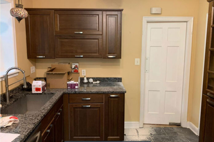
As an avid cook who adheres to a healthy eating regimen for her family, Adrianna also insisted that their new space feature a galley-style cabinet layout with ample counterspace that effectively creates separate food prep stations for cooking and cleanup. So, after finding IKD online, Adrianna and Jose began working with IKD designer Patty to combine IKEA SEKTION cabinetry framework along with a mixture of white IKEA HAGGEBY horizontal lift wall cabinets and base cabinets — as well as Semihandmade Oak floating shelves — to create a dynamic new cooking environment. IKD designer Patty explains: “The original space had reddish oak, raised-panel cabinet doors which screamed ‘1995’. In addition, a jumbled mix of horizontal and vertical doors showed poor design and the contrasting cabinet front edges behind the doors (as well as the prefab granite countertops) were of poor quality. It all had to go.”

Therefore, the new design was complemented by 51-square-feet of Cambria’s Blackbrook black quartz countertops (seen also on the backsplash between the fridge and the sink). This look was combined with a variety of affordable stainless steel appliances, including a Frigidaire 36″ counter-depth, four-door fridge; an IKEA VINSTGIVANDE wall mounted range hood and a clever IKEA cabinet hack to accommodate the under-counter microwave in the newly created coffee station area. Ultimately, the kitchen was completed for a total of $13,445 (including $983 in Extra Items) — comfortably under their original budget of $15,000! (Note: IKD’s been referenced by Martha Stewart Living experts on how to reduce kitchen renovation costs as well).
“The countertops were somewhat pricey, but I spent so much time researching and prepping on what I wanted, that I was willing splurge.” Adrianna says. “Overall, we’re so thrilled at every aspect of our IKEA kitchen, including the countertops; the very accessible storage with the Semihandmade shelving; the overall efficiency and the simple fact that we can now enjoy healthy meals together as a family.”
Let’s see how their IKEA kitchen came together!
Efficient IKEA Kitchen
Not only was the original space inefficient and poorly designed, but it also became more cramped due to very low ceilings. As a result, Adrianna and Jose opted to decrease the overall quantity of wall cabinets in their layout. “I really felt that corner cabinets were going to become inaccessible and a real space-waster,” she says. “That’s why I requested one long cooking segment and the shorter coffee station. The 97″ ceiling height had really just made everything feel even lower, and I’m very happy with the design solutions Patty suggested,” she says.

In total there are only fourteen IKEA cabinets; costing $2,862. This includes the IKEA SEKTION cabinets with HAGGEBY door fronts featured along and above the stainless steel refrigerator, and along the base cabinets, from the refrigerator to the opposite end past the oven, dishwasher and past the sink. In addition, the Semihandmade Oak floating shelves — which are featured on either side of the Hauslane stainless steel range hood, add an almost artistic element to the space, providing storage and niches for pottery and plants to be displayed. Notably, Patty points out, the overall material cost was $9,600 and the wall cabinets top out at 94-1/2″ in the kitchen.
The base cabinets also provide ample storage and establish clearly defined food prep and cooking zones, as seen on either side of the induction cooktop and between the Frigidaire stainless steel dishwasher and the end of the cabinet run (which includes a mixture of IKEA HAGGEBY cabinet doors along with IKEA MAXIMERA drawers as well as a trash-pullout and recycling center).

Two Heads Are Better Than One
The family rarely used the adjacent dining room, settling instead on eating together in a smaller seating area in the kitchen.
“We tried to utilize the dining room but found the layout cumbersome to cook meals, set the table and move easily between both rooms without bumping into each other. It kind of defeated the purpose. Now we can move freely during food prep and clean up, and still have normal discussions without yelling into the other room,” she describes.
To accomplish this, they decided to knock down the wall between the two areas, which gained about 60 sq ft and created a total of 189 square feet for the entire space. Specifically, this called for a 4’ nook placed toward the back of the kitchen. The nook was created with a 2″ thick slab of reclaimed wood to match the flooring. It also features the white IKEA HAGGEBY base cabinets and HAGGEBY horizontal lift wall cabinets as well as the Cambria Blackbrook black quartz countertops, to create a stand-alone coffee/snack station. This nook provides storage for glasses, plates, cutlery and other items while featuring the under-counter microwave hack as well. Ample seating is now available for relaxed family meals — not to mention the natural lighting now coming into the kitchen from the glass doors leading to their backyard.

IKEA Cabinet Hacks
There were actually two of IKD’s signature cabinet hacks involved in this IKEA kitchen.
As just mentioned, the first hack is featured in the coffee/snack station as two of the IKEA HAGGEBY base cabinets were modified to accommodate the GE Profile under-counter microwave there. This creates an easy way for Adrianna and her family to warm up snacks to go with their coffee or tea, for instance. “We love the coffee station and found it also serves the dual purpose of allowing us to heat up side dishes for dinner and serve them to the family much more readily. The extra counter space is a great landing space for serving dishes,” she describes.
The second cabinet hack is found on the opposite side of the kitchen, as the 36″wide cabinet over the Frigidaire fridge needed to be reduced from 15″ to 10″. Patty handled this by again modifying IKEA’s HAGGEBY doors, establishing additional storage above the refrigerator as well as creating extra room for the tall storage cabinets next to the refrigerator as well.
“Our remodeled and re-imagined kitchen really provides all of the function I need to create healthy meals for my family. Our original kitchen was so dark and cramped. Now it flows so easily with a great combination of IKEA cabinets, open shelving and plenty of storage. This kitchen really feels like it was personalized for us!” Adrianna concludes.
IKD’s Summary: The key to this kitchen was to design a practical kitchen for an avid cook. We were challenged by the ceiling heights at first and the limitations of a smaller space, but the use of the IKEA HAGGEBY doors and Semihandmade shelves — as well as a couple of IKD’s signature design hacks, made for a very dynamic design that Adrianna and her family will enjoy for years to come.
Learn more about how we can design your IKEA kitchen, bath, laundry room and other rooms at inspiredkitchendesign.com.
.fusion-body .fusion-builder-column-0{width:100% !important;margin-top : 0px;margin-bottom : 0px;}.fusion-builder-column-0 > .fusion-column-wrapper {padding-top : 0px !important;padding-right : 0px !important;margin-right : 1.92%;padding-bottom : 0px !important;padding-left : 0px !important;margin-left : 1.92%;}@media only screen and (max-width:1024px) {.fusion-body .fusion-builder-column-0{width:100% !important;}.fusion-builder-column-0 > .fusion-column-wrapper {margin-right : 1.92%;margin-left : 1.92%;}}@media only screen and (max-width:600px) {.fusion-body .fusion-builder-column-0{width:100% !important;}.fusion-builder-column-0 > .fusion-column-wrapper {margin-right : 1.92%;margin-left : 1.92%;}}
.fusion-body .fusion-flex-container.fusion-builder-row-1{ padding-top : 0px;margin-top : 0px;padding-right : 0px;padding-bottom : 0px;margin-bottom : 0px;padding-left : 0px;}
[ad_2]
inspiredkitchendesign.com


