[ad_1]
A review of how to open up your IKEA kitchen remodel to the outdoors
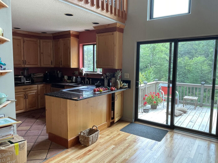
Sometimes it’s good to be on the outside looking in. This was the case for IKD customer Trish who wanted her recent IKEA kitchen remodel opened up to take advantage of the scenery around her home. She explains: “Our original kitchen was on the second floor but completely boxed in with dark cabinets and small windows. This blocked the beautiful trees surrounding the kitchen.”

Plus, there were other spatial challenges, such as an oven door which opened in front of the sink, and an induction cooktop which cluttered up the intended peninsula surface space. Even more of a challenge, Trish is rather short (5’4”) so a lot of tall cabinets were pointless — and that’s exactly what originally enclosed the kitchen. So really what Trish had was an outdated, inefficient and cluttered kitchen layout that clearly didn’t work!
To remedy this, Trish found IKD online and began working with IKD designer Richard to reimagine her kitchen using IKEA SEKTION cabinetry framework with white IKEA VOXTORP doors around the perimeter and IKEA VOXTORP Dark Gray base cabinets on the peninsula island. This look is complemented by IKEA butcher block countertops on the island, as well as a variety of appliances, such as a new 24” dishwasher and a 30” French door stainless steel refrigerator. There’s also roughly 35 square feet of white quartz countertop ($70 per square) featured throughout, totaling $2,243.00.
Richard concludes: “We also integrated an antique bookshelf at the intersection between her chimney area and the island. This along with storage items such as custom spice pullouts, really created unique design features. It also maximized space and really personalized the kitchen layout to meet her needs.” And, notably, this was all accomplished while staying well under her budget of $10,000.
Let’s see how Trish’s kitchen came together!
Opening It Up
Opening up the space was a top priority for Trish’s IKEA kitchen remodel.
IKD designer Richard explains: “The main goal was to change the original U-shaped configuration into an L-shape kitchen design that opened up into the nearby living room. In addition, we needed to increase the window over the sink to 72″ with a mix of fixed and 12″ slide-able panels. This really added an open, natural feel to the space and brings in more natural light as well.”

It was important to be mindful that Trish wanted lots of large drawers as well (she found Lazy Susans to be useless). Therefore, she selected white IKEA VOXTORP cabinet doors around the perimeter for the upper and base cabinetry, including base cabinets that begin below the 30” cooktop and run to the stainless steel refrigerator on the adjacent wall; as well as two wall cabinets around the IKEA hood which are embellished with Justis glass doors. This creates a very sleek and modern kitchen! It also provides plenty of workable storage options, including accessible storage for pots, pans and other cooking items; as well as custom spice pullouts that improve the efficiency of the kitchen as well.
One bit of tall custom cabinet storage is found above the stainless steel refrigerator, ideal for seasonal dishware and serving trays. Now Trish has useful kitchen storage without needing to reach and climb to retrieve those specific items too often. Ultimately, 14 IKEA cabinets and the IKEA range hood (including the 12 cover panels and custom cabinet above the 30” French door refrigerator) totaled $5,487!

Natural Flow
Stylistically and functionally it was important that everything flowed naturally. This particularly meant proper appliance placement.
Trish offers: “There were several issues. For instance, how the oven door opened in front of the sink and effectively blocked the base cabinet underneath it. It was very frustrating to operate in that area! I was hoping we could move the original cooktop to a perimeter wall and I’m so glad IKD pulled that off.” Indeed, a priority was to separate her original range into an electric 30″ cooktop with the forementioned IKEA hood along the back wall and a Wolf 30″ oven below her new island. The next step was to place her new dishwasher and 30″ fridge to the right of her sink, making meal cleanup much easier. This really made the entire space more ergonomic by improving the work triangle as well as freeing up seating space for the peninsula. This area was previously unusable in its original configuration with the induction cooktop protruding out and obstructing it.
“Maximizing the space of my new kitchen and having enough room to sit and enjoy meals with my family were top on my wish list. IKD’s solutions were ideal to making this happen,” she notes.
Peninsula Island
One of the other unique features of Trish’s kitchen is her separate peninsula island.
Richard explains: “Trish told us she cooks often and loves IKEA’s butcher block countertops. We also made sure to include a trash pull out and spice rack to keep meal prep simple.”

Therefore, the large 68”(L)x44”(W) peninsula island features butcher block countertops which add an even more warm, natural feel to the kitchen. The countertops also make meal prep and clean up more sanitary (as they are heat-resistant and allow to chop directly on them). This comes in very handy as the island stretches across from the range to across from the refrigerator. The other unique element is the antique bookshelf which was integrated between her chimney area in the main room and the island. This provides ideal storage for cookbooks or to display decorative items, such as collectibles or flowers.
Trish concludes: “I’m amazed at the results of my IKEA kitchen. I love how open and efficient the space feels now and I absolutely adore having such a wonderful view simply by looking out my kitchen window. IKEA cabinets were ideal for our design and for our budget!”
IKD’s Summary: Opening up Trish’s kitchen to nature meant a focus on appliance placement. Also, designing less cabinets for greater and more efficient storage was a unique challenge, but one that provided a clean, streamlined look that works well for this L-shaped layout. The end result is a highly functional kitchen with plenty of flow and great style.
Learn more about how we can design your IKEA kitchen, bath, laundry room and other rooms at inspiredkitchendesign.com.
.fusion-body .fusion-builder-column-0{width:100% !important;margin-top : 0px;margin-bottom : 0px;}.fusion-builder-column-0 > .fusion-column-wrapper {padding-top : 0px !important;padding-right : 0px !important;margin-right : 1.92%;padding-bottom : 0px !important;padding-left : 0px !important;margin-left : 1.92%;}@media only screen and (max-width:1024px) {.fusion-body .fusion-builder-column-0{width:100% !important;}.fusion-builder-column-0 > .fusion-column-wrapper {margin-right : 1.92%;margin-left : 1.92%;}}@media only screen and (max-width:600px) {.fusion-body .fusion-builder-column-0{width:100% !important;}.fusion-builder-column-0 > .fusion-column-wrapper {margin-right : 1.92%;margin-left : 1.92%;}}
.fusion-body .fusion-flex-container.fusion-builder-row-1{ padding-top : 0px;margin-top : 0px;padding-right : 0px;padding-bottom : 0px;margin-bottom : 0px;padding-left : 0px;}
[ad_2]
inspiredkitchendesign.com


