[ad_1]
#html-body [data-pb-style=B0T2736]{justify-content:flex-start;display:flex;flex-direction:column;background-position:left top;background-size:cover;background-repeat:no-repeat;background-attachment:scroll;border-style:none;border-width:1px;border-radius:0;margin:0 0 10px;padding:10px}#html-body [data-pb-style=SJCK2I6]{border-style:none;border-width:1px;border-radius:0;margin:0;padding:0}


Remodel Spurred by a Dishwasher Flood
It was Thanksgiving when the dishwasher broke and then flooded the kitchen. But Washington homeowner Brenda
R. didn’t panic.
Instead, she and her husband started filing insurance claims and seeking help for repairs when a thought
came to them: instead of just fixing the minor items, why don’t we go for the big remodel?
Interested but wary, they began asking questions. How would it look? What was the process like? How much would it cost? After exploring their
options, they decided to go ahead and renovate their kitchen.
An Awkwardly Designed Space
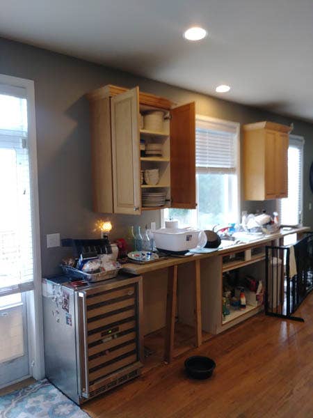
Mediocre in design, the existing kitchen left much to be desired. Especially related to the cabinet and
kitchen island layout.
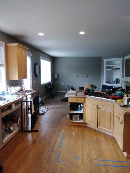
In proportion to the rest of the space, the island was strangely small. It was known in the house as “the
boomerang” due to its odd, angular shape, which left a large empty space smack dab in the middle of the
room. Moreover, there was insufficient clearance between the island and the wall oven.
“If you’d try to pop something out of the oven, you’d always be saying ‘excuse me,’ to try to get people to
move,” Brenda explained.
Aside from the island, the cabinetry layout also needed work. Along her sink run, the builder-grade
cabinetry ended abruptly in the middle of the wall, leaving almost two feet of empty space. Trying to make
use of the space, they wedged their wine cooler at the end of the row, but it didn’t look extremely elegant.
“It was so awkward,” Brenda said. “It was just, bizarre.”
Kitchen Island Suited for Entertaining
“I host a couple of different parties throughout the year,” said Brenda. “I tend to cook a lot and bake a
lot. We always have a lot of people over – even on a spontaneous basis.”
Their goal was to create a space with superb functionality for their love of entertaining. To help overhaul
the kitchen, they hired David and Valerie Minor of the remodeling firm Community Builders.
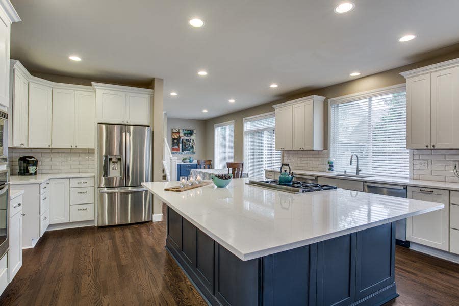
David saw that the kitchen island could be greatly expanded while still allowing plenty of room for traffic
flow.
“The kitchen wasn’t matched to the house. It didn’t fit at all,” said Minor. “For me, proportions are really
big, so we gave her a huge work surface for the island. When you walk in – it’s stunning. Your immediate
reaction is, ‘wow, that is one massive island.’ And yet, it doesn’t look out of place.”
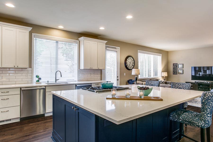
Six by seven feet squared and large enough to seat five, the kitchen island was designed by CliqStudios
kitchen designer Kelly McKenzie.
“We probably changed the island six different times just to get it exactly how she wanted to use the space,”
McKenzie said. “She wanted a lot of storage around the island. That’s why we have usable cabinets on both
ends, and on the backside.”
As a dedicated baking zone, the island stores the food processor, blenders, KitchenAid, and all the related
utensils.
“I can pop them right on the counter with the outlet right there – I’m ready to go,” said Brenda.
“Everything is in close proximity and the way that the cabinets and drawers are set up makes it so easy.”
The rest of the kitchen’s usable storage was maximized with the help of dedicated nooks and little details.
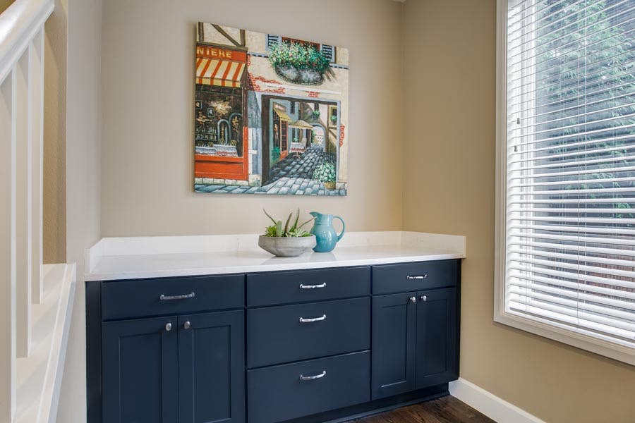
A kitchen buffet near the dining table allows for serving space as well as storage for less frequently used
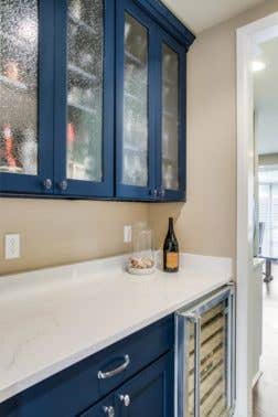
items. A separate bar area with a glass doors and a bar fridge was installed just outside the main kitchen
area.
For accessible storage, drawers were incorporated on as many base cabinets as possible. Tray
dividers were incorporated above the wall oven and refrigerator for cookie sheets and serving
platters. Brenda, Kelly, and David worked on multiple revisions to ensure that every item in the kitchen has
its proper place.
The New Neutral
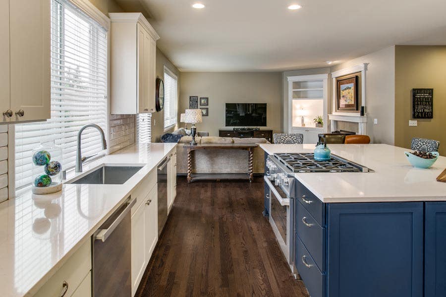
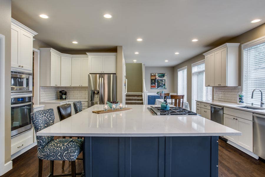
Taking advantage of her large windows, Brenda chose white cabinets and countertops to make her kitchen feel
open, spacious, and bright.
But she knew that she wanted to add another color. That color was blue.
“Blue is to me that new neutral color,” she said. “It’s kind of that classic. It doesn’t scream ‘I’m blue’
at you – when you’re in the home, it just flows really really well.”
The two-tone kitchen adds a splash of elegance and intrigue without sacrificing the bright cleanness of a
white kitchen.
“It’s definitely a modern style,” said designer McKenzie. “Very simple, but very chic at the same time.”

Cabinets for a Hard-Lived Household
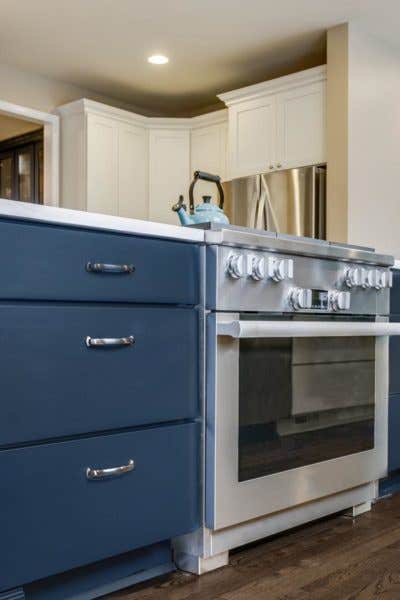
With two 100+ pound Bernese mountain dogs running about in the house, it was very important to Brenda that
the items she brought into her kitchen were built to last.
“We are a hard-lived house,” she said. “We need to have things that are hard-lived.”
The things she loves the most about the kitchen are the cabinets. “The soft-close uppers and lowers are
absolutely phenomenal.”
For that, she thanks her contractor, without whom she would not have discovered CliqStudios. Compared to the
local cabinet manufacturers she had considered, CliqStudios provided a higher quality product at a lower
cost.
For David Minor, it was ease and helpfulness of a dedicated designer that he appreciates the most.
“We’ve worked with designers from a lot of different companies,” he said. “Some have great design sense,
while some are just selecting boxes and putting them into place. Kelly was very responsive, very
knowledgeable, and had a great design sense.”
From the design, to the delivery, to the product quality and customer service, “everything in my eyes has
been very, very pleasant,” said Minor. “Easy to work with and very professional.”
Advice for First-Time Remodelers
For first-time remodelers, Brenda recommends that seek a reputable contractor .
“They’ll tell you when you need to pick out things and what your timelines are – that’s really important,”
she said.
Trust your gut, she added.
“Go in with a vision, know your vision and stick to your vision. And try not to have a bunch of change
orders.”
In the mornings, Brenda comes downstairs to her kitchen and feels a rush of excitement. Although it’s
summertime, her mind turns to Christmas. She looks forward to the hosting the holiday party, standing around
the island with friends and family, exchanging cookies.
Project Details
- Cabinets: Shaker in White and Blue
- Countertops: Misterio Quartz
- Dishwashers: Miele
- Range: Miele
- Chairs: Pier1
[ad_2]
www.cliqstudios.com


