Three Key IKEA Kitchen Design Mistakes and Professional Solutions
In this article:
- A second look is important for your IKEA kitchen design.
- Filler size matters.
- Give your kitchen range counter space.
- Sometimes, unusable space is useful.
One reason our customers love IKEA is because of their DIY-friendly products. First, you build a desk. Next, you build a bookcase. Suddenly, you feel like you could take on anything – including a complete kitchen renovation.
The truth is, you probably can take on a kitchen renovation if you have a complete and accurate design to follow. Many IKEA customers find the online home planner challenging to use. It also doesn’t allow for much innovation (i.e., no cabinet hacks, custom fixtures, or lighting plans). This leads many homeowners to use the home planner as a starting point but then create a design using different software or ye olde graph paper.
“I’ve designed and re-designed so many times on the Ikea software that I’ve hit a mental block. I’ve got some specific floor plan issues and have never come up with something that hits our goals for the space exactly right. I’m hoping my theory that a fresh set of eyes will be what we need.” –Summer Branum, IKD customer
It’s at this stage that we find many of our customers. They have the vision and plan, and then they start to second-guess themselves. While we typically design IKEA kitchens from start to finish, homeowners also trust us to provide design review services. They feel they get more from consulting a professional design service specializing in IKEA than contacting IKEA planners.
“I went through kitchen planning with Ikea and also their partner that does most of the installation in the USA. Both processes seemed rushed, and they went with my draft design rather than being able to offer ideas and improvements. I didn’t feel like they were truly design professionals with a lot of experience.” –Sarah Sonke, IKD customer
We find creative solutions the average homeowner may overlook, and often, we catch design errors that would significantly affect the function and longevity of our customers’ IKEA kitchens. In this article, we describe three IKEA cabinet design problems our designers have found and solved for our design review customers.
Why Design
with IKD?
Why Design with IKD?
@media only screen and (min-width: 601px) {
.ikd_video_container {
display: flex;
flex-direction: row;
background-color: #f2f1ed;
padding: 20px;
}
.ikd_heading_column {
display: flex;
width: 30%;
padding-right: 10px;
align-items: center;
justify-content: center;
}
.video_column {
width: 70%;
}
h2.v_align_middle {
text-align: center !important;
color: #999798 !important;
margin: 0 !important;
}
}
@media only screen and (max-width: 600px) {
.ikd_video_container {
padding: 20px;
background-color: #f2f1ed;
margin-left: -20px !important;
margin-right: -20px !important;
}
.ikd_heading_column {
width: 100%;
text-align: center;
align-items: center;
justify-content: center;
}
h2.v_align_middle {
text-align: center !important;
padding: 20px 0 ;
color: #999798 !important;
margin: 0 !important;
}
.video_column {
width: 100%;
}
}
<!–


–>
Common Mistake #1 in IKEA Kitchens: Incorrect Filler Sizing
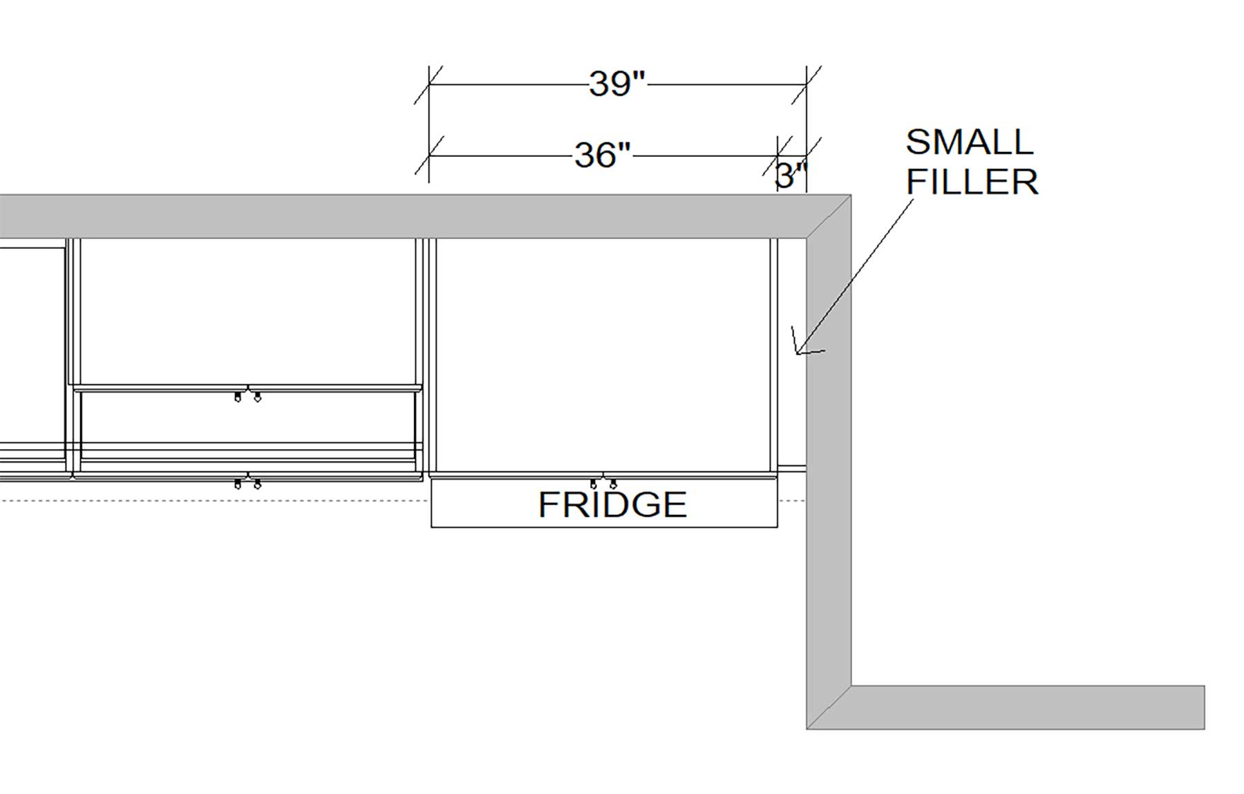
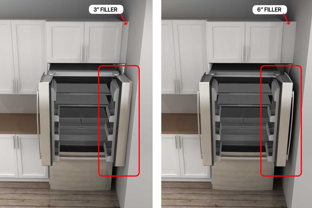
At IKD, we love functional filler, but sometimes filler functions by just…filling. In this example, IKD customer Lyle tried to maximize his kitchen space by placing a 3” filler between the wall and the refrigerator (and over-fridge cabinet).
This design looks like it should work, but we know you need a 6” filler minimum between the fridge door and the wall. Otherwise, there is not enough clearance for the fridge door. We also see customers try to use no filler in this situation. It ends badly.
“If IKD hadn’t caught this, I would’ve been very frustrated. I’m not trying to do this twice! It was worth a couple hundred bucks to make sure my fridge could open. They’re kind of important in a kitchen.” –Lyle, IKD customer
Common Mistake #2: Inadequate Countertop Space Near Appliances
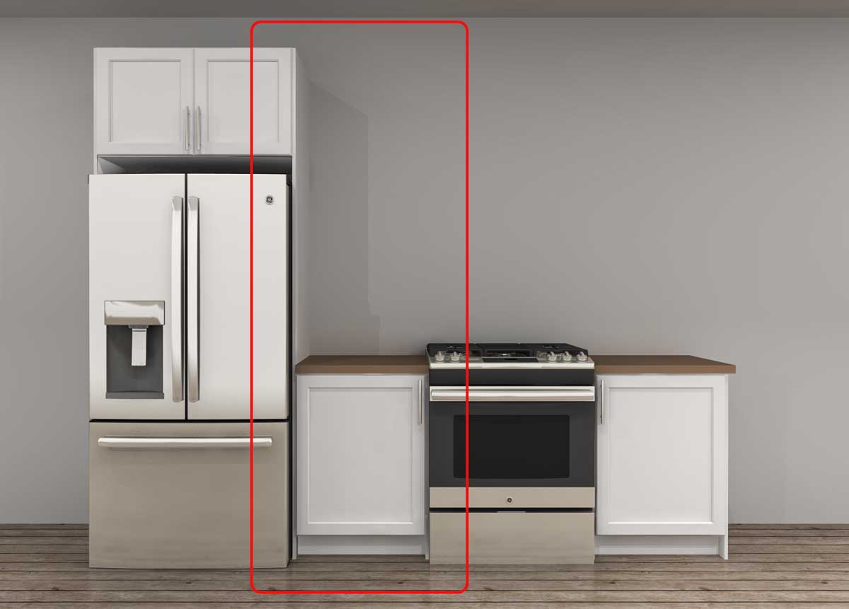
We’ve mentioned that IKD customers love IKEA for DIY solutions, but they also love IKEA for creative storage solutions. However, just because a storage solution exists doesn’t mean you should use it. Natasha discovered this when she sent us an IKEA Home Planner design to review that included a tall cabinet between the fridge and range. She hoped to use it as a pantry, but our team knows that having a tall cabinet next to the range is not ideal.
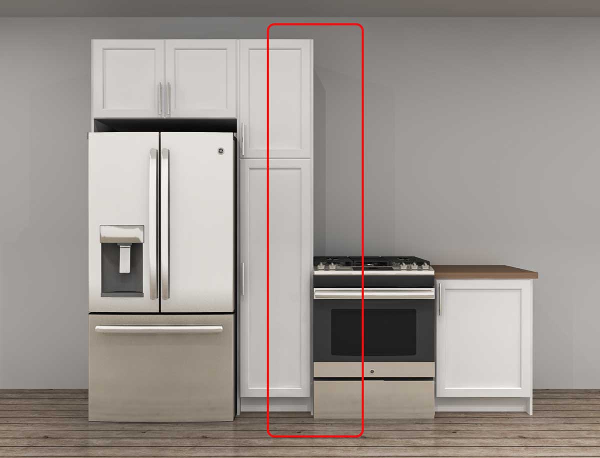
With the basic 3D rendering above, we were able to demonstrate the space and the potential problems for Natasha.
“When I was putting it together in the home planner, it seemed to make sense, but seeing it like this, I immediately realized that having heat so close to a cabinet is a bad idea, especially with a gas stove. It also made me take more notice of other homes I visited, and I realized that their ranges always have counters on either side. I’m not a designer, so I didn’t really think about anything other than storage.” –Natasha, IKD customer
Natasha’s right. Due to the heat, it’s necessary to maintain 18″-24″ of counterspace between the range and cabinets. While there is less cabinet space in the IKD image below, it’s the safer design and will ensure the cabinets stay beautiful (and intact) for a long time.
Common Mistake #3: Misplaced Corner Cabinets in Design Layout
What’s wrong with this picture? You probably won’t catch it if you don’t design kitchens for a living. However, we know the problem is that the corner cabinet is in the corner. Don’t worry; it didn’t make sense to our customer, Zack, either.
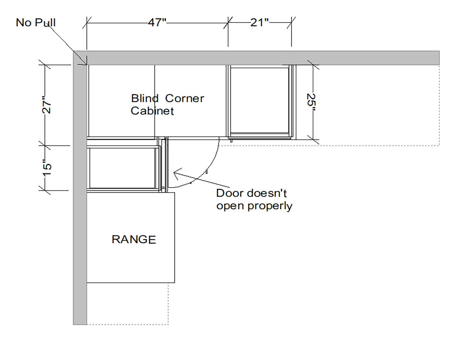
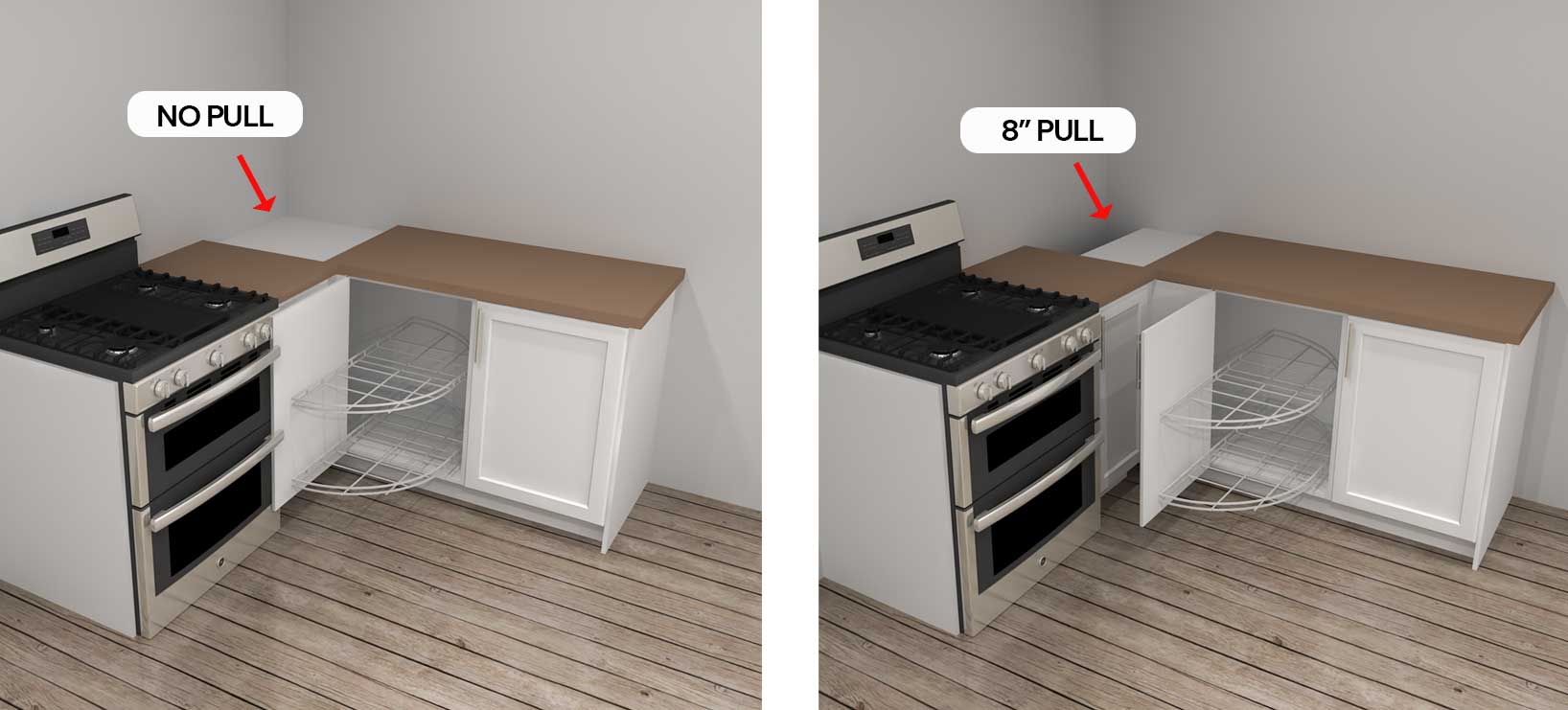
Much as we dislike dead space, it’s sometimes necessary. If this corner base cabinet is set back into the corner, the IKEA cabinet door won’t have enough clearance to open, and the internal organizer won’t function properly. Approximately 8” of pull, or dead space, is required in the corner for this cabinet to function.
“My partner would have been so mad. I told him I could handle the design, and for the most part I did, but at the last minute I decided to have IKD just look it over and make sure everything looked okay. They found the corner cabinet issue and also provided an IKEA shopping list. That’s without even paying for the full design. I didn’t tell him, so I still get to look like a hero.” –Zack, IKD customer
Professional Kitchen Design Review: A Critical Step for Your IKEA Kitchen Success
IKD offers two kitchen design packages: Express Design ($245) and Complete Design ($445). The Express Design includes one revision and plans; it’s great if you’re in a hurry or need a design review. The Complete Design handles everything from start to finish, including three revisions, cabinet hacks, installation plans, and more.
Without taking the extra step to have us review their DIY designs, these customers would have been riding the struggle bus. Make sure your IKEA kitchen design journey is an easy one by trusting IKD with a second look.
Get a Professional IKEA Kitchen Design – All Online
Work with our certified kitchen designers to get a personalized kitchen designed around your needs and vision. If you’re interested in learning more about our service, make sure to check out our IKEA Kitchen Design Services.


inspiredkitchendesign.com


