Two leading forecasting authorities on the global design stage, WGSN and Coloro, have announced their take on the colours we will be using by 2026.
Their key observation is that climate change – and the effect it is having on our overall sense of security and wellbeing – will, by Autumn/Winter 2025/6, be having an even greater effect on our lifestyles than it is now. Influenced by the acceleration of climate change and its threat to the planet, we will be seeking reassurance and repair, security and confidence.
WGSN and Coloro have created a set of five colour palettes they believe will be used in many aspects of life, from fashion and beauty to interior styling. They comprise Celestial Yellow, Cherry Lacquer, Retro Blue, Neon Flare and Future Dusk.
Wattyl has created an interior palette based on these colours, using its range of paints.
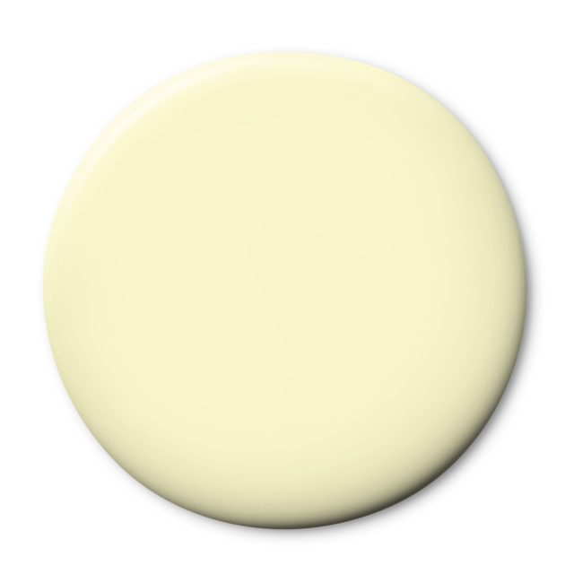
Celestial Yellow – Wattyl Mollymook Sand, Yellow Carousel and Anime.

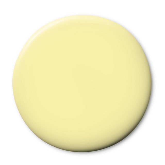
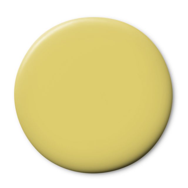
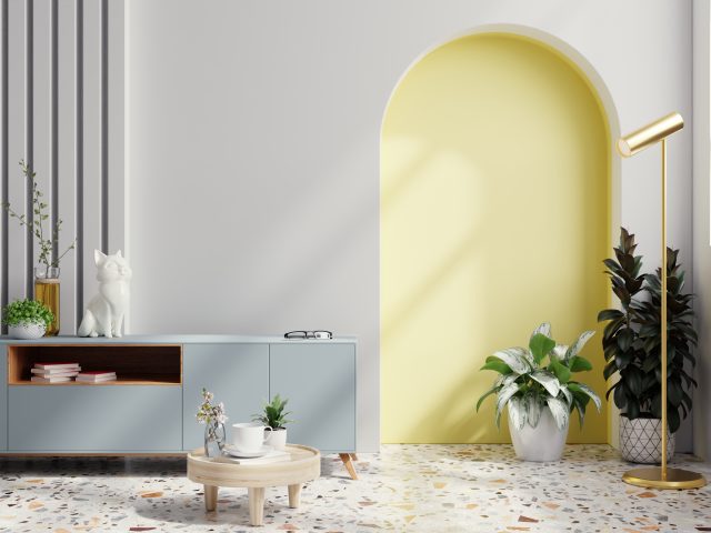
Celestial Yellow – glowing, luminous, restorative. Reminiscent of the moon, stars and sun, it channels the search for reassurance as people look to spirituality for guidance. Seen here paired with the softest greys and an uplifting terrazzo floor. Use this hue as a highlight, teamed with low-key neutrals.
Cherry Lacquer – Wattyl Paso Doble, Red Carpet and Seductress
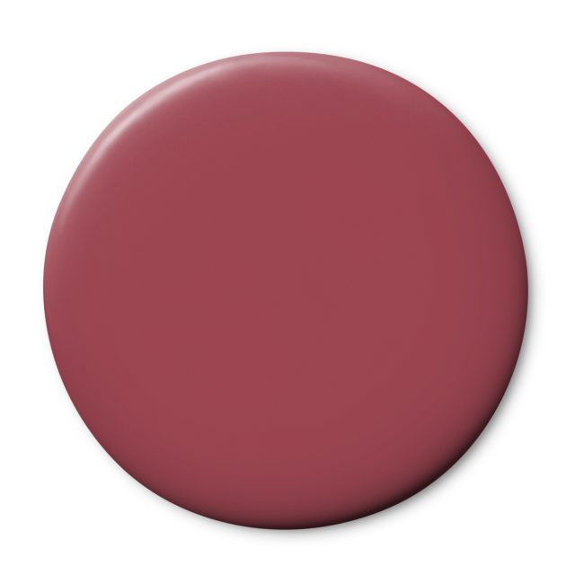
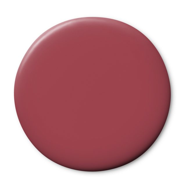
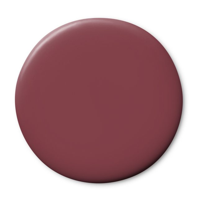
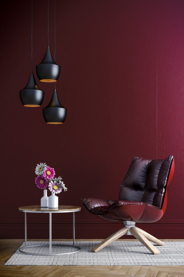
Cherry Lacquer, a dark and luxurious take on the dramatic nature of red. Inspired by themes of resistance and rebellion, this hue is seductive and alluring, delivering a level of escapism and self-empowerment. Well suited to lacquered, glazed or glossy finishes.
Retro Blue – Wattyl Breezy Day, Eucalyptus Haze and Baloo.
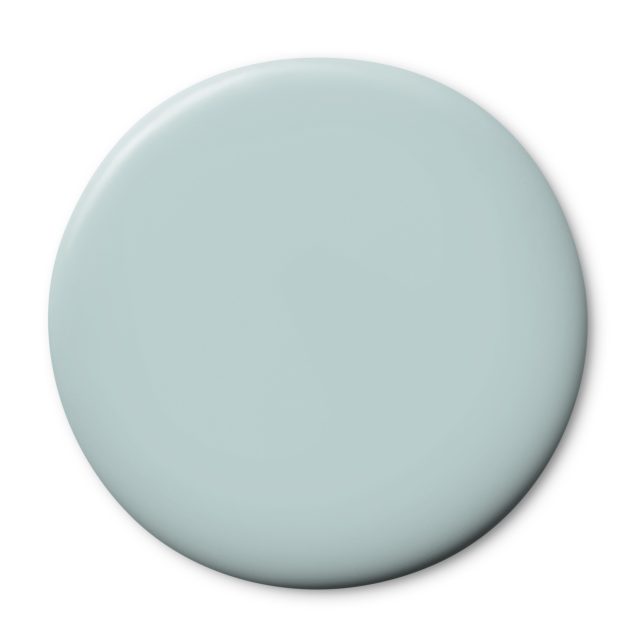
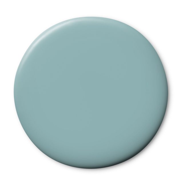
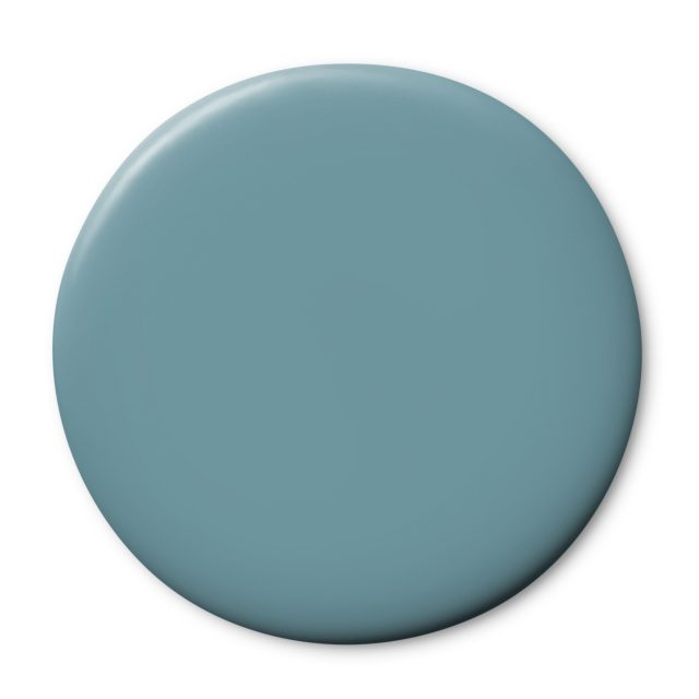
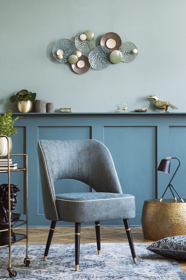
Retro Blue, an offbeat, analogue colour that exudes warmth and sentimentality. There is an undercurrent of joyful innocence, a harking back to wistful childhood memories. This hue triggers a love of all things vintage, of repurposing and revisiting pre-loved items.
Neon Flare – Wattyl Quince Paste, Ruby Sunset and Montezuma.
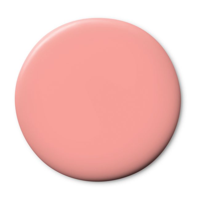
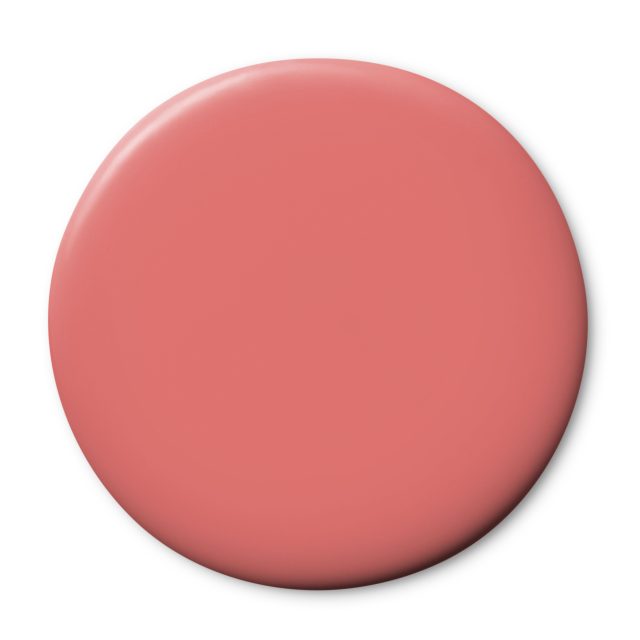
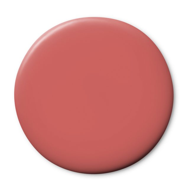
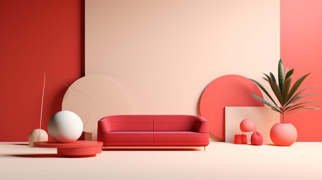
Neon Flare, an AI-inspired colour that is both highly stimulating and triggering. Its charged character speaks to the need for unity and communal effort. Pair with near whites and creams to temper the urgency of the hue.
Future Dusk – Wattyl Agapantha, Red n Blue and Perfect Strangers

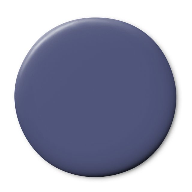
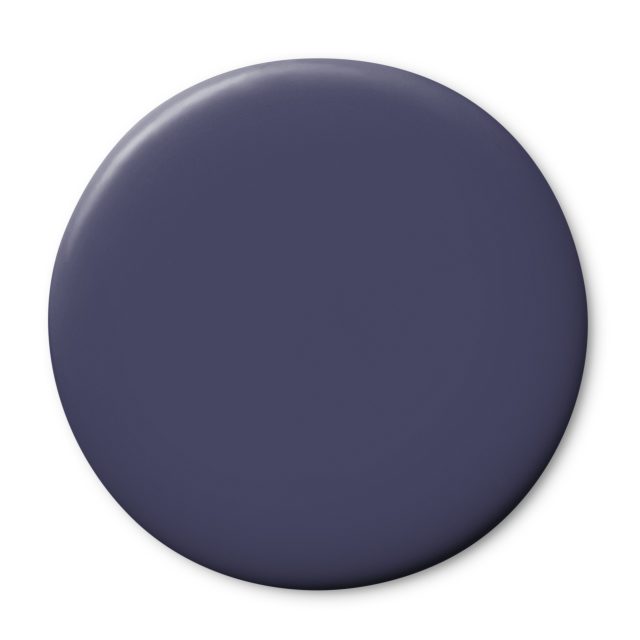
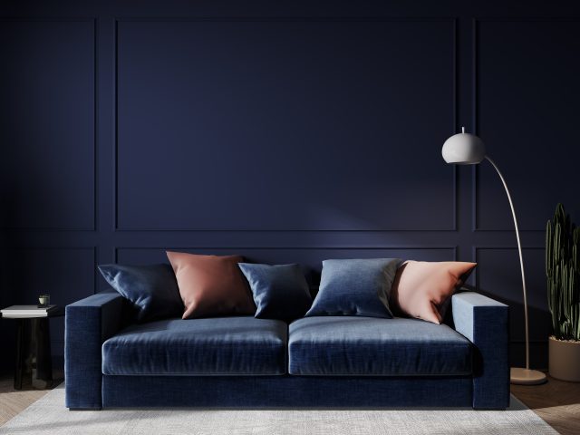
Future Dusk – sitting between blue and purple this hue brings a sense of mystery and escapism, it has dark and moody qualities. It also speaks of luxury and cocooning. Use tone on tone to create a layered effect.
While colour is a focus for Wattyl, sustainability and the reduction of environmental impact remains a top priority. Wattyl I.D. Advanced interior paint features an ultra-low VOC formula of less than 1g/L (one of the lowest VOC interior paints on the Australian market) – meaning greatly reduced carbon emissions during the manufacturing process and better indoor air quality post painting.
Swatches and sample pots, together with cans of paint, for colours from the new Colour By Wattyl Fandeck can be ordered online or picked up in store at Wattyl Paint Centres, Mitre 10, Home, Timber & Hardware and other leading paint specialists.
The post Top forecasters reveal 2025 colour trends: how to use them appeared first on The Interiors Addict.
theinteriorsaddict.com

