[ad_1]
With a new room in their new homes – and a new judge! – it was time for the Blockheads to take on the first room of their build, the studio bathroom. Ooh, we do love a bathroom! And they’re not easy are they?!
And with a range of styles from spacious rooms with curves galore to smaller spaces offering unique solutions to design challenges, last night’s room reveals were varied, which is always more entertaining than seeing a lot of similar spaces.
Naturally the drama and backstabbing (or allegations of it) have already started with Steph very firmly in the firing line. And with her dad now brought on board as her builder, we all know there’s going to be conflicts of interest and fireworks ahead!
Kyle and Leslie (first place)
Points: 25/30 | Spend: $30,366
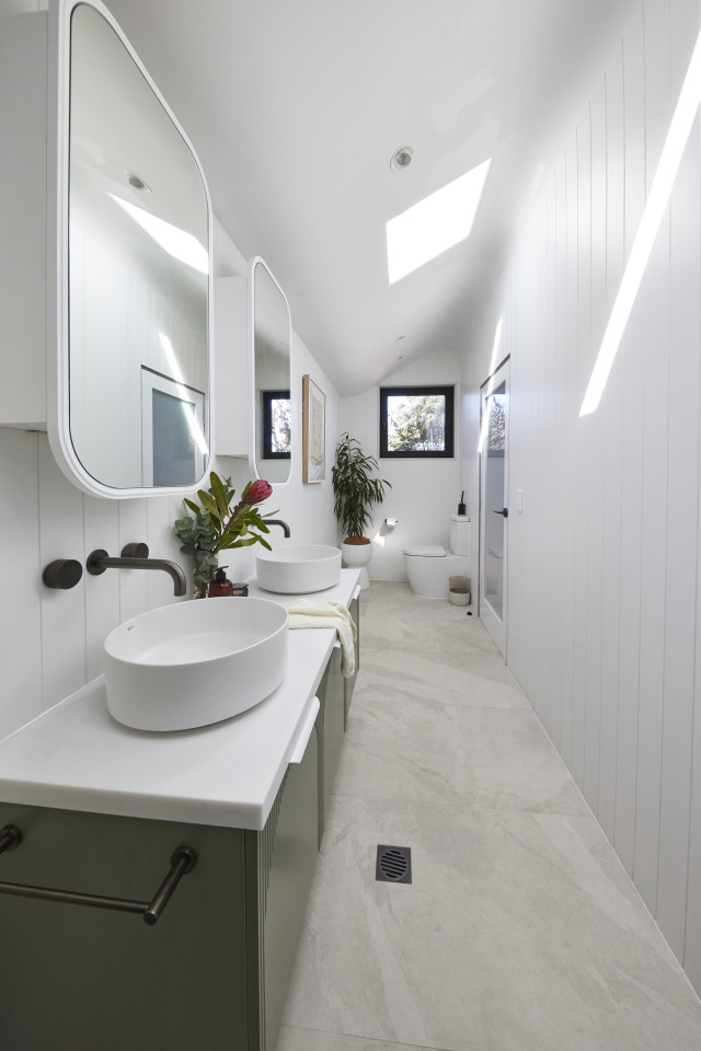
“This is massive!” the judges said when they saw Kyle and Leslie’s bathroom, complete with Venetian plastering, a unique hero curved ceiling, double vanities, loads of storage and natural light galore thanks to the Velux skylights and the window.
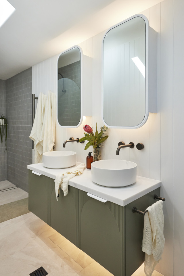
With what Shaynna called: “a timeless colour palette” accented by VJ panelling and a layout that earned praise from Marty, the room quickly won them over. Only the gunmetal floor grate, the lack of underfloor heating and a bath mat Darren thought should go were negatives in a room Marty summed up as one that will be memorable for buyers and will look very good in a sales brochure.
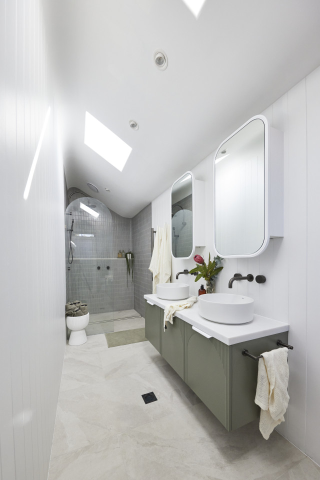
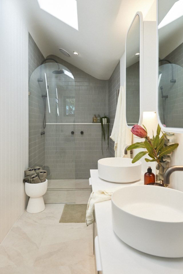
Shop the look (below): Elsa beige art print, $320 | ADP Archie by Alisa & Lysandra All Door Wall Hung Vanity Unit
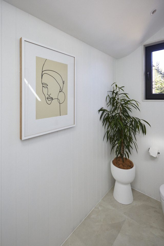
Personally, I loved the fresh look and feel, especially the white shaving cabinets, the skylights and the VJ.
Leah and Ash (second place)
Points: 24.5/30 | Spend: $19,691
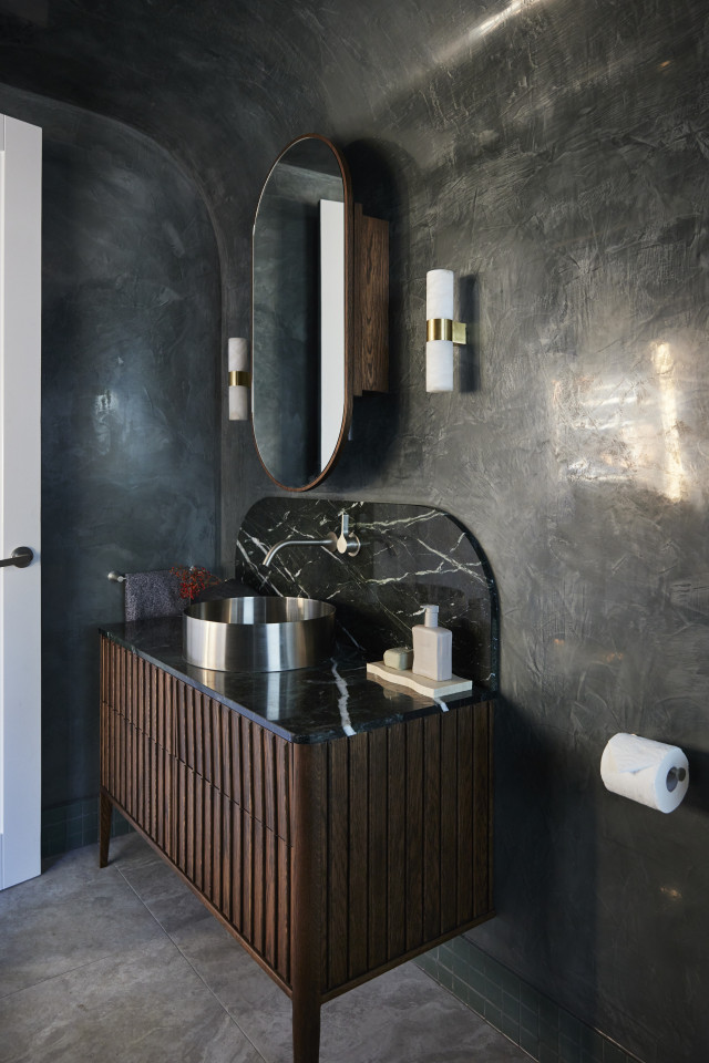
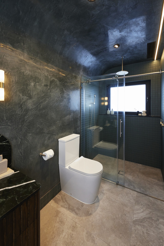
“Sophisticated, sultry and gorgeous,” said Darren as he took in the drama of a room he instantly loved… but also warned might be polarising. With another curved ceiling, polished Venetian plaster and moody colour scheme it was a space that made Marty feel like he’d walked into a nightclub.
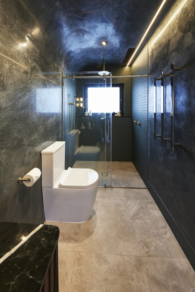
From the vanities to shaving cabinets, everything was luxe, they agreed, but there were issues. For a start, the style would be too much to take throughout the whole house, Marty said, and the frosted window left him feeling shut in. The tiles over the shower screen were too much, Shaynna added but overall, it was a successful room, executed beautifully.
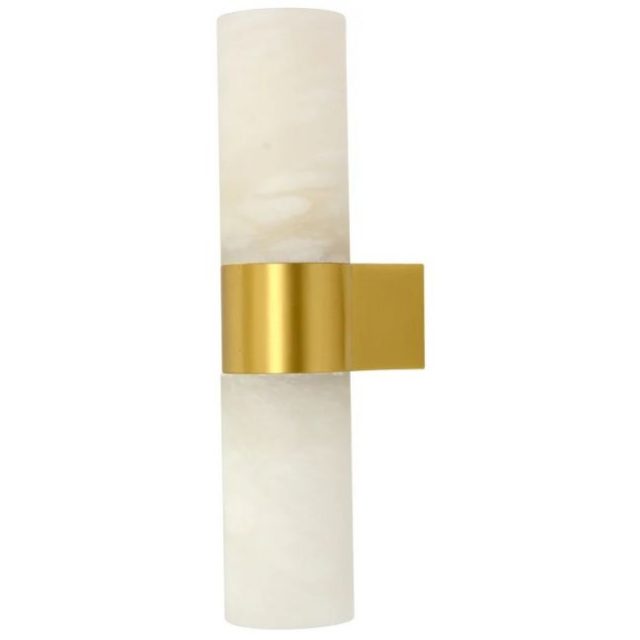
Shop the look: Made by Mayfair Luella 2 Light Wall Bracket in Brass
Personally, I loved the vanity, the Venetian plaster and curved ceiling and the wall lights but it was way too dark overall for me. Nightclub was right and a nightclub bathroom is not what I’d want in my house! I loved that they made bold choices but agree it will be polarising, which is risky, and the white toilet sticks out like a sore thumb!
Eliza and Liberty (third place)
Points: 23/30 | Spend: $26,262
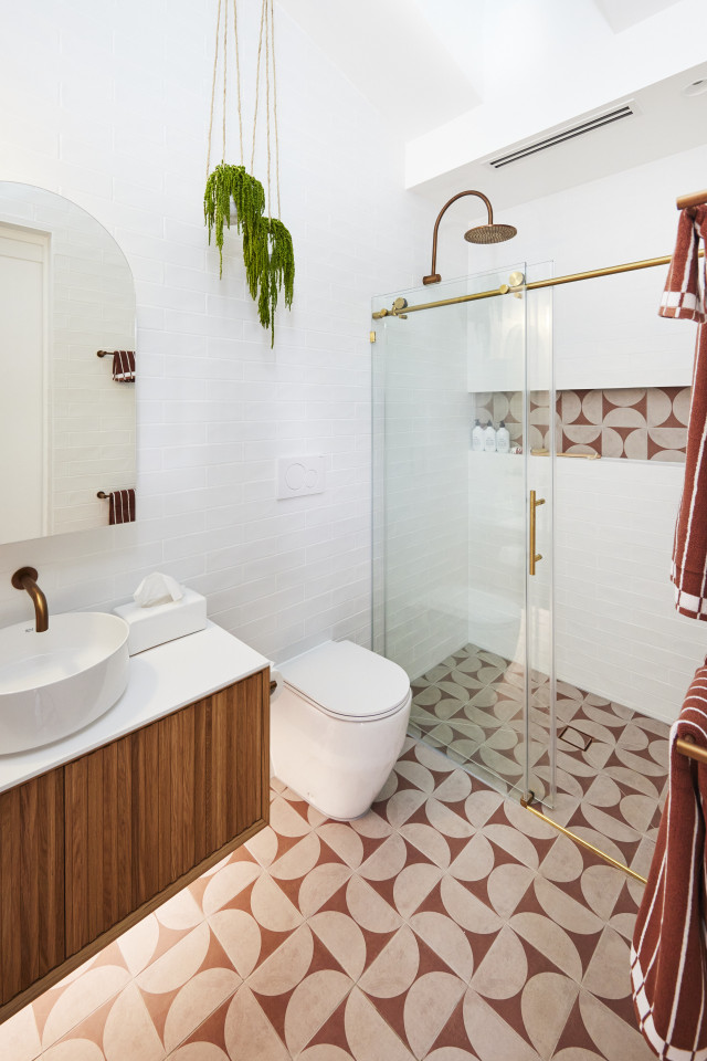
Struck instantly by the bold choice of floor tile, the judges felt Liberty and Eliza’s bathroom was “a happy place” with Shaynna saying the whole room felt divine. But it didn’t take long for them to start finding flaws. The tall shower height and face-level toilet flusher confused them. Then there were the mismatched metals in fixtures, something Shaynna never likes, and a shower screen she and Marty both agreed would be better frameless.
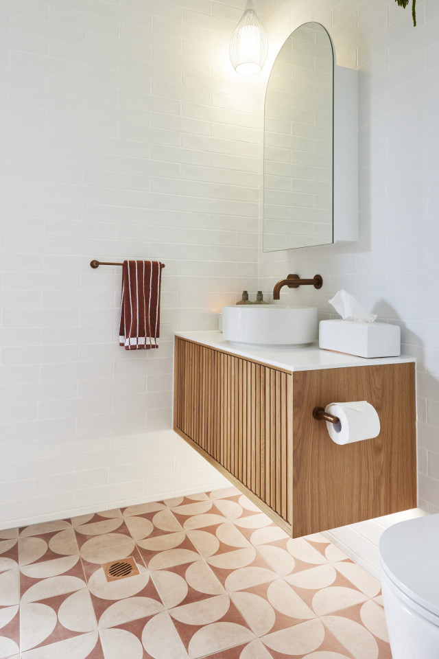
Marty also pointed out the lighting mixed warm and cold, with Darren adding the pendant looked dated. Execution however, was all good, they said, adding up to a great style Shaynna thinks is very saleable.
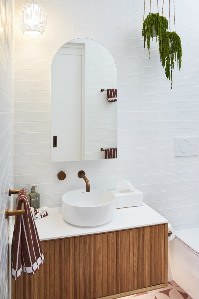
Shop the look (below): Hanging Amaranthus in Ceramic Pot, $94.
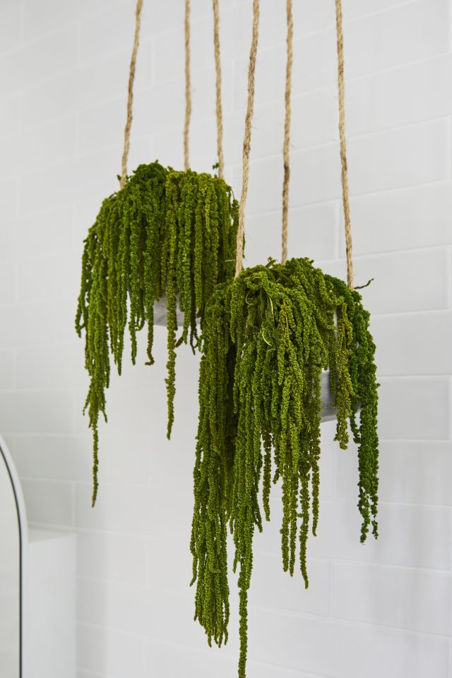
In many ways this was my favourite. I loved the tiles and the brass and the calm feel, but the mixed metals and the toilet flush need to be fixed immediately! And Darren was right about the pendant light. Not a fan! I also don’t like faux plants but that’s a matter of personal preference and I know many of you love ’em!
Kristy and Brett (fourth place)
Points: 21/30 | Spend: $17,534
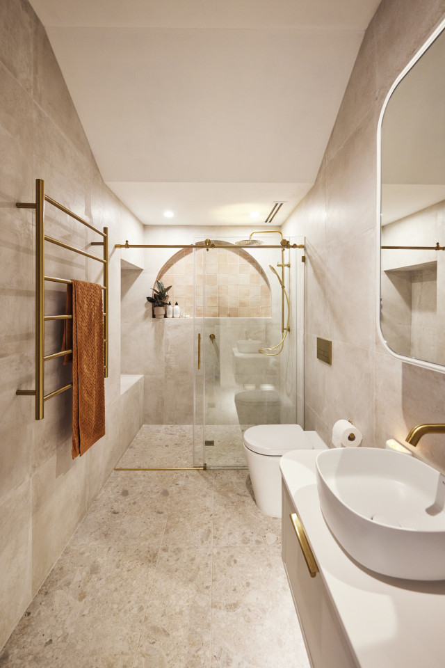
Is it a Melbourne bathroom, Shaynna wondered as she walked into Kristy and Brett’s bathroom, or a a Moroccan Day Spa… either way it’s something she likes! But it doesn’t take long for her and the other judges to find flaws. The industrial shower screen doesn’t work with the overall look, she feels, and after seeing two other curved ceilings, Darren thinks this would have been the ideal place for another.
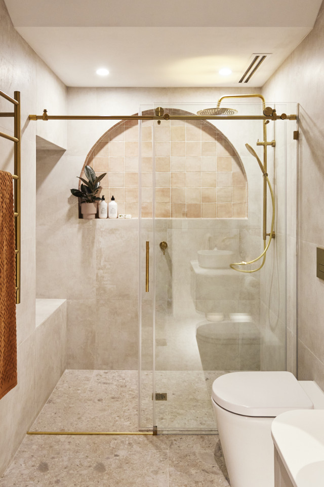
“It’s a missed opportunity,” Marty agrees, saying after seeing the competition, this was feeling “bland” to him. It’s a room that had some great features, but was being played too safely, he thought.
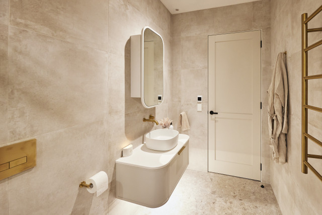
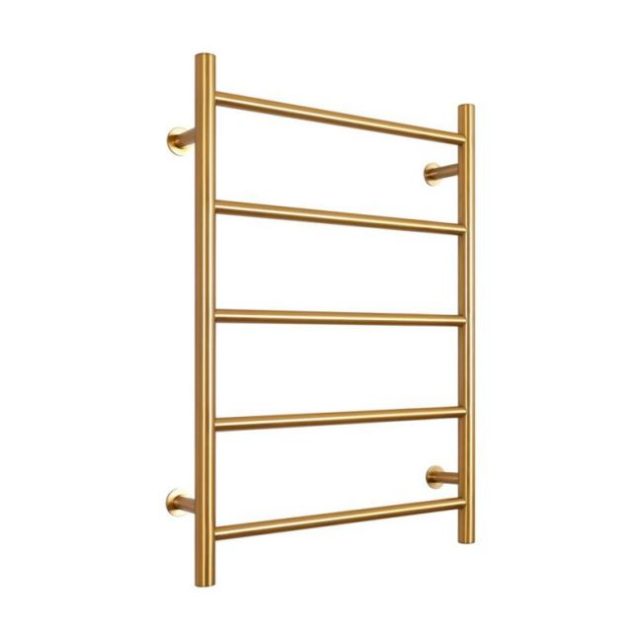
Shop the look: Mizu Drift MK2 Heated Towel Rail Brushed Gold PVD
I agreed with the judges on this one. Not memorable but not offensive either. And the brass industrial hardware, the shaker profile and the tiled arch don’t gel. They need to decide which style they’re going for.
Steph and Gian (last place)
Points: 20.5/30 | Spend: $22,362
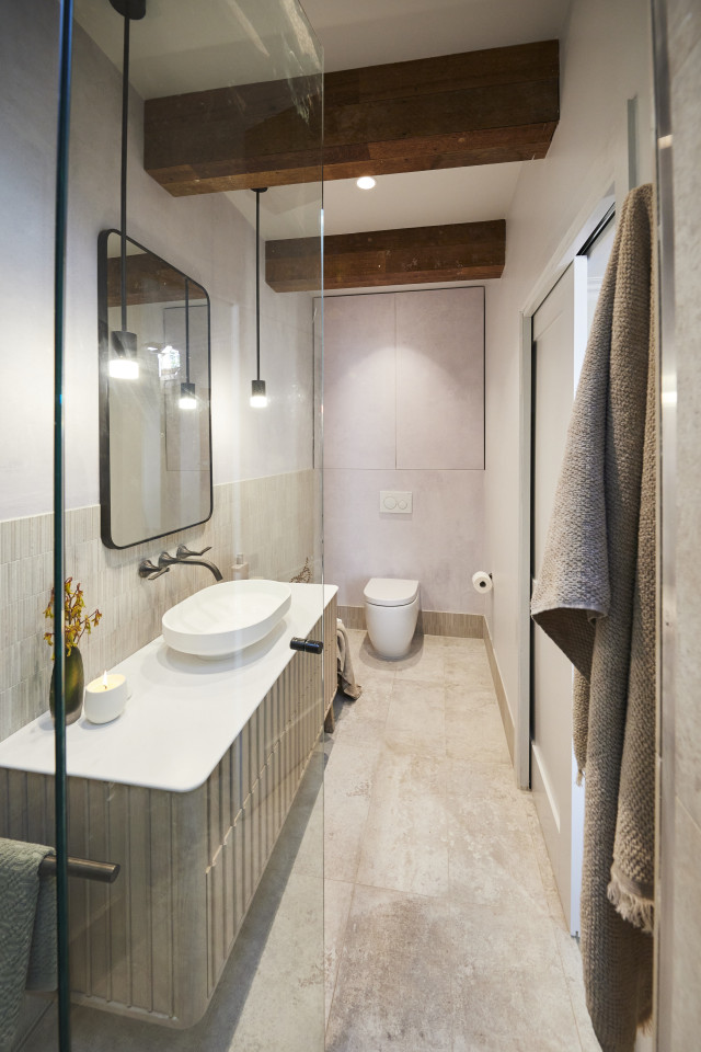
From the moment they walked in, all three judges agreed this was a room that worked from a planning perspective. Toilet to the side, walk in to face the vanity and with beautiful tiles and oak veneer the look combined for contemporary sophistication. Looking closer however, they started to worry. The rustic beams above fought the room, and the metal angle in the corner of the tiles was “abysmal” Darren said, the walls seems out of plumb and the wallpaper “robbed the room” of style. It all adds up, they agreed, to a well planned, but poorly executed room, but nothing that can’t be fixed.
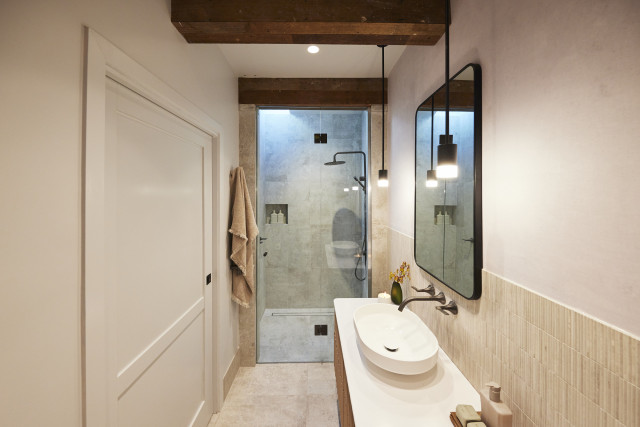
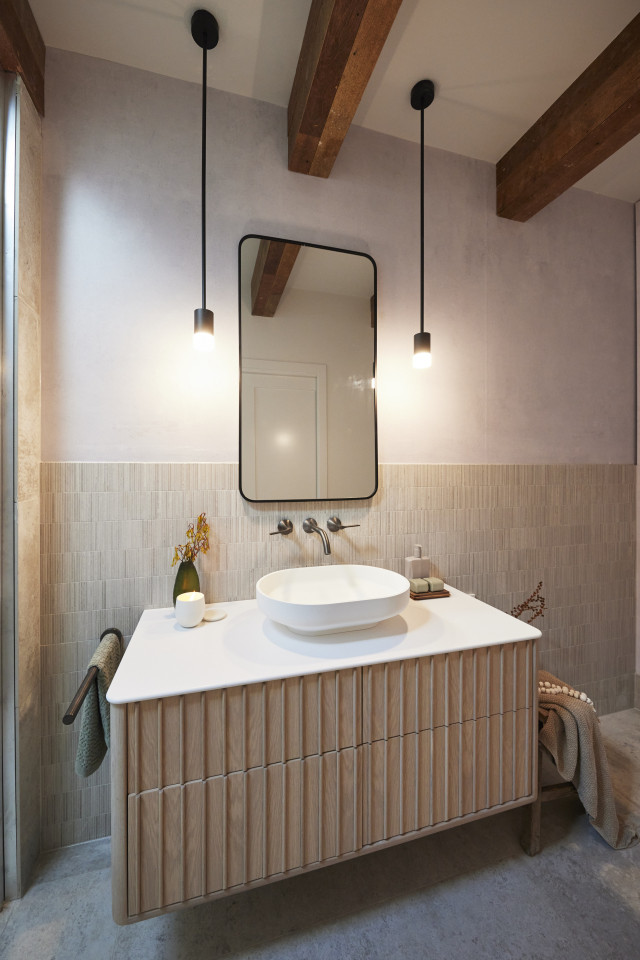
Shop the look: Future Glass | Trinity Rectangle Mirror
I have to say the beams aren’t doing it for me, or the pendants either side of the mirror. I do feel sorry for these two though and hope they have some better luck next week.
All our Block coverage in one place
The post The Block’s first bathroom reveals are a very mixed bag appeared first on The Interiors Addict.
[ad_2]
theinteriorsaddict.com


