[ad_1]
A chance to fix the room they like least, plus the final guest bedroom to complete their house interior? Welcome to The Block’s redo week! For the contestants, this was a chance to finally wrap up their home and make sure everything flows, correcting the rushed decisions they made earlier. And for the judges it was time to see how much the contestants have been listening to their advice… if at all! And from complete makeovers to subtle tweaks, every combination is here for them to see.
Here’s what the judges thought and scored.
Tom and Sarah-Jane (equal first) 28 points
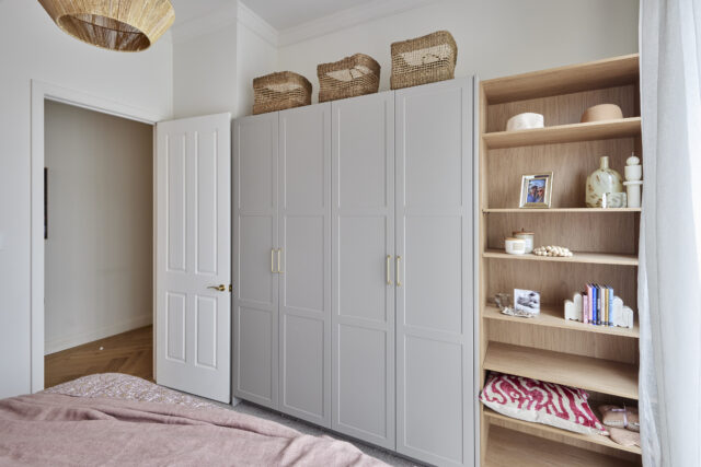
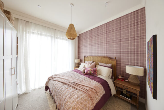
With a rattan bedhead and complementing Grafico wallpaper to reflect the style of house one’s original guest bedroom, a king-size bed and perfectly placed cabinetry this final guest room immediately caught the judges’ hearts, with Darren declaring once again that Sarah-Jane should be styling rooms for a living.
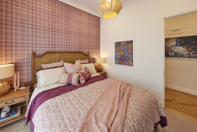
Neale said he loved their ability to put so many patterns, colours and textures together. “I just think it’s got a freshness and vibrancy about it that’s unique.” He even went so far as to compare Sarah-Jane’s style to the legendary Kit Kemp’s!
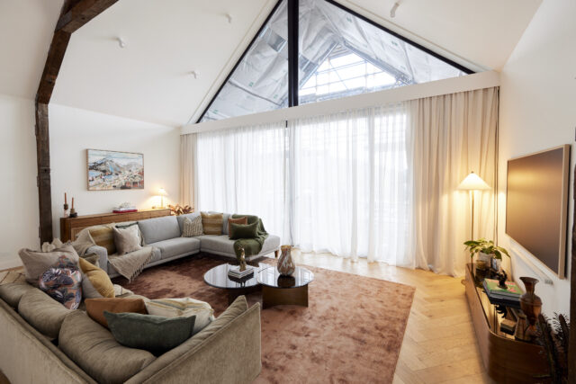
Into the redo room, the lounge area, and suddenly things seemed much cosier, Shaynna said. New rug, chairs turned toward the fire, an extra couch and an updated entertainment unit (which thankfully tidies up the cables) all worked with the huge space and finally shows, Neale says, even with the house’s massive size, it can still seem cosy.
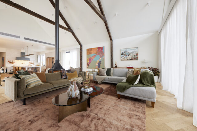
Neale said: “It feels now that the room is playing to the strengths of its size. It feels like a home.” The judges said they’d kept all the things that worked and fixed all the things that didn’t. “Authentic is a really good word for everything that Tom and Sarah-Jane have done,” Shaynna said.
Rachel and Ryan (equal first) 28 points
“As a guest bedroom, this works really really well,” said Darren.
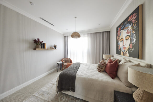
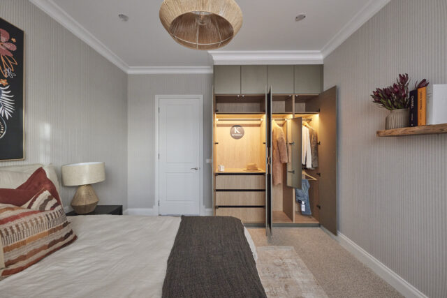
With a metallic-green tinge to the cabinetry, Grafico striped wallpaper, cornices, skirts and lamps all combine for contemporary country chic that’s a world away from their first guest room, the judges agreed.
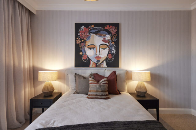
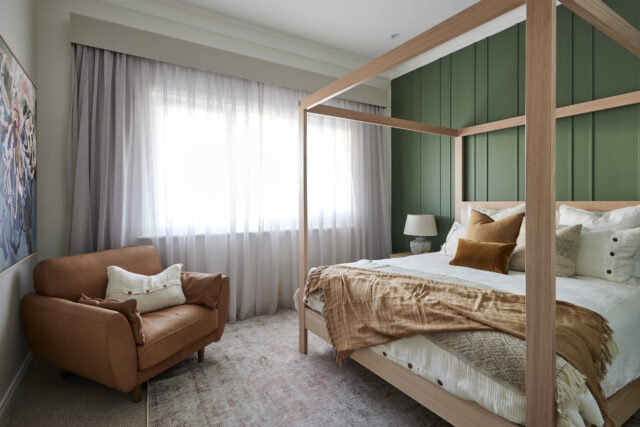
Then they revisited that first room, now Ryan and Rachel’s redo room, to find a new warmer colour on the feature wall, a new rug, a new bed and a new feel. Shaynna said it married well into the home’s overall theme and the countryside in which it sits.
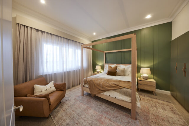
“They’ve really hit their stride!” Shaynna said, pointing out the colours of the land outside were now reflected inside as well, adding up to a cohesive feel throughout.
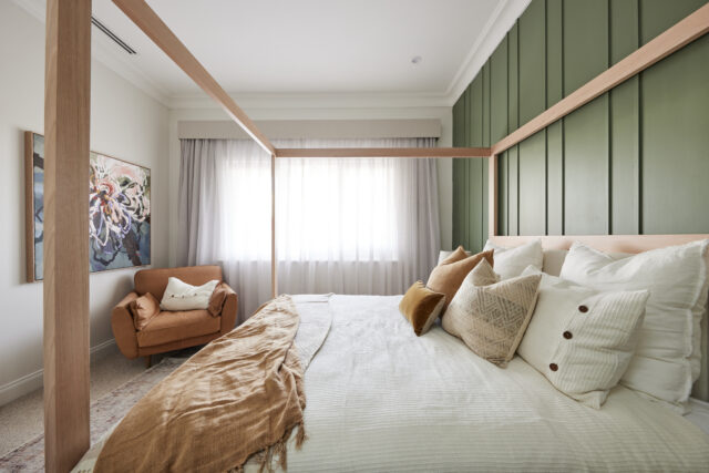
Neale wasn’t mad for it, saying the new green wall colour clashed with the wardrobe colour. Shaynna however said it was all changed for the better.
Dylan and Jenny (third) 27.5 points
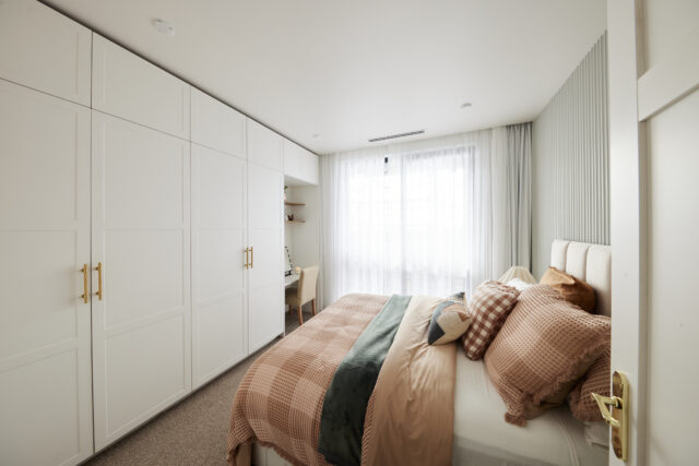
Fluted wall panels and waffle bed throws combine for “texture on texture” Shaynna said, working well with the cabinetry (especially the handles), artwork, bedside table and lamp to showcase the palette and feel of the new room. Simple, Neale, said, but consistent with the rest of the house.
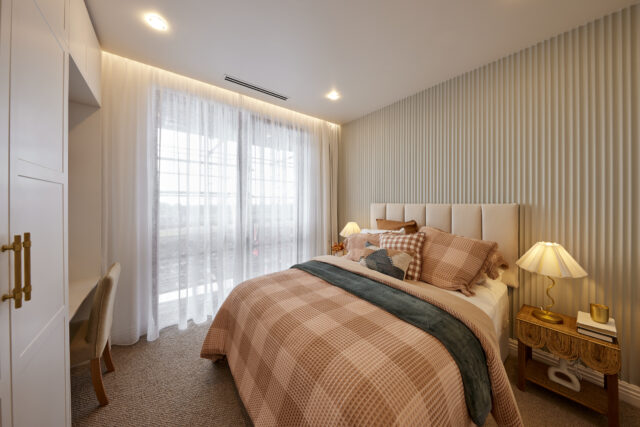
Darren said how amazing to see a rattan woven bedside against everything else and it worked. Neale said it was absolutely beautiful; a contemporary yet subtle colour palette. The artwork however, clashed with the palette but everything else worked.
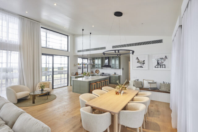
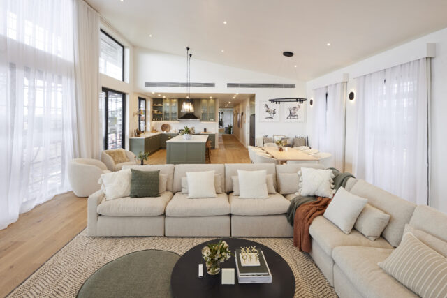
Into the re-do living and dining room and that sense of cohesion continued with a completely changed space that now sits well with the home. New sconces, the chandelier replaced by a fan, a fresh coat of paint over the Venetian plaster and styling changes have given the space a contemporary feel without sacrificing the country nods. “Next level,” Neale summed up, and now right for their home.
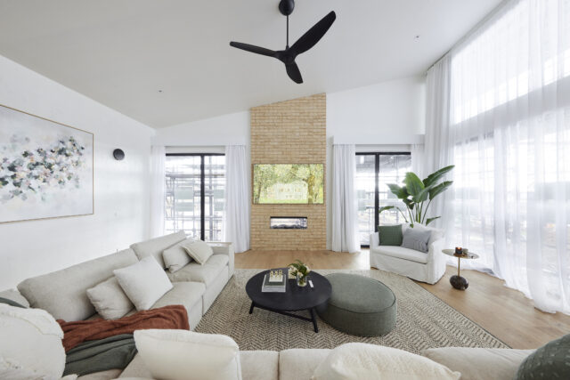
The judges agreed it was completely changed and for the better. Darren loved the palette. He said the redo had had a transformative effect because it was all wrong and now it was all right.
Omar and Oz (third place) 25 points
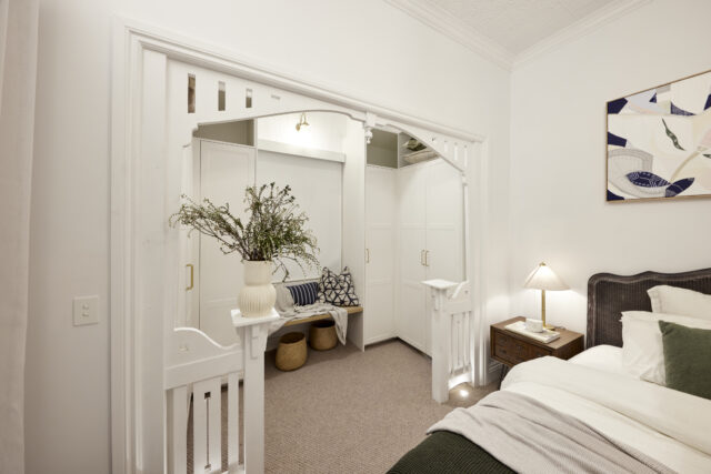
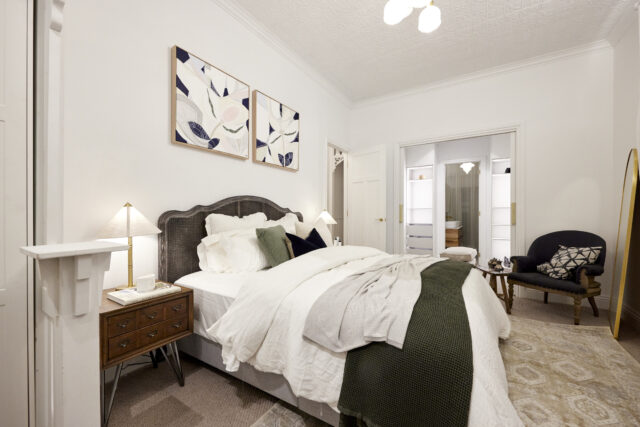
With the aesthetic of a Japanese ski lodge, Neale felt right at home in Omar and Oz’s final guest room, with Darren pointing out the discrete pelmet lighting and LED strips all combine to bring modern touches without sacrificing the country feel.
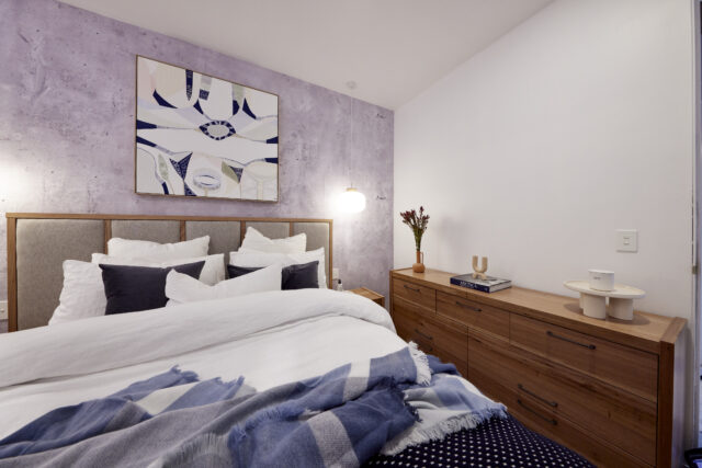
Neale said it was very fresh and contemporary; a really nice combination of finishes, textures and colours. “When these boys are good they’re really good.”
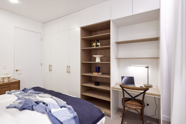
Shaynna felt it was too cluttered with furniture. Darren said it was well designed, it just had a few too many things in it.
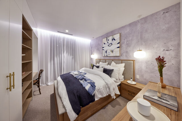
As for the re-do room, their master bedroom, all judges agreed the change was spectacular, with the new king size bed a natural fit now the cluttered reading nook had gone and pendant and bedside lamps combining for a warmer, cosier feel. There were issues with the fretwork blocking access to a wardrobe, but overall a huge improvement on what had been there before.
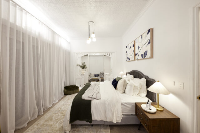
Darren said the changes were so subtle but so massive. The change to the king bed was also great. Neale said the two rooms had the same aesthetic and palette. Shaynna said she loved the extra storage.
Ankur and Sharon (fourth place) 23.5 points
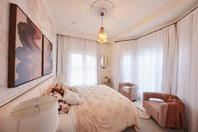
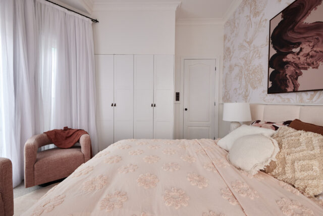
A “nice” room suitable for a 10-year-old, Darren said as he took in Sharon and Ankur’s pink-themed guest room… but then why add cocktail glasses, Neale asked? He did, however, love the wardrobes, the cornice and ceiling rose, the pelmet and curtain, all working well to give the room great bones, it was just the styling that left him confused.
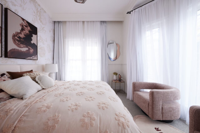
Neale and Darren agreed it was nice but not very exciting. Shaynna said it was an example of how not to put pattern together. Neale said it was way off the mark and didn’t feel luxe.
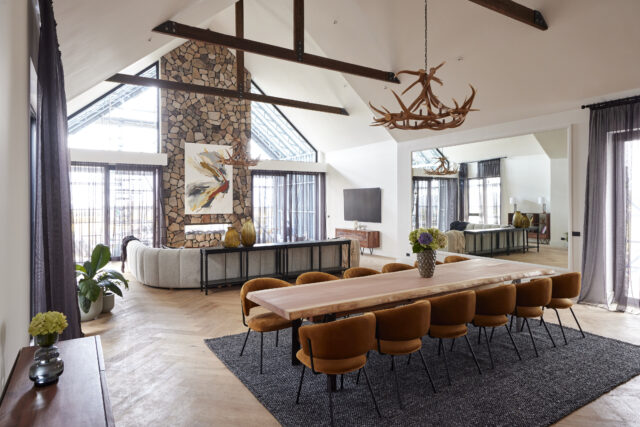
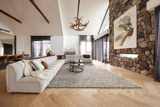
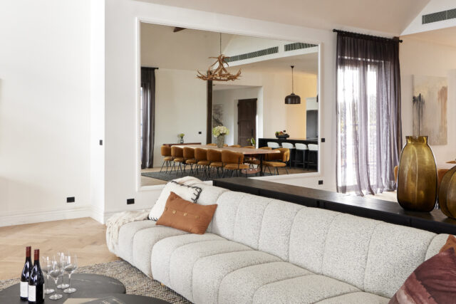
Into the redo room, the living and dining area, and all confusion left, with the added mirror, moved table, dark sheers and refinished paintwork leaving the judges happy that the space had definitely been saved. There were still some touches that could be tweaked, they said, but overall, it’s a massive improvement.
Darren even sad he now liked the chandeliers. While Neale said they needed to get their damn mojo back with two weeks to go!
Shop the looks at The Block Shop
The post The Block 2022 re-do rooms and guest bedroom 4 reveals appeared first on The Interiors Addict.
[ad_2]
theinteriorsaddict.com


