[ad_1]
This latest kitchen renovation is in a home located in the Sonoma Valley, surrounded by oak and olive trees, and rolling hills covered in vineyards. If you’ve ever considered a visit to the region, I recommend this article on the best of Sonoma County.
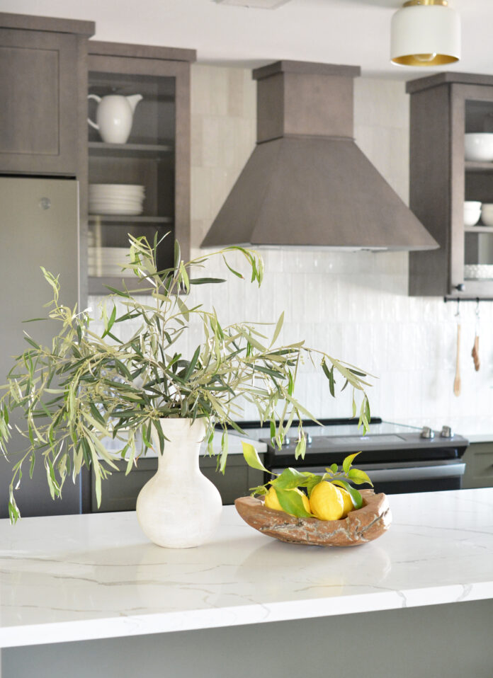
I wanted this space to echo its surroundings so the colors were inspired by the local landscape. I chose dark wood cabinets in the same tone as the oak floors and olive green cabinets to play off the trees that grow all around.
The hues are rich and traditional, but the space also includes modern touches such as marble look quartz, black hardware, gold light fixtures, and open shelving.

This kitchen is small, less than 12 feet from refrigerator to window, so I had to be smart about appliance placement and cabinetry. I wanted to appeal to a wide range of buyers with the finishes and extra storage.
Here’s a look at what I started with last year: dated white cabinets, laminate countertops, an awkward pantry, bulky upper cabinets above a strange skinny peninsula, old carpet and laminate flooring, and not a lot of storage.


The footprint of the kitchen stayed the same, but I made sensible modifications. I made the peninsula deeper with cabinetry and moved the microwave there too. I kept upper cabinets but replaced two of them with glass fronts.

I chose a chimney hood in the same wood tone for a cohesive look. I contemplated a drywall range hood which is trending in kitchen design, but chose to stick with a smaller scale stained angled hood to contrast with the white tile.


I definitely needed to move that pantry so I designed the tall cabinets in the dining space to take its place. I thought the future owner could benefit from more storage so I extended lower cabinets into the dining space as well.

First, some kitchen details. I used elongated matte black hardware on the drawers and doors, see source list below. I also added a small rail with hooks under the upper cabinets for added utility.


The matte black faucet is modern and sleek, installed over the single basin granite composite sink.

The tile is a textured 3×8” glazed ceramic in white in a vertical stacked offset pattern from counter to ceiling. I’ve been wanting to install this pattern for a year and I love it in this space. White tile is timeless yet the installation feels fresh.


The countertops are 3cm calacatta quartz with grey veining installed on both the surround cabinets and the peninsula.


When picking cabinet colors, the finish on appliances is always a consideration, they need to complement each other. Stainless, white, and black look great, but I went out on a limb with this project and chose slate appliances instead. They blend beautifully with the wood stain and olive color in the cabinetry.
I was walking through Home Depot glancing at options when I spied the GE Slate series and thought if I’m choosing dark tone cabinets, these will work really well. The finish on these appliances is matte and feels muted and blended as if they’re receding instead of trying to take the spotlight.


The cabinets are a mix of stained and painted in the kitchen, and all stain throughout in the dining space. I like how the floating shelves tie the two spaces together.


Here’s another before and after!


And one more…


A dramatic difference, right?
My next kitchen remodel takes me to Florida to take on a totally different style. I’m excited!
Sonoma kitchen remodel sources:
stained cabinets: eden classic in fieldstone / painted cabinets: eden artisan in jade*
waterproof oak plank flooring / backsplash tile / quartz countertop /
single basin composite sink / pull down black faucet / oak tree art / landscape art
hardware: knobs / long pulls / medium pulls / cabinet rail & hooks
slate counter depth refrigerator / slide in slate electric range
slate dishwasher / slate microwave with cabinet trim kit
flush mount lights / similar dining sconces / dining chandelier
*cabinet color no longer available, the closest color match is Sherwin Williams Cocoon.
[ad_2]
centsationalstyle.com


