[ad_1]
We have featured Eclectic Creative’s stylish work before and today we’re bringing you another one of interior designer Jessica Viscarde’s fabulous renovations. Located inside an early 1970’s bungalow in Melbourne’s leafy Croydon, Jessica completely reworked the kitchen and laundry floor plan as well as its aesthetic. “The ultimate goal was to create a central family hub that served as the dining, kitchen and laundry, as well as serving as a busy thoroughfare to the adjoining living, bedroom and outdoor spaces,” she says.
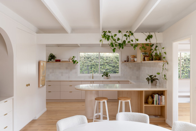
Home to a couple, their three children and a menagerie that includes a dog, cat and chickens, Jessica was given a brief that called for a ‘Scandinavian-inspired cottage vibe’ that also worked with the existing late 60’s/early 70’s architecture of the home that included exposed beams and a lowered, flat roofline. “The original space was drab, boring, and felt cluttered and small. It didn’t function as a hub for the home and our clients wanted the space to serve as a kitchen and entertaining zone,” says Jessica.
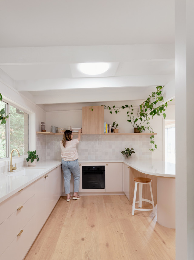
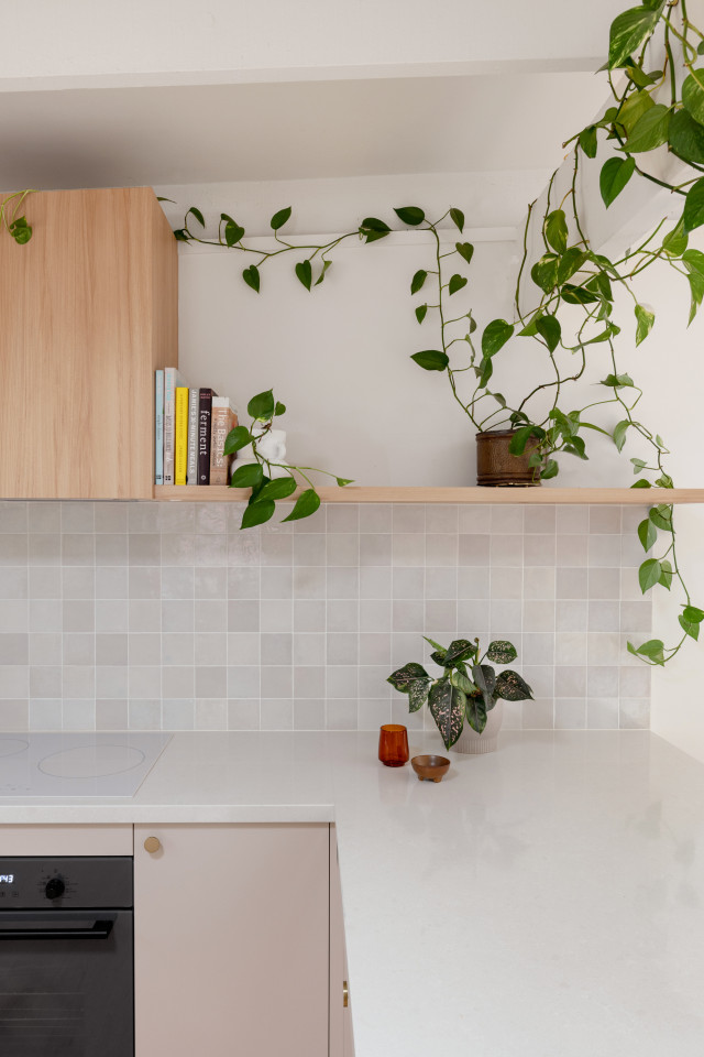
As for the kitchen’s new design, a feature peninsula-style stone bench (with cylindrical support) draws the eye while open ledge oak shelving runs the length of the area. “This makes the space feel light and effortless, as opposed to how it might have felt with a solid island bench or heavy overhead cupboards,” says Jessica. Highly functional too, the kitchen includes an integrated dishwasher, charging station and ample lower drawer storage. A family-size fridge and wine fridge are tucked around the corner, essentially hidden out of sight, but within easy access of the working areas.
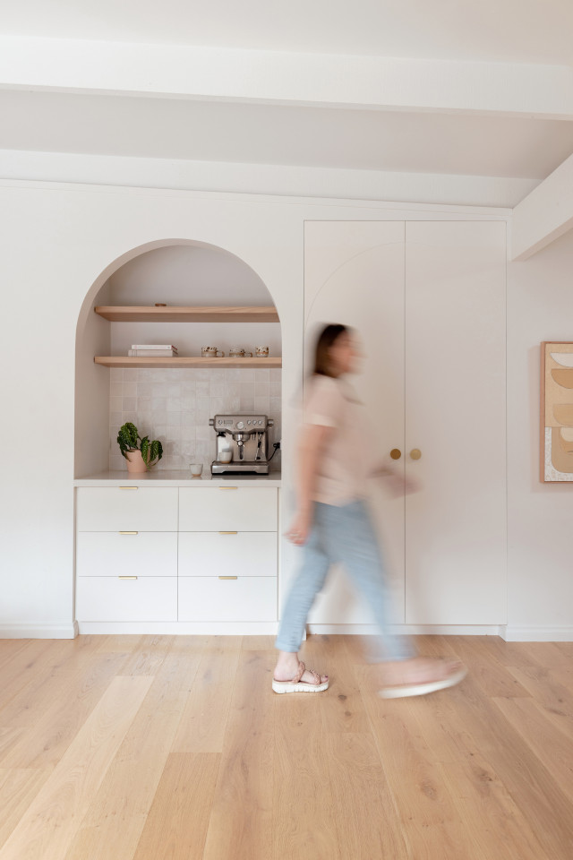
“A must-have item was a designated coffee station, preferably not hidden behind doors, so we designed this beside the pantry within a custom arch alcove and finished it with the same materials as the kitchen for cohesion,” says Jessica.
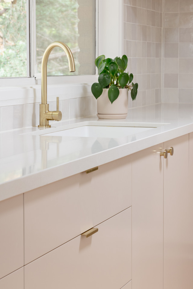
Oak, brass and blush pink formed the predominant colour and material selections for the kitchen and laundry, with hand-cut, Zellige Moroccan tiles wrapping around the entirety of the area, offering an organic touch. “We were conscious to work with tones that enhanced the original brick exterior and didn’t compete with it,” says Jessica. Cabinetry in Dulux ‘Chintz,’ walls in Dulux ‘Natural White,’ ABI Interiors tapware and door hardware and Tiento Tiles splashback tiles round out the stylish mix.
One key structural change was the removal of the wall that previously divided the kitchen and laundry – this opened the entire space while also providing considerable bench space that can be used in both areas. The home’s new compact laundry is housed neatly at the end of the space with functional access to the outdoor and adjoining study. “Our clients requested a small laundry, with the end result flowing seamlessly with the kitchen design,” says Jessica.
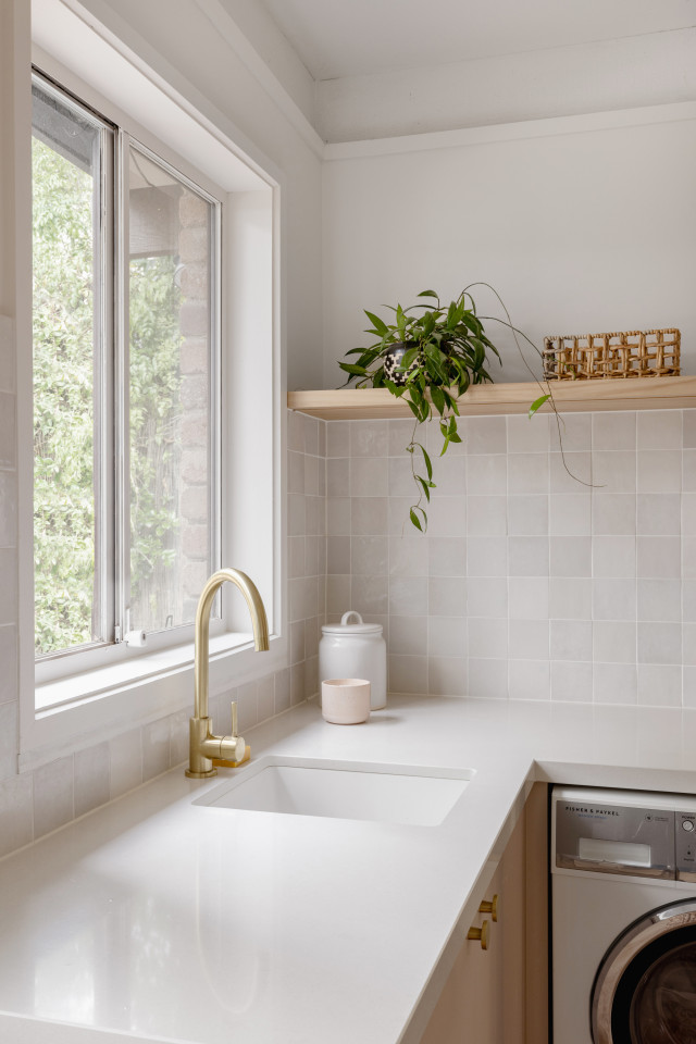
Plants also play a significant role in the spaces. “I just love the overall feel and how my client has integrated all her indoor plants into the scheme. It feels connected to the existing architecture yet fresh and contemporary.”
Photographer: Elise Scott | Stylist: Eclectic Creative
www.eclecticcreative.com.au
The post Seventies home given sympathetic nude pink kitchen & laundry reno appeared first on The Interiors Addict.
[ad_2]
theinteriorsaddict.com


