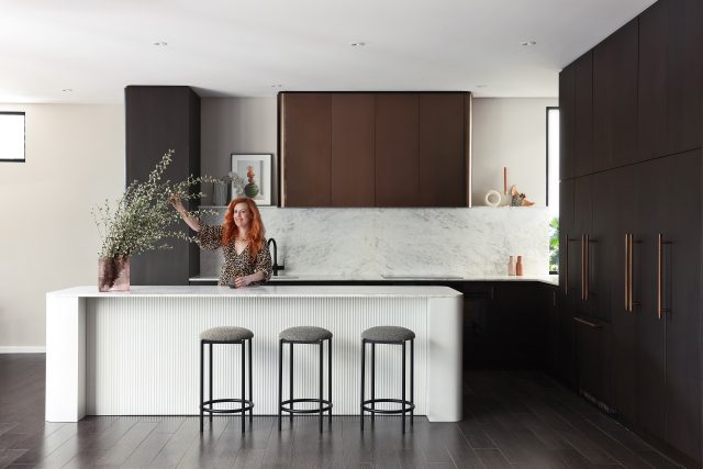
As an interior stylist and design writer exposed to endless interiors inspiration daily, when it comes to my own home, I often take a long time to make a decision – particularly when the stakes are high. And the stakes certainly were raised when I presided over my own kitchen renovation recently. After all, it’s the most expensive room in the home to renovate but the old kitchen was too small, had a dysfunctional layout and featured fairly lacklustre finishes.

When we embarked on the renovation, I knew it had to be something special but there’s a very fine line between timeless and dull and I was more than cognisant of striking that delicate balance. Fortunately for me, I collaborated on it with my good friends and talented colleagues at the Perth design practice Rezen Studio. The joinery was built by the perfectionist team at Noda Studio.

Parisian inspo
When seeking design inspiration, I often look to Paris apartments (if you haven’t, I’d suggest a Pinterest deep-dive pronto). The city’s effortless blend of historic charm and modern sophistication is a pretty irresistible one and it proved the perfect muse for my kitchen which is nestled inside an extension at the back of a heritage home. And while the room doesn’t have the ornamentation found in Paris apartments, I still found the aesthetic provided a solid foundation for the design. A longtime fan of Art Deco, the design features several nods to that aesthetic too.
A neutral palette
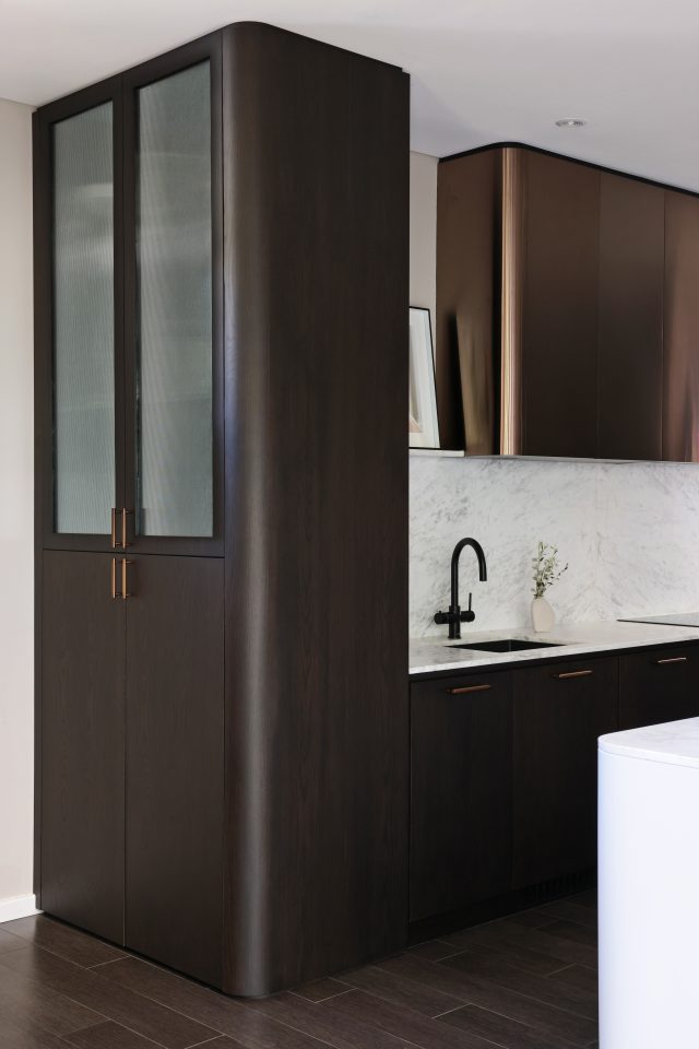
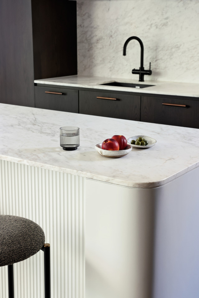
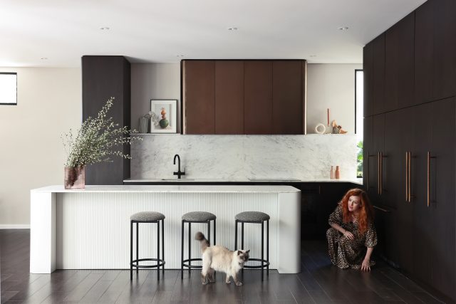
While I adore vibrant colours (I’m a big fan of dopamine dressing and vivid interiors), I chose a neutral palette for the kitchen; a textured mix of dark stained American oak veneer, warm flecked Greek marble and bronze accents. The decision was intentional – a neutral base allows me to infuse colour through artwork and objects and creates a versatile backdrop that can evolve over time. I’m obviously biased, but I feel the space proves that neutral needn’t mean boring!

Metallics
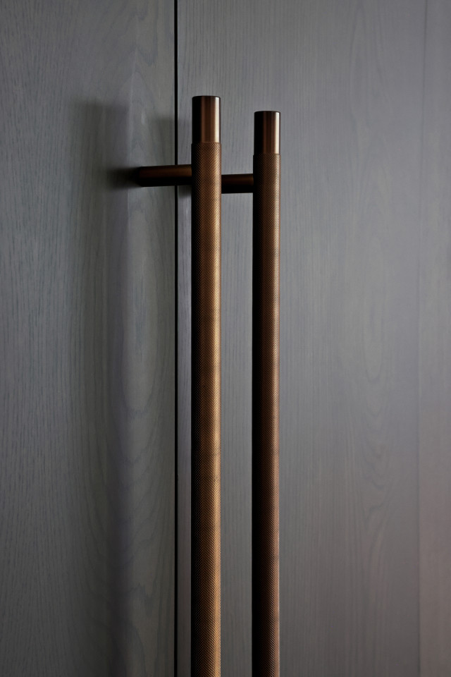
To elevate the kitchen’s overall aesthetic, I opted for bronze metallic overhead cupboards and complementary handles from Lo & Co for an elegant, luxe touch. Just as jewellery works to elevate an outfit, the bronze elements add elegance, depth and further visual interest.
Natural stone
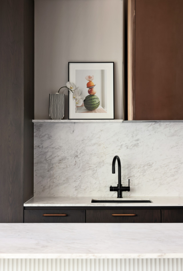
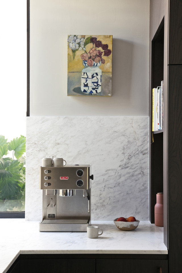
Honed marble was a must-have for our kitchen benches and while we toyed with the idea of a tiled splashback, we ended up using marble there too. Not only is it stunning to look at, but the Artedomus Selenis Greek marble (complete with warm grey/brown veining) offers incredible durability and has the most beautiful hand feel which was something I didn’t expect. The smooth, cool surface will age gracefully and develop a patina over time too.
The must-have shelf
One of my favourite features of the kitchen is the open shelf that was designed for styling purposes. As a stylist, I wanted a space where I could showcase beautiful ceramics, art, flowers, foliage and my favourite objects. The shelf adds character while allowing me to express my creativity in a continuous, evolving way.

A foodie mecca
As a family of food enthusiasts, we needed a kitchen that could accommodate five of us as well as our passion for cooking. The three-metre island bench is a generous workspace that is perfect for meal prep, casual dining and teaching the kids to cook. And while the open plan lounge room is right in front of the kitchen, nobody ever sits there – the space is truly the heart of the home.
Renovating our kitchen was a journey filled with countless decisions and moments of inspiration. By focusing on a monochrome palette, incorporating metallic finishes, and choosing materials like marble, we created a space that’s elegant, functional and truly ours. Overall, I think the space is testament to the power of good design and the joy it can bring to daily life.
Photography: Matt Biocich
For more on Rezen Studio | For more on Noda Studio | For more on Amy Collins-Walker
The post Our Amy’s stunning new kitchen renovation appeared first on The Interiors Addict.
theinteriorsaddict.com

