[ad_1]
Ex Blockheads Deb and Andy Saunders from DNA of Design, have transformed a mismatched and outdated home and transported it into the 21st Century. The clients, Mishelle and Ross, have a blended family of seven, so it was essential that the new home was practical to support their busy family dynamics. Set on the Gold Coast Hinterland, the home was inspired by the surrounding nature and renovated with large family living in mind.
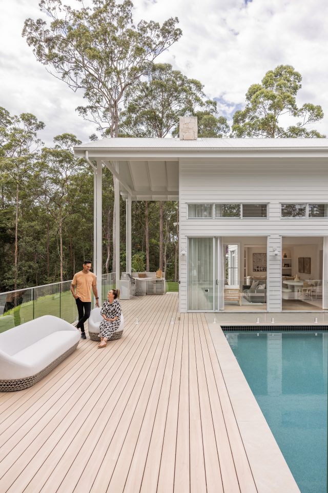
“We were heavily inspired by the home’s surroundings, located on the Gold Coast and enveloped by lush forestry that’s home to a koala or two and plenty of kangaroos – we love how they regularly gather among these large gum trees. It’s such an amazing view,” says Deb. “We used the colours of the bark and leaves from the gum trees to inspire the design of the entire home. We wanted it to feel as though the interior and exterior spaces were in complete harmony with nature. One of our favourite parts is the new wing of the house that reaches right out into the trees, bringing all that nature inside to feel like you’re floating.”
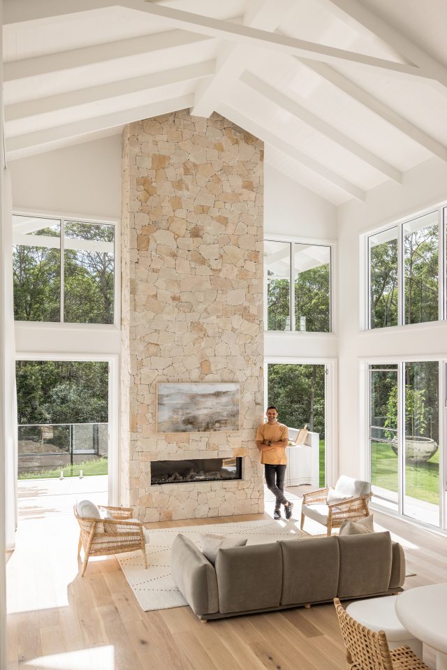
The overall style feels natural and relaxed, playing into the wabi-sabi design philosophy but with a contemporary flair incorporating clean lines and shapes.
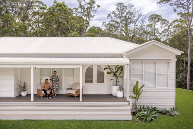
The façade comprises Queenslander-inspired features with bright timber cladding and a large porch. Facing west, the front of the home is subject to significant heat during the tough Queensland summers. In order to keep it cool but still remain stylish and in line with the wabi-sabi aesthetic, awnings were selected from the Luxaflex Evo Awning range. They’re made in Australia specifically for our climate. Additionally, to create a statement piece and a sense of privacy outside, modular walls were added behind the mailbox, blending with the style of the home whilst also adding character to the surrounding landscape.
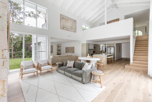
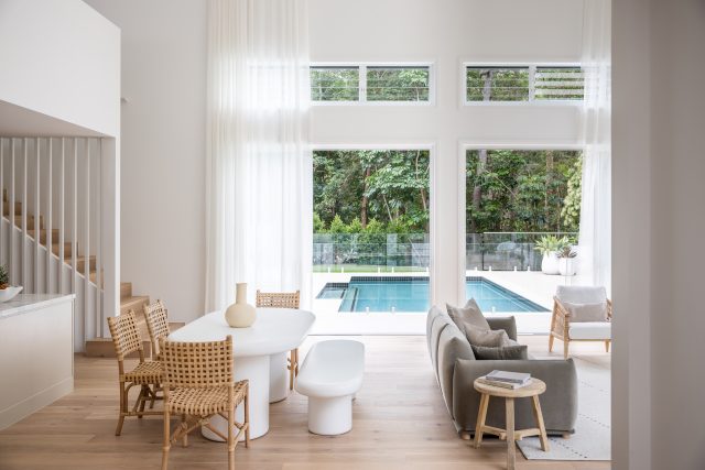
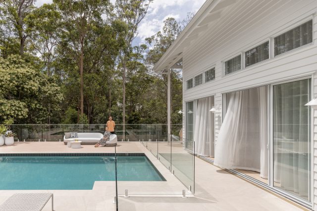
Originally tired and uninviting, the inside of the home underwent drastic changes to convert it into a space that was practical for the blended family. “We moved the kitchen from upstairs to the downstairs area and added a new living and sitting space downstairs too. We love how the house now hugs the pool and outdoor area (which was previously mainly accessible via the old staircase) which means that the entire floorplan flows more seamlessly. Seeing the home take on such a brand-new, fresh aesthetic and improve its functionality in many ways has been incredibly satisfying to witness,” says Deb.
Central to creating a seamless flow throughout was the transformation of all the walls, utilising Gyprock Supercheck to enable a more cohesive look and feel. “At the start of the renovation, we thought it would be impossible to make the old and new sections work together, but Gyprock helped us achieve this harmony without any issues. Everything now looks so seamless; you can’t even tell where the old part ends and the new part begins.”
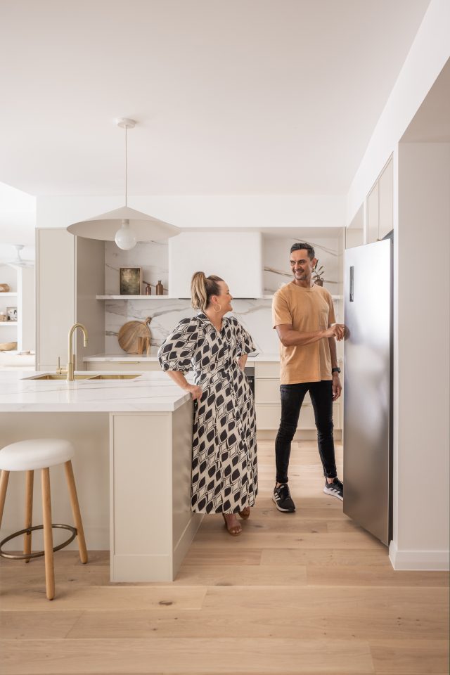
Being the heart of the home, the kitchen was a major part of the renovation – transforming it from its drab 90s feel to a modern family space. “The kitchen, pantry, and laundry are probably the hero areas of the home. These three spaces flow so well off one another that they’re almost like one large room, yet they can still be closed off and separated when needed,” says Deb.
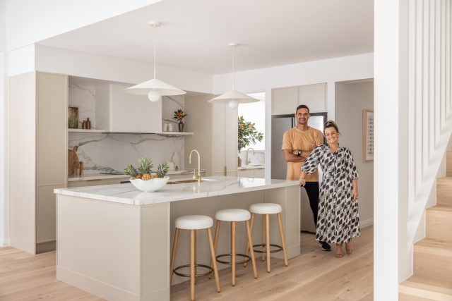
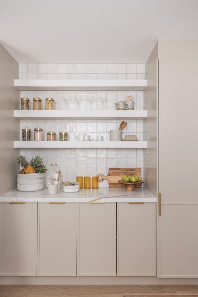
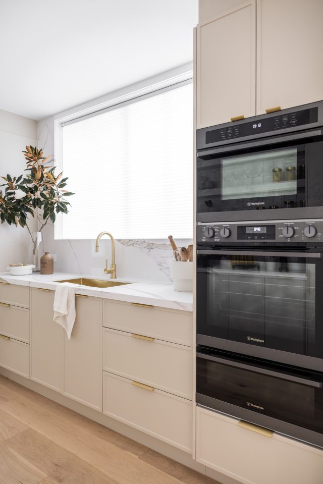
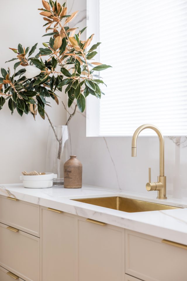
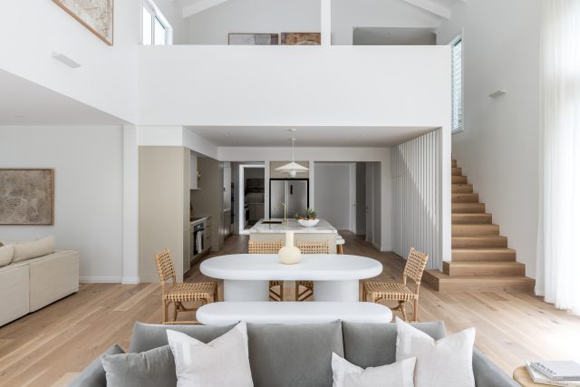
Sitting in the new downstairs extension, a stone benchtop was chosen to bring a sense of the outdoors in via natural materials. Featuring gold flecks, it was paired with brass finishings. “We found it quite challenging to join the old and new sections of the house. In the original part of the house, we ended up building the laundry and butler’s pantry, while we built the kitchen in the extension area. In the end, the whole area flows like a dream and the space we created is now big and roomy. Something else that stands out is the ceiling height in the living room alongside a soaring sandstone fireplace, it’s absolutely insane how gorgeous it looks. We then added a mezzanine above the kitchen due to engineering issues that we worked around.”
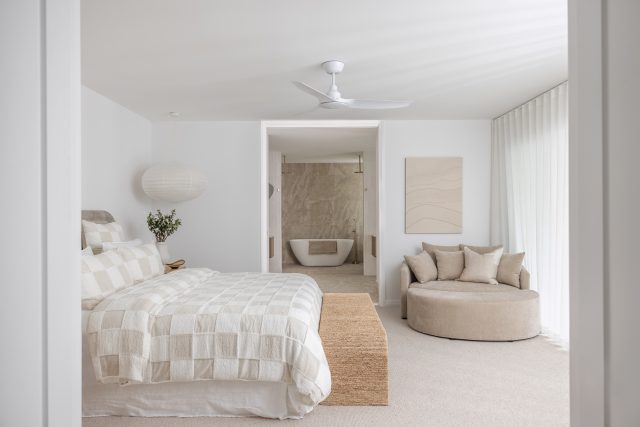
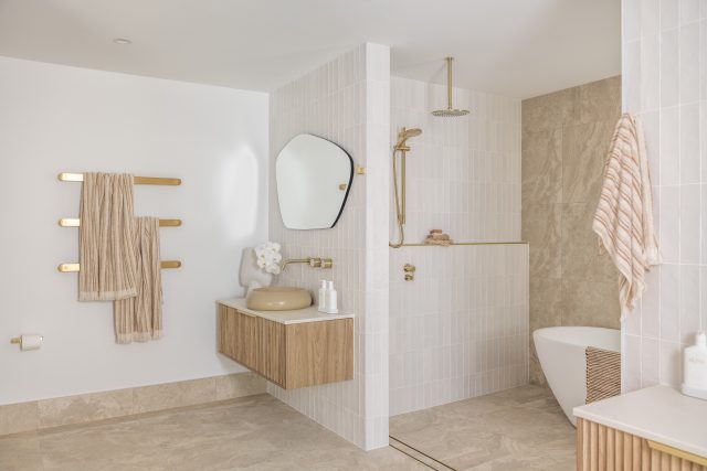
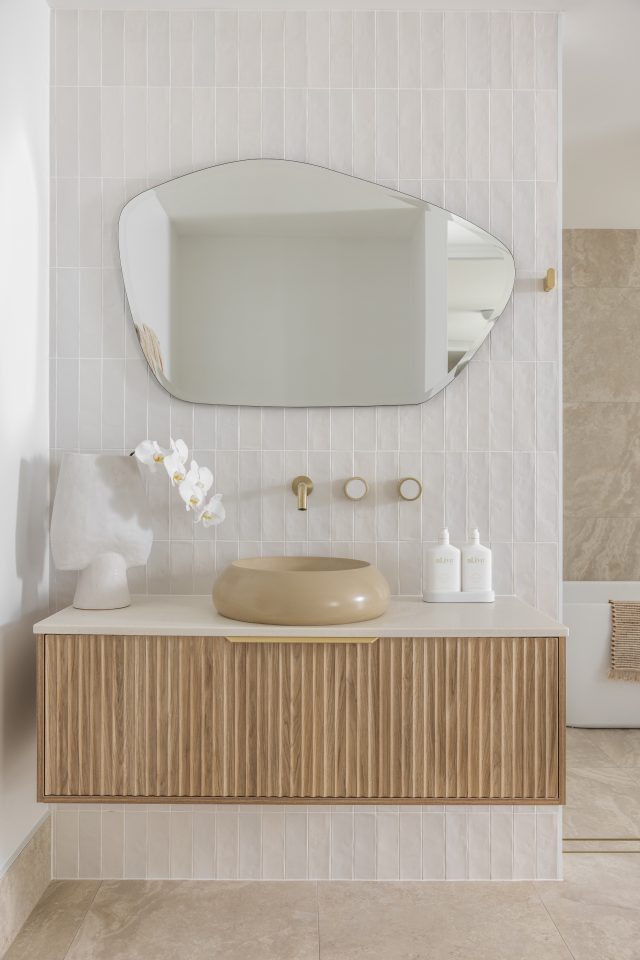
Moving to the master bedroom and ensuite, a hotel-like suite has been designed. Opening up with a grand entrance, the bedroom hallways feature two walk-in robes for the couple on either side. Through the bedroom, the ensuite stands at the end of the space with double showers and a standalone bath. Deb and Andy wanted the space to feel like a spa, so a neutral palette and earthy tones were incorporated to induce a calming feel.
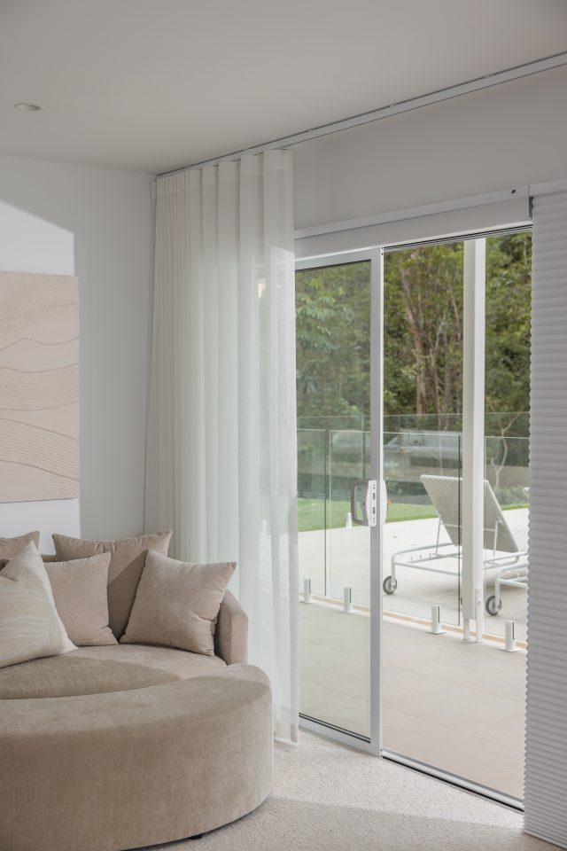
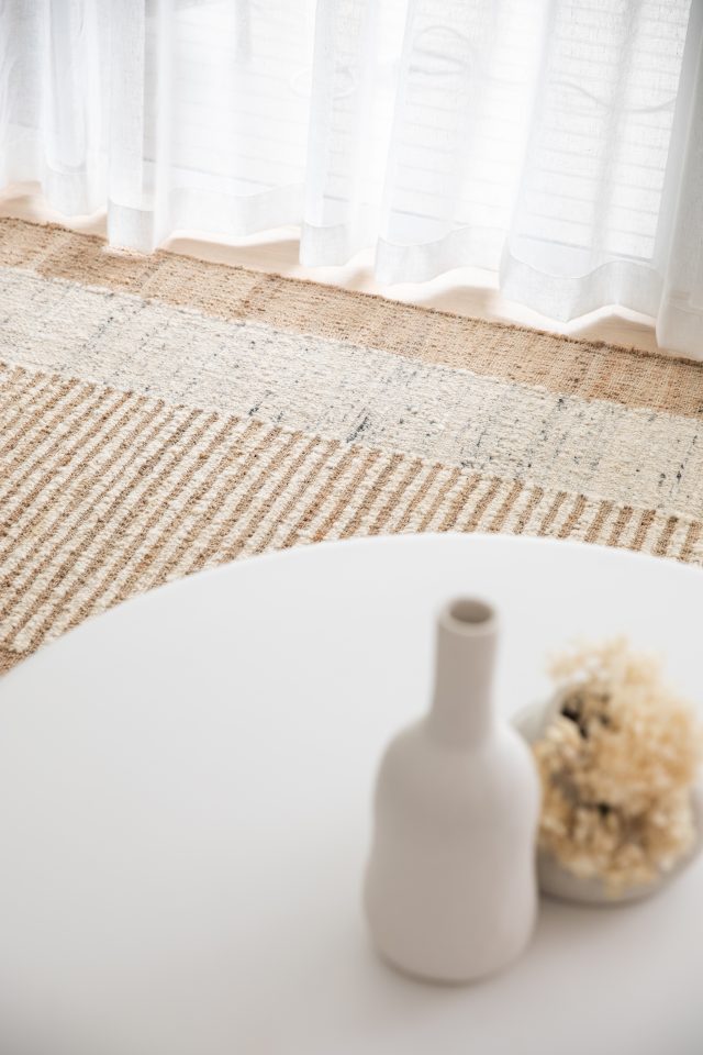
“The main challenge with this space was the lack of natural light. To overcome this, we extended one side of the room and opened it up by installing glass sliding doors overlooking the tree-filled backyard,” describes Deb. “We decided to create a layered effect using Luxaflex Duette Shades and Sheer Curtains to help make the rooms appear fuller and more finished. These coverings worked perfectly, with a gorgeous, lightweight feel and soft white tone to match the rest of the home’s aesthetic.”
At the end of the project, the couple renamed the house “Unearthed” to fit with the wabi-sabi design philosophy that was incorporated into the interior design. Wabi-sabi originates from Japan and focuses on authenticity, simplicity, and embracing beauty in imperfection. It’s also about focusing on organic textures and tones. “The name and earthy interior style also fit well because the downstairs area of the home was quite literally built into the earth. all, the home’s style is earthy and modern with muted tones. It’s a soft space made for relaxing and unwinding,” says Deb.
For more information on Gyprock | For more information on Luxaflex | For more information on DNA of Design
The post Old and new parts of home brought together to flow with nature appeared first on The Interiors Addict.
[ad_2]
theinteriorsaddict.com


