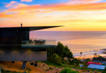
Unrecognisable from its original early 2000s incarnation, this Mount Martha residence has been overhauled by the talented interior designer Silvia Roldan of Studio Esar. Transforming the home from dated to delightful, she drew inspiration from the nearby coastal colours and textures of Victoria’s Mornington Peninsula when crafting the design. “The original home is completely unrecognisable. There is not an inch of this four-bedroom home that we didn’t touch!”
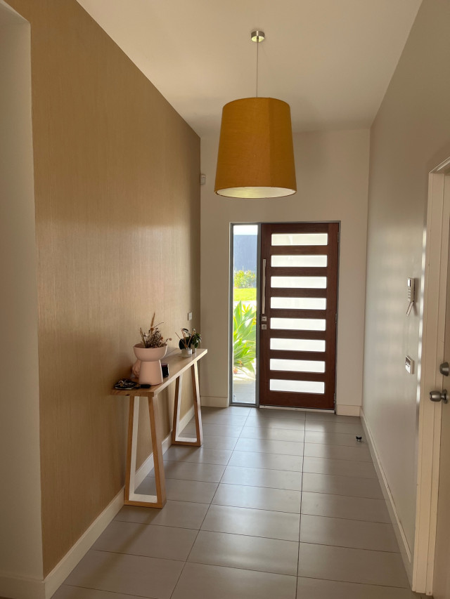
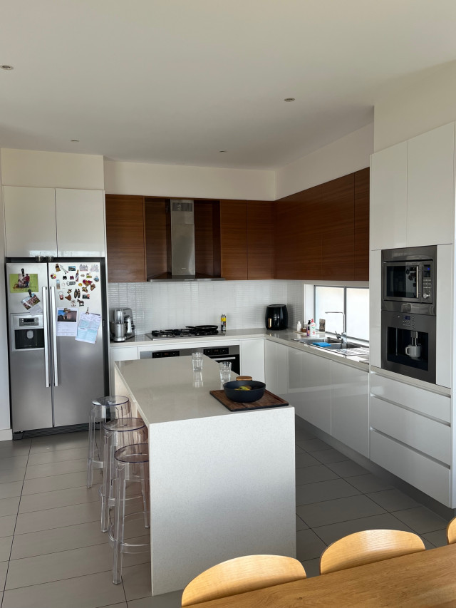
Built in the early 2000s, the home had a lot going for it (a great layout, large rooms, high ceilings and enviable ocean views) but when it came to aesthetics, it fell short. “The rooms felt cold and dull with a tired and unimaginative palette – grey floor tiles, stark white paint, timber-look wallpaper and laminate surfaces. We’ve seen it all before and don’t need to see it again,” says Silvia who was engaged to rejuvenate the home.
“The owners wanted a place they felt proud to call home and they recognised the value in investing in quality materials and updating the joinery to a contemporary design,” says Silvia of the renovation that involved very few structural changes but plenty of fabulous aesthetic ones.
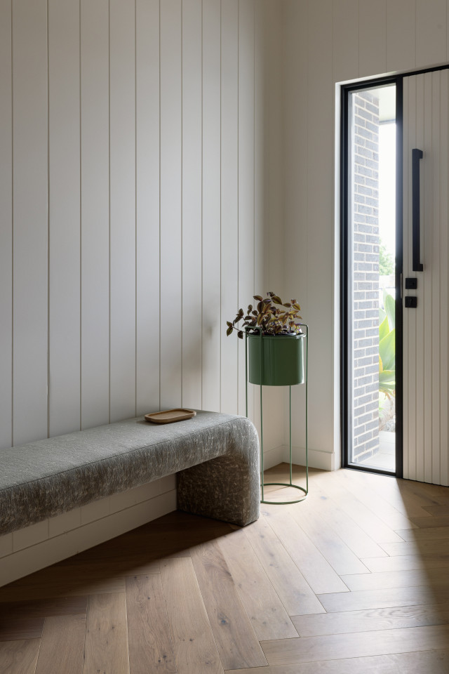
When you enter the home, the mix of herringbone timber floors and shiplap-lined walls really set a tactile scene. The timber floors continue up the split-level staircase to the living spaces upstairs and the bedrooms downstairs.
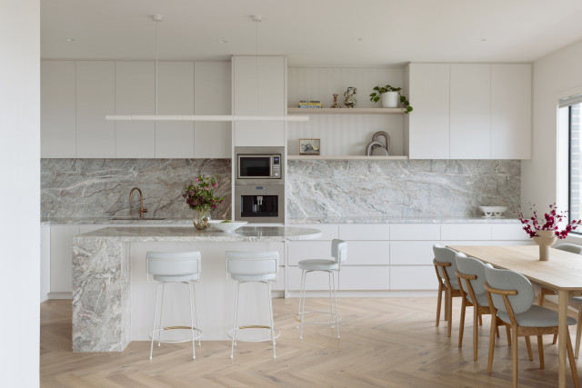
The upper level comprises the open-plan kitchen, dining and living zones and all the rooms have been kept free of window furnishings to maximise the ocean view. Views aside, the natural light and brand new, much larger kitchen takes centre stage.
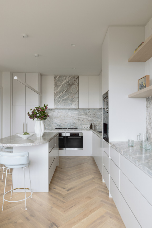
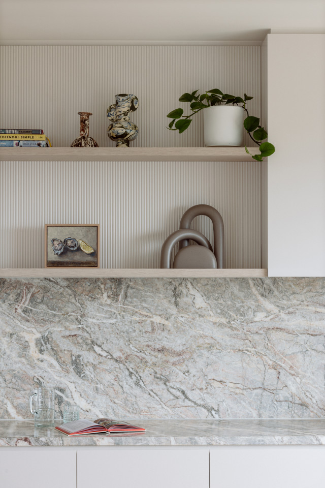
Arguably the most eye-catching element of the kitchen redesign is the Fior di Pesco marble that is on the benchtops, splashback, island and rangehood; its apricot and brown flecks complement the warm herringbone timber floors and soft-white 2pac joinery. “The fluted timber wall behind the shelves adds texture and rhythm and closes off a redundant highlight window. Curves introduced to the island benchtop and landing wall smooth transitional spaces and soften the angular edges typical of this era of build,” says Silvia.
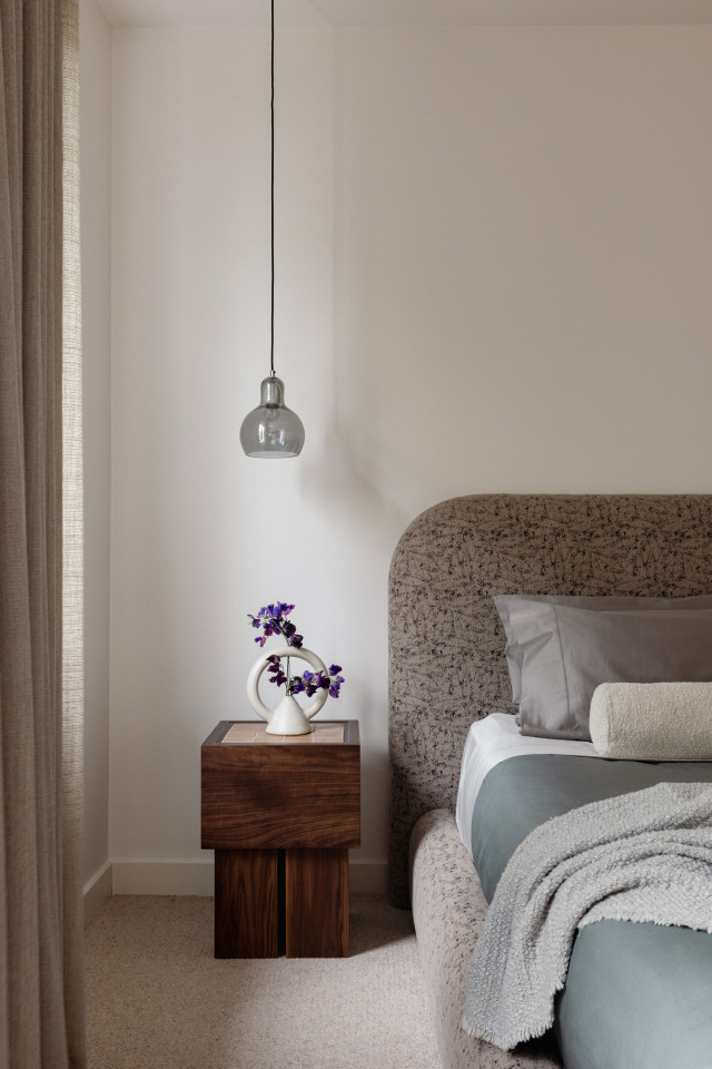
Downstairs, the refresh continues in the bedrooms and bathrooms. “The main bedroom is now a serene retreat with extra-chunky loop pile carpet, textural sheer curtains, an upholstered bedhead and frame and hanging pendant lights,” says Silvia.
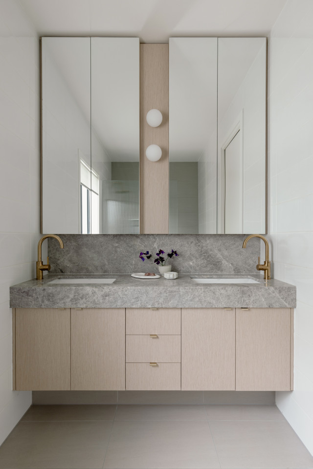
The main ensuite and two bathrooms feature statement-making natural stone vanities complemented by bronze tapware and timber veneer joinery. The existing floor and wall tiles were regrouted and reeded glass installed to the shower screens to enhance texture and diffuse the light. “With a refined and tactile selection of materials and finishes, the mundane has become magical, and the bland is now beautiful.”
Photography by Elise Scott | Furniture & styling: Studio Esar
For more on Studio Esar
The post Mornington Peninsula home goes from bland to beautiful appeared first on The Interiors Addict.
theinteriorsaddict.com


