[ad_1]
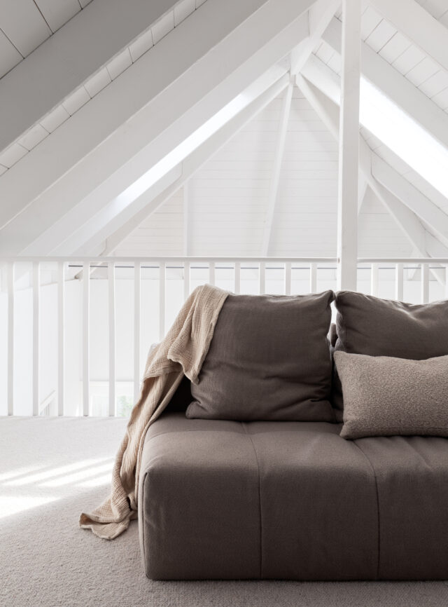
Another project by the talented Melbourne architect Bonnie Mills, this Richmond home was renovated recently with a clean, minimalist design aesthetic. “The meticulous detailing and soft, cool hues, create a sense of belonging and peace within the space,” says Bonnie Mills of the once dark and enclosed terrace house that houses a family of three. Northern light has been maximised and the colour scheme lightened up; both aspects make the home feel much more spacious.
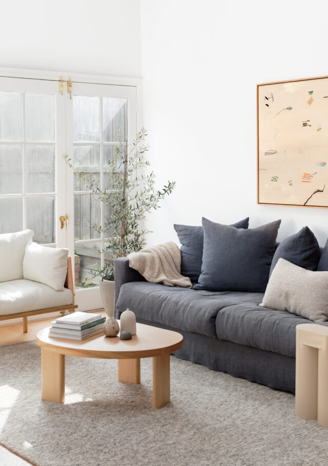
Hidden behind an attached miner’s cottage in Richmond, the renovation has also increased the connection to the common areas of the home. “Being an attached terrace house means there are only windows on one side of the house so we needed to get as much north light into the space as possible, as well as maximising access to any possible east light,” says Bonnie.
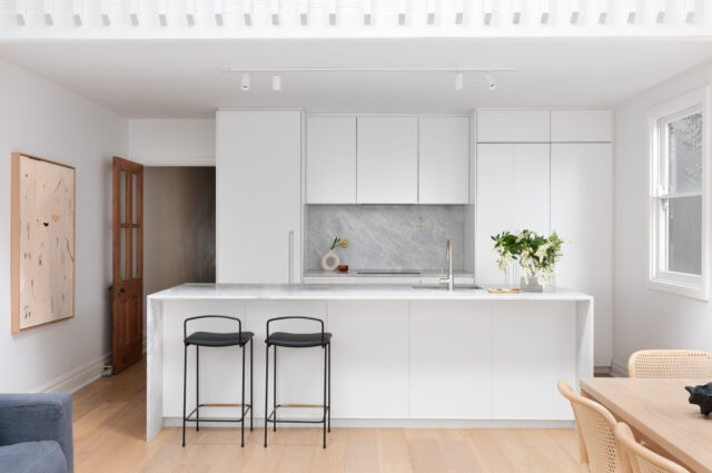
Bonnie was tasked with levelling out the multi-level kitchen, dining and living area to allow for maximum flow between the spaces. “We increased the light and perception of space by elevating the kitchen to be on the same floor level as the living and dining area,” says Bonnie. The stylish and tranquil new kitchen features Phoenix tapware and Artedomus benchtops.
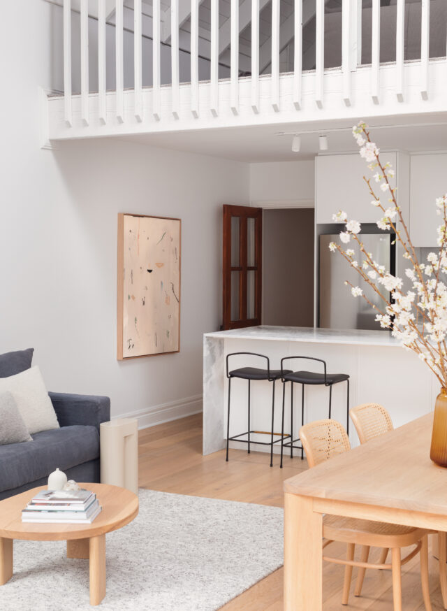
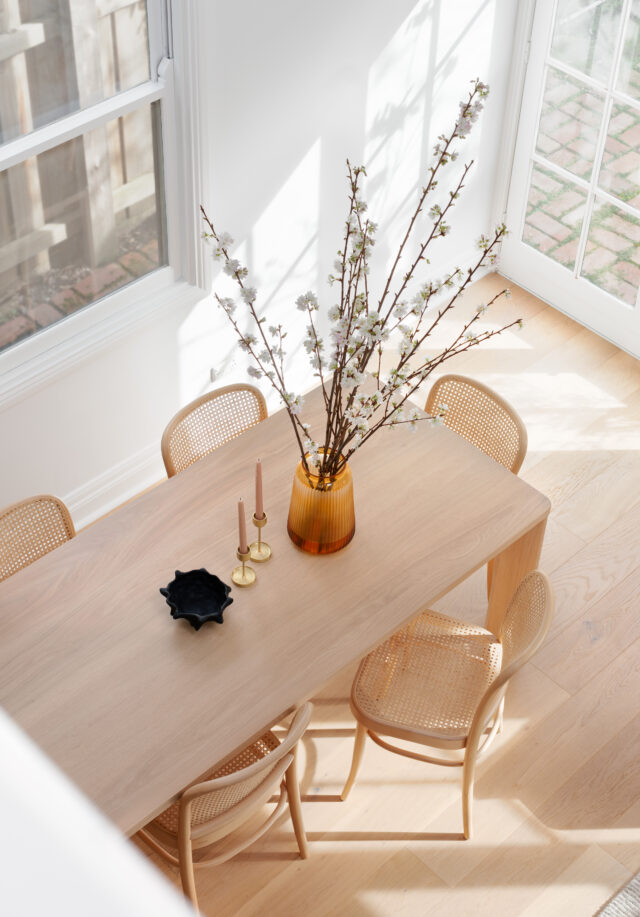
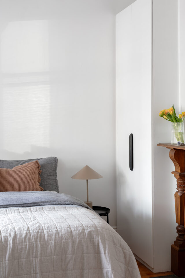
Central to the renovation, the home’s colour palette was changed from warm, earthy and dark tones to a fresh, cool and light scheme featuring soft timbers and natural stone. “Harmony was further bought to the space by linking the aesthetic of the soft furnishings to the colours within the fixed architectural elements,” says Bonnie.
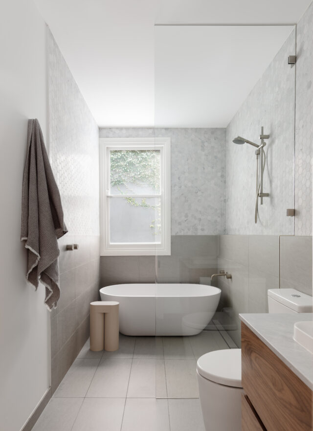
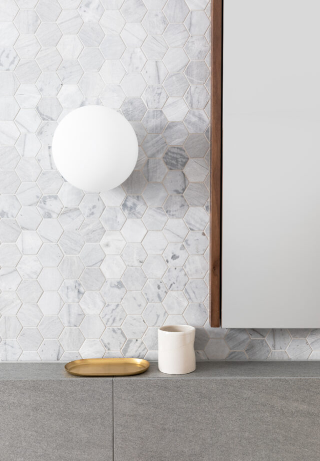
The diminutive bathroom was overhauled too with the bathtub and shower combined to form a unified wet room and allow for the vanity and toilet to remain within the same space. “The laundry was separated from the bathroom by cleverly creating a nook within the hallway for ease of access and subtlety,” says Bonnie.
Photography: Elise Scott Studio | Styling: Studio George
For more on Bonnie Mills Architecture & Interiors
The post Minimalist makeover gives dark Melbourne terrace a light new look appeared first on The Interiors Addict.
[ad_2]
theinteriorsaddict.com


