[ad_1]
Located in Northbridge, on Sydney’s North Shore, this gorgeous abode was overhauled recently by interior designer Lauren Mahoney of Studio Trio. Tasked with updating the home’s dated 2000s aesthetic for a young family, she embraced neutrals and texture to give it a contemporary feel while maintaining a sense of homeliness and warmth. “When I came to the house, it had existing features that were very beige. I had to work to grey it down a bit and used touches of black to anchor it and give it an updated look.”
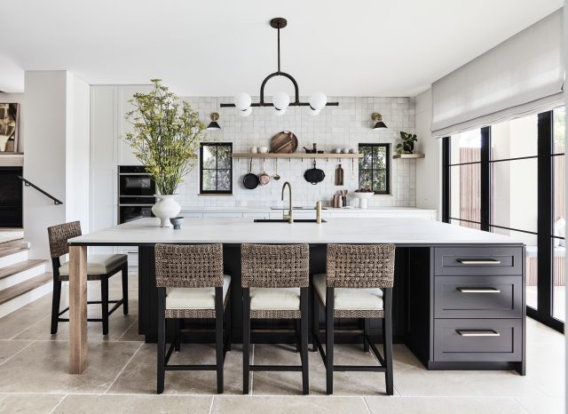
A standout space in the home, and Lauren’s favourite room, the kitchen features a monochrome palette of black and white that is accented by warm touches – brass, timber, rattan and Moroccan Zellige tiles all work to soften the space. “The owner requested no overhead cupboards in the kitchen – mainly because she isn’t very tall. But it meant that we could do a beautiful tile to the ceiling as well as a shelf.”
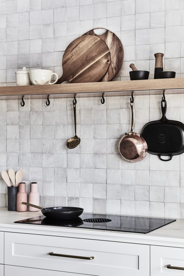
The kitchen shelf is the perfect styling spot and it’s complemented by a series of Society Inc hooks below, which allow for easy access to pots and pans. “The owners love to cook so they love having everything at hand,” says Lauren. Brass tapware from Astra Walker, brass Mark D. Sikes wall sconces from LightCo, and a pendant light and bar stools from Boyd Blue further elevate the aesthetic. “I love the kitchen. It’s simple, not fussy and very beautiful. I am most proud of that space,” says Lauren.
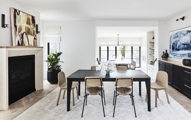
The nearby dining room features new joinery and furniture, and its existing fireplace was refaced with a bevelled mantle and timber top. Oak herringbone flooring completes the luxe look.
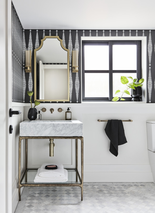
The powder room features Schumacher wallpaper and a unique Carrara marble basin with burnished brass legs that was imported from America through Restoration Hardware. “The owner wanted a glam powder room and I love the space because it’s modern but classic,” says Lauren. A Moroccan shaped mosaic tile from Terranova lines the floor while picking up on the shapes in the wallpaper.
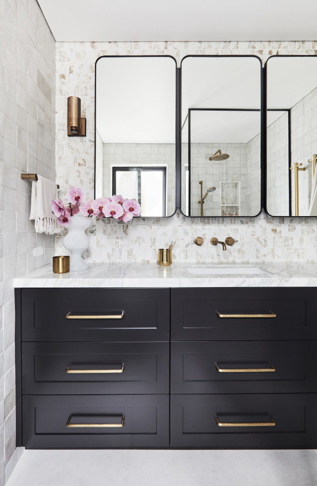
The ensuite features custom made black steel shower screens and shaving cabinets as well as a gorgeous feature tile. “Mosaic tiles behind the shaving cabinet are a beautiful Calacatta Oro marble mosaics and the black shower screens make the space feel modern and add interest,” says Lauren.
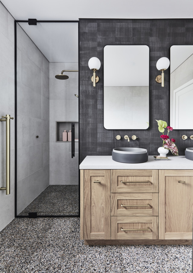
The children’s bathroom was designed around a gorgeous terrazzo tile from Surface Gallery. “The owner really wanted terrazzo in there and we warmed it up with a natural oak vanity,” says Lauren. A double step, two-tone basin from Nood Co. as well as Artedomus tiles and a custom mirror round out the stylish mix.
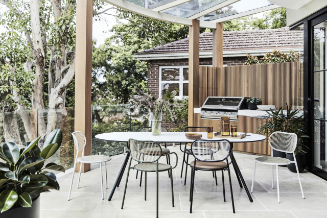
“The outdoor area was a mess. It had a concrete plinth that hid pool pumps and a horrible old glass fence. It really was disgusting,” says Lauren who ended up cladding the area with cedar battening and designing outdoor BBQ joinery to create a space that the family use much more than they did before the renovation.
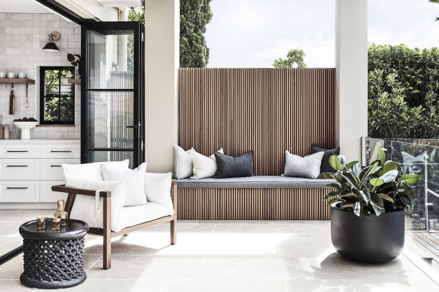
“Overall, the brief was to create a home that was very neutral in tone and texture. Something not extremely modern but that was earthy and up to date,” says Lauren, and I’d say the designer nailed the brief!
Photographer: Maree Homer | Stylist: Jackie Brown
For more on Studio Trio
The post Luxe, textured materials star in modern classic Sydney home reno appeared first on The Interiors Addict.
[ad_2]
theinteriorsaddict.com


