[ad_1]
Whether renovating or designing from scratch, it’s easy to get immersed in the fun part of the design process (colours, finishes etc!) when space planning is just as important. Improving the functionality and workflow of a space is key and this is especially the case in the kitchen. Part of a whole apartment renovation in Sydney’s Manly, this kitchen was overhauled recently with fabulous results.
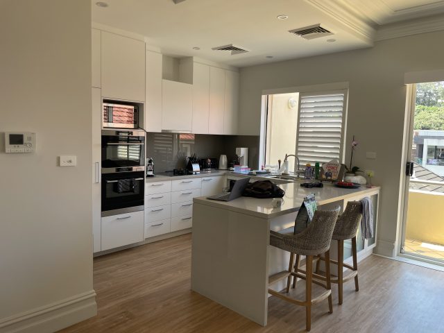
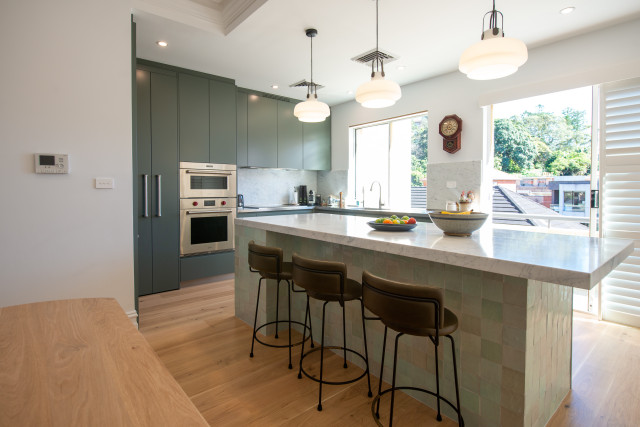
Finishes aside, it’s the change in orientation that has made the biggest difference to this kitchen. “The old island bench has been rotated by 90 degrees and now sits perpendicular to the workspace. This has created an entirely new personality for the space and allows the owners to take advantage of the lovely views from the terrace beyond,” said David Bartlett, Art of Kitchens owner and head designer.
The island bench is the central focus of the design, oriented to allow the owners to fully enjoy the beautiful natural vista outside. “The island is perfectly balanced to provide enough space to be functional, but not so large that it becomes an impediment to good visual flow,” said David. A large overhang creates a casual meals area, and the tiled surface imparts a gorgeous retro feel.
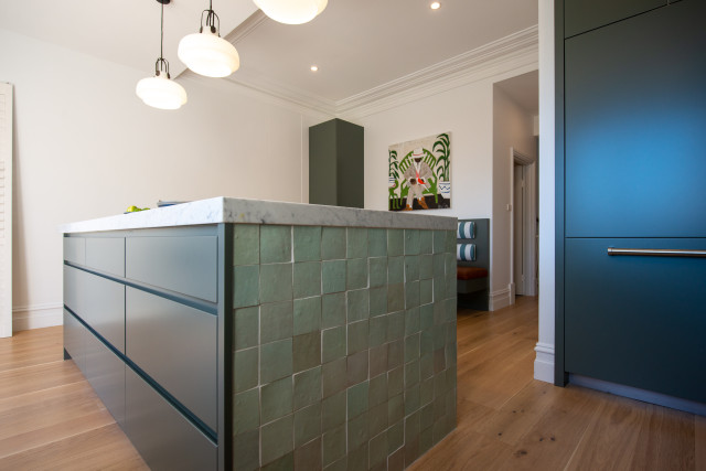
Located by the seaside, the main goals of the renovation were to enhance the owners’ lifestyle and create a connection with nature – this is mostly obviously seen through the colour scheme. “Reflecting the stunning landscape of the exterior, the colour scheme is a lovely balance of Dulux Bottle Green in a satin polyurethane finish together with a Carrara honed marble island benchtop and splashback,” says David. A stainless steel benchtop was chosen for the back run for added functionality and a sink has been fabricated into it for a seamless, hygienic finish.
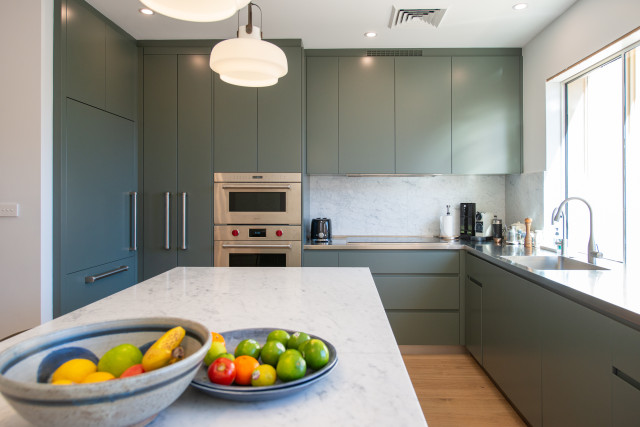
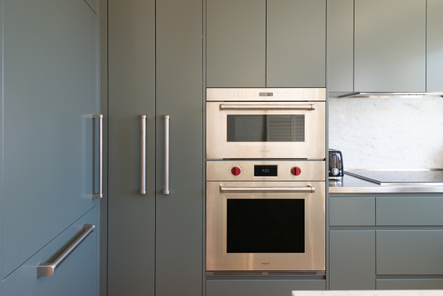
The pantry area is fitted out with LED lighting as well as organisational elements to ensure everything that’s needed is close by and easy to find. A Blum oil drawer is helpfully located adjacent to the cooking zone for ease of access and storage space is maximised by taking the upper cabinets all the way to the ceiling and utilising a range of drawers under the benchtops.
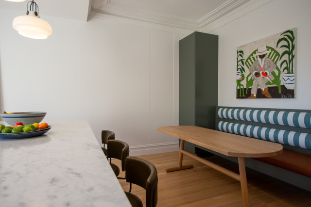
“Of note is the casual breakfast/meals area behind the benchtop. A bench seat provides variable seating options while the playful striped upholstery reflects the main green of the kitchen cabinetry. The freestanding timber table has a shape reminiscent of a surfboard, further reflecting the beachside location of the apartment.”
For more on Art of Kitchens
The post Kitchen reno proves space planning just as important as finishes appeared first on The Interiors Addict.
[ad_2]
theinteriorsaddict.com


