[ad_1]
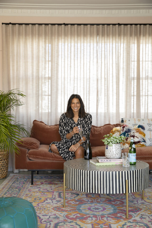
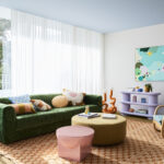
When interior designer Rachel Collard first perused this 1940s Mount Martha beachside shack, she had every intention of knocking it down and replacing it with a brand new build. But instead, she fell in love with the area (there’s hot springs, wineries, breweries and miles of beach) and decided to perform a cosmetic flip on the abode which she has affectionately titled Miss Morris. With a comfortable work/life balance as the goal, Rachel splits her time between Melbourne and the home which is also available to rent for short stays.
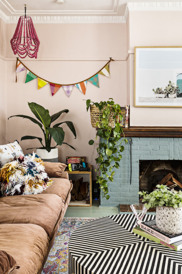
“The home’s maximalist feel came from me wanting to be able to give other people and myself an alternative to the normal cookie-cutter homes in the suburbs. So I decided to play with colour and have fun so when that people come and stay at Miss Morris they feel like they’re on a getaway,” says Rachel who runs her own business, R&Co.Design.Studio.
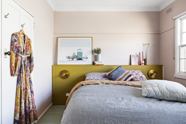
In describing the maximalist design aesthetic in general, Rachel explains that while most people think it’s just a huge amount of stuff and colour thrown into a room, all the choices are very deliberate.
“It’s about getting the balance of colours and textures right. Everything is very considered, despite how it looks,” says Rachel who recently went on interior designer Simone Haag’s tour of LA where she got to experience some incredible homes in the maximalist vein.
“What struck me was how much fun they have over there with materials and colour. Nothing is safe and it’s about personality and not fitting in with trends,” says Rachel who shares her top maximalist tips with us today.
Layering
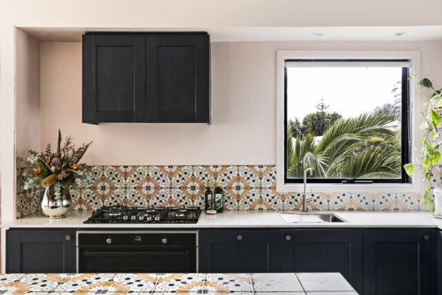
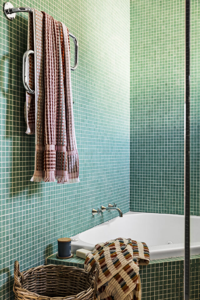
The layering of materials and finishes is central to the look. “For example, if you paired striped and spotted fabrics you would need to include a plain or flat surface to offset them. It’s about creating negative and positive spaces as well as breathing space,” says Rachel. It’s important to get the scale of your patterns and textures right too – finding the right balance helps make a home feel considered and not chaotic.
“Grouping is another important part of laying. Put a cluster of objects/vases or plants in one corner then leave the other bare to give the eye a break,” says Rachel.
Colour
“Start with cool or warm palette and then commit to that. Colour is a feeling. Does it make you feel happy? Does it make you want cosy up on the couch? For me it’s important to create emotion when you move into a space,” says Rachel.
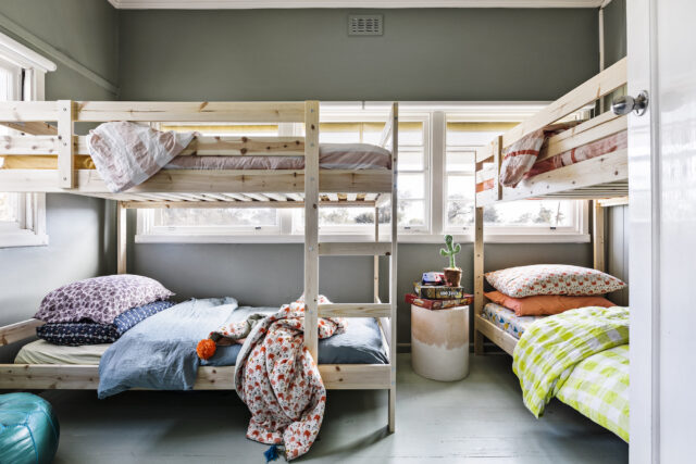
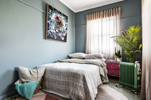
Rachel always wanted to use colour in this home as she didn’t want white, blank canvas walls. Obsessed with pink at the time, a custom Porter’s Paint blush shade adorns the walls and Porter’s Paints’ Glasshouse transformed the home’s timber floor. A seafoam green, the floor colour references the ocean and was designed to bring the outside in.
Go bold or go home
“Don’t worry about what other people think. If this is a style you love, keep going on that journey. Most people can’t create this type of look. It’s about having faith in what you can achieve and sticking to your guns,” says Rachel.
When Rachel embarked on this home, most people thought her design brief wouldn’t work but feedback has been nothing but positive. “It’s big and bold and people remember it.”
Photography: Spacecraft
For more on R&Co.Design.Studio | Too book your stay at Miss Morris
The post How to embrace colour & maximalist style in your home appeared first on The Interiors Addict.
[ad_2]
theinteriorsaddict.com


