
2024 Dulux Colour Awards jury member Nick Travers, is the co-founding director at Melbourne and Albury based Technē Architecture + Interior Design. Here, he shares three insights into the transformative power of paint, the case for colour and embracing it on the walls of homes.
Hospitality design takeaways for the home
Because of Technē’s hospitality beginnings, we’ve never been frightened to use colour and this sensibility is embraced across all project sectors. It has become a core part of the palettes we explore enthusiastically for its theatrical effect and ability to tailor an intended ambience.
In social and public domains like restaurants and bars, we seem more willing to experience the full psychology of colour, but when it comes to domestic settings and putting paint on the walls, it can be overwhelming to navigate the spectrum and in most ways, a palette of neutrals is nothing short of a sure bet. It is easier to be reticent and take a safe position on decisions about the use of colour, but transformational results can also be yielded when we simply approach residential spaces with a considered hospitality sensibility.
Setting a distinct mood and experience for diners inside the neoclassical building at London’s Sketch, India Mahadev has played with hues of soft pinks in The Gallery to evoke a grounding intimacy and femininity, while its latest iteration illuminates proudly in a setting of copper and sunshine yellow. Instilling the interiors with an innate warmth, the signature flood of colour is crucially enhanced against a highly layered material and textural palette.
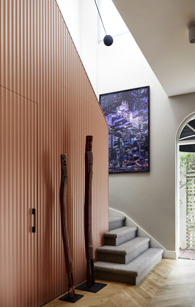
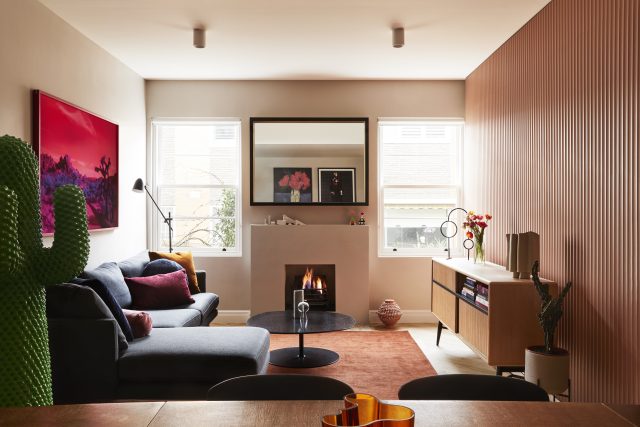
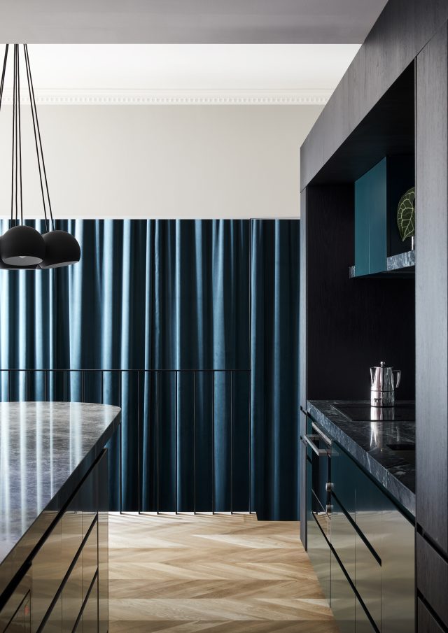
In the case of my own home, Monomeath House, one of a set of townhouses in a 1930s structure, washes of colour were similarly used to create a sense of surprise and delight that counterbalances the conservative architecture people first are introduced to. Warm peach tones envelop the family living space, and rich emerald greens lead a trail from the kitchen down to the rumpus room, imbuing the home with a bold sense of playfulness and theatre. Complemented with carpets, textural cladding and oak flooring, a homely and inviting feeling grounds the residence throughout.
Rethinking the classics: does art need white walls?
While white walls may be the go-to for art displays, don’t be afraid to embrace colour for a bold, distinctive backdrop that adds life to a space and sets a tone to experience the art.
Some spaces naturally lend themselves to displaying art against dynamic colours. Make the most of a hallway or stairwell by arranging pieces salon-style at varying heights, but take it a step further with a coat of deep red paint to the walls. Similar to The National Gallery of Victoria Salon, its effect evokes a classical atmosphere that is intimate, refined and sophisticated, while naturally spotlighting the artworks through this contrast.
Alternatively, for less drama but the same boldness, assess the intended artwork or collection for its dominant hue and paint your walls in line with its tonal palette. If you’re spotlighting a beachside landscape, a sky blue shade could magnify the tranquil and calming nature of the work and embed it into the space. Creating a monochromatic colour story that compliments the tones of the pieces can create enveloping environments that encourage a sense of journey through the home for yourself or your guests.
Colouring as a tool to shape and form
Aside from its impact on our emotional interpretation, colour can also be applied sculpturally to alter perceptions of space and add visual interest. Look to the work of Luis Barragán. A master of vibrant colours and spatial composition, his tactical applications of colour on architectural elements interplay with light and dimension to create structures shrouded in mystery, vitality and abstraction among its landscape.
When you’re confronted with a space that is quite ill-defined or featureless, colour boldly like Barragàn. Looking at the contours of physical structures, evaluate the ways that colour can be strategically placed on planes and volumes, and discover how colour blocking can add depth, define sections, focus attention or balance disparate proportions.
Over in Dale Frank’s regional NSW home, the 19th Century estate is transformed with rooms lined with walls of blues, reds, oranges and pinks. In the front rooms, different shades of green extend up into the ceiling and become an extension of the surrounding gardens within sight line — a technique that gives the illusion of an unwavering connection to the peacefulness and restorative disposition of the natural landscape.
Whether in grand public venues or in the privacy of residential dwellings, thoughtful and strategic use of colour has the power to dramatically transform our environments and what we experience in them. Just as the works of innovators like Luis Barragán and India Mahdavi reveal, colour is a tool to instil rooms with intrigue, emotion and life when wielded with imagination and confidence. Remember, it’s just paint! Fundamentally, it is relatively the simplest thing to change and experiment with.
–Technē Architecture + Interior Design is a leading mid-sized design studio based in Melbourne. Directed by Nicholas Travers, Justin Northrop and Steve McKeag, Technē has contributed to Australia’s modern design aesthetic by creating spaces that enrich the human experience.
The post How to be braver with colour in your home: learn from hospitality appeared first on The Interiors Addict.
theinteriorsaddict.com


