The owners of a run down terrace in Redfern worked closely with architects Thodey Design to transform the traditional street-facing house in the trendy Sydney suburb into a light-filled home with pool for their young family.
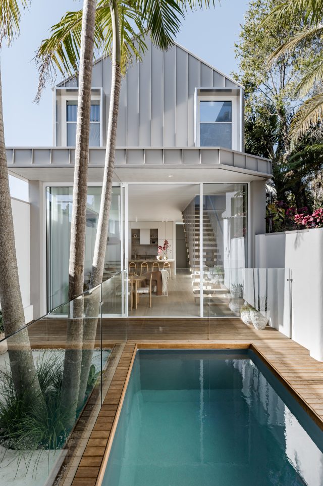
Set on a small plot, relative to its inner-city location, the brief was to open up the existing home, build up a level and to create a light-filled sanctuary for the owners and their three young children.
Homeowner Drew Mansur, co-founder of TileCloud, describes the style of the home as ‘warm coastal’ with modern Australian vibes, and worked closely with interior designer Kate Lawrence to achieve this look. Now a perfect match for their current family dynamic, the home exudes a relaxed and liveable ambience, delivered through a minimal aesthetic that has been injected with warmth throughout.

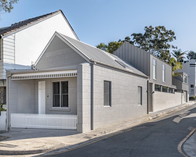
The existing home lacked flow and cohesion, its layout had a rabbit warren feel of long corridors and closed off rooms and it required a sophisticated rework of the floorplan in order to meet the homeowners’ vision. Council restraints meant the traditional exterior features of the heritage home needed to be retained, but otherwise it has gone through a complete transformation, with the interiors having been ripped out and rebuilt.
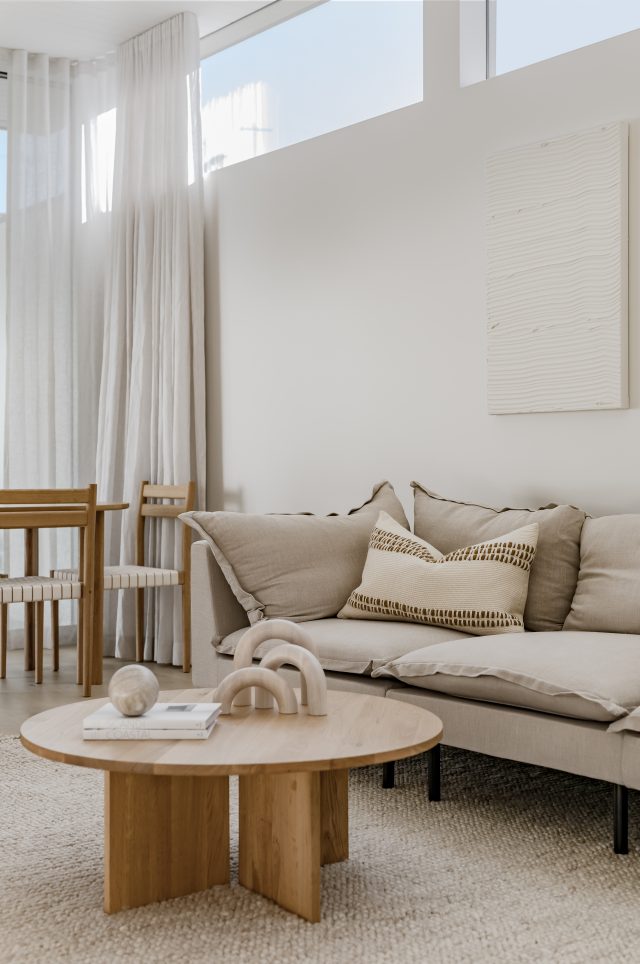
“The heritage house was tired and dated so we knew it had to be a big transformation to create the desired finish,” says Drew. “Lots of closed off rooms and a long windowless corridor left the place feeling gloomy and closed in.”
The stunning new dwelling consists of two bedrooms and a bathroom on the upper level with the downstairs comprising of a primary bedroom with ensuite, a guest bathroom, powder room and laundry as well as an open plan living/kitchen/dining area that flows seamlessly through to an outdoor oasis, complete with swimming pool and a separate garage/studio for guests.
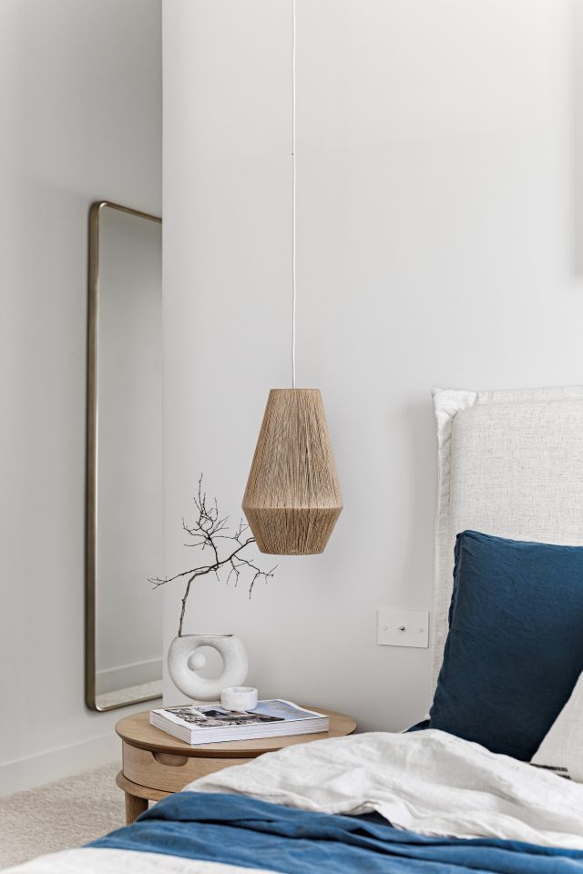
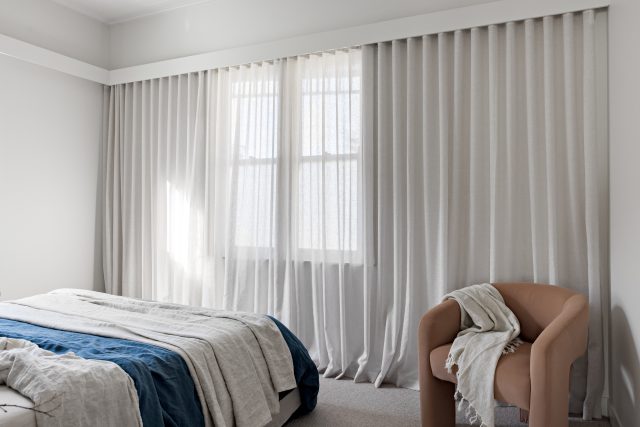
Sleek lines and a neutral colour palette are some of the defining features of the home, which has been softened through warm neutral tones, textured finishes and curved interior elements. Central to creating a seamless flow throughout the house was the transformation of all the walls and, with an understanding that the right type of building materials can really impact the longevity of a renovation, the homeowners selected to use CSR Gyprock’s premium plasterboard product, Gyprock Plus to line the walls. “Finishes are what truly make the design of the home feel complete,” says Drew. “We have three young kids under the age of six so it’s safe to say the house is going to be stress-tested over the next few years in particular! We went with the Gyprock Plus, as it’s a lightweight 10mm thick plasterboard, which is denser and more impact resistant than standard 13mm Gyprock, meaning we will be patching less knocks and dings in the high traffic areas.”
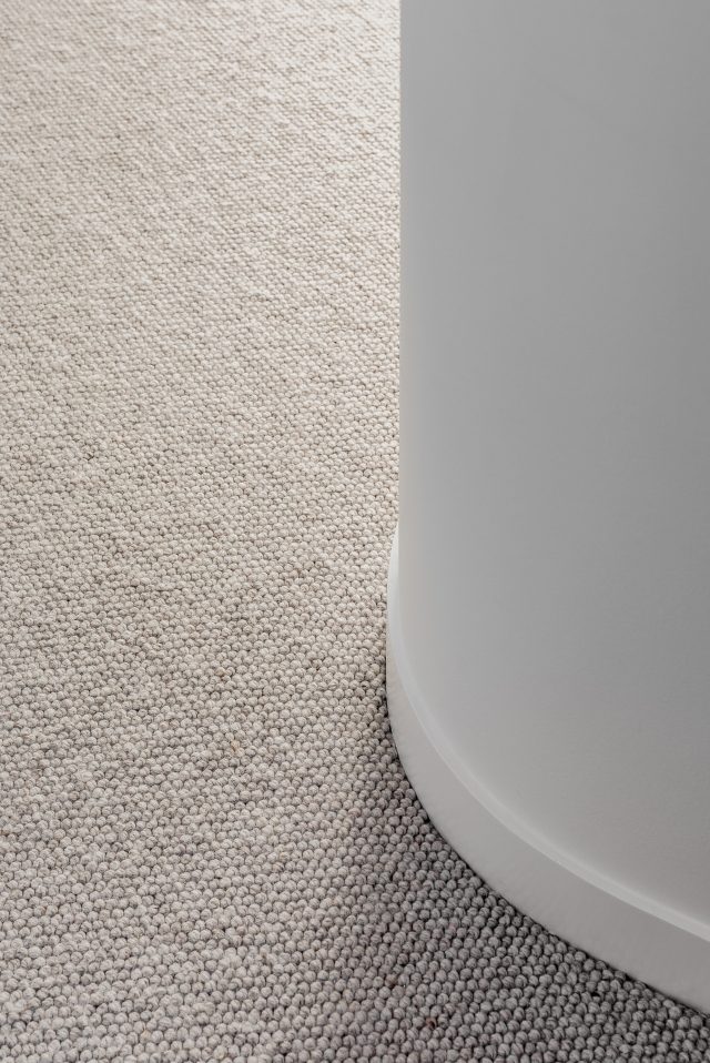
He adds: “It also meant we were able to achieve perfectly crafted walls. We have heaps of skylights so the long vertical shadows would have been a nightmare for poor products and workmanship. Fortunately, it was up to the challenge.”
Natural light was a key factor in creating the desired ambience and the home has been punctuated with skylights throughout. A huge window in the upstairs hallway and large sliding doors on the ground level also work to capitalise on the light flow, opening up the home beautifully.
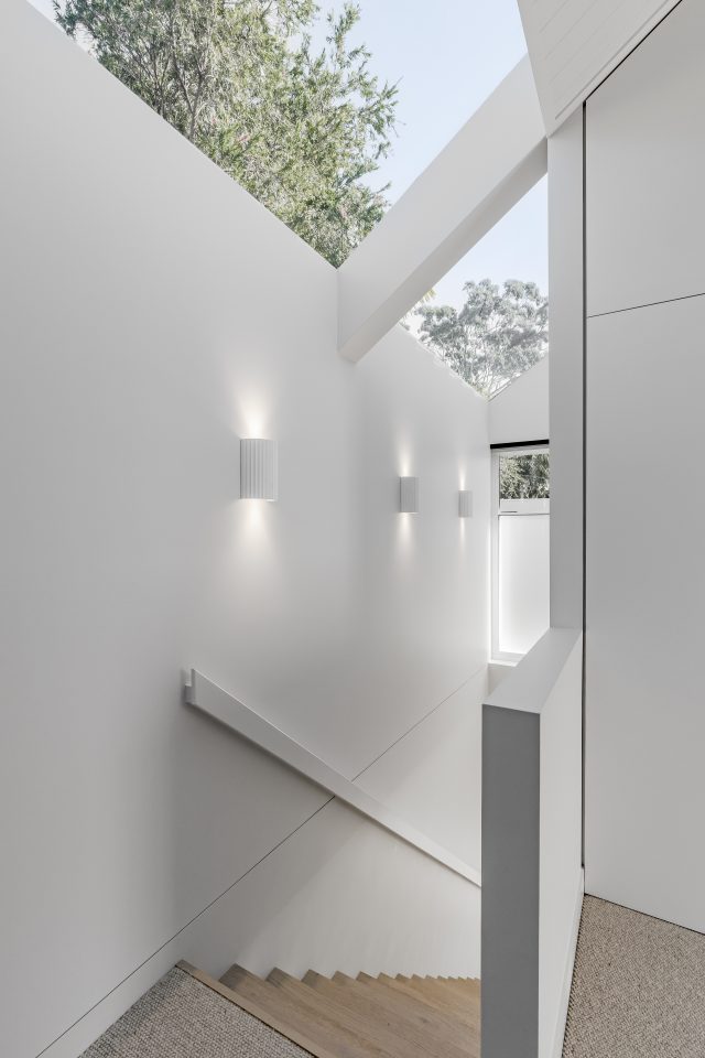
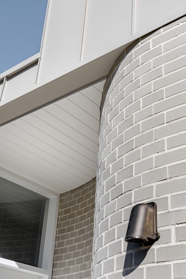
A major move for the interior floorplan was to move the original front entrance of the home to the side, which enabled a more cohesive flow, and maximised the communal spaces. The new entry way from the exterior now features a curved brick, which works to soften the cooler grey exterior tones. The curve of this wall is mirrored on the interior and was achieved using Gyprock Flexible. “We used two layers of 6mm Gyprock Flexible to bend around the feature curved hallway walls in the main entry, master bed and upstairs circulation space,” says Drew. “These have to be one of my favourite features of the house as they add so much perceived space to the size of the hallways. We absolutely love them.”
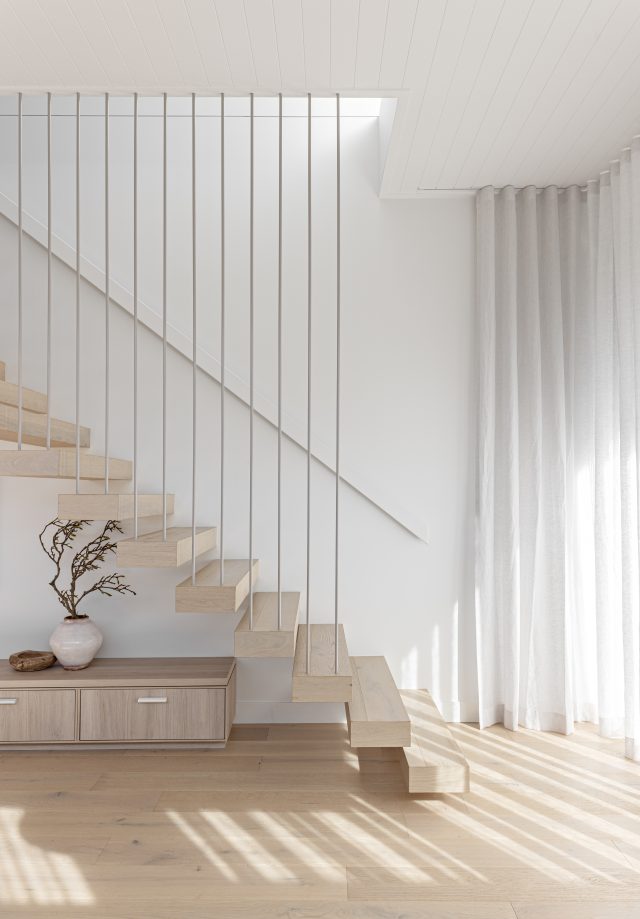
Other favourite features of the home include the stylish floating stairs. “The floating stairs are a real point of focus and help to reinforce a modern and contemporary space,” says Drew.
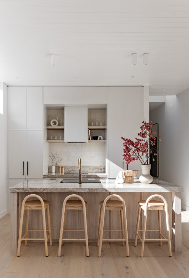
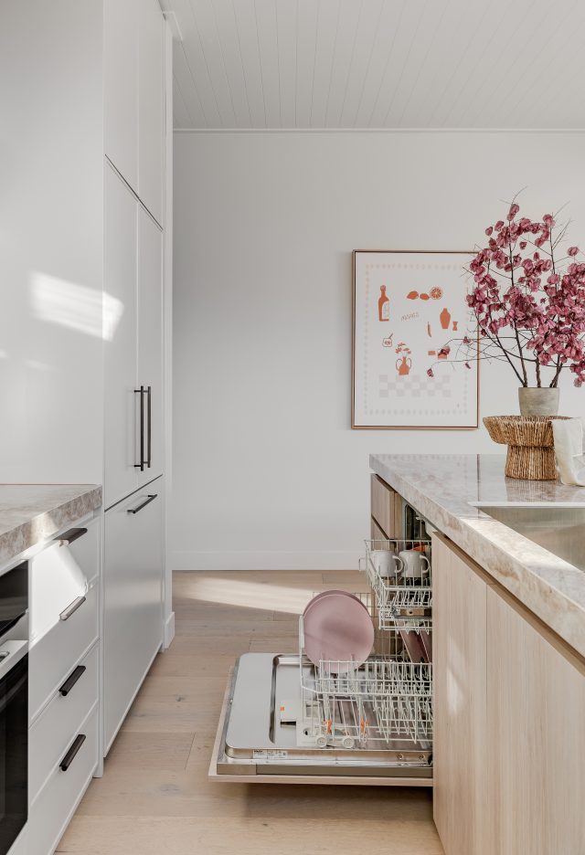
Being the heart of the home, the kitchen was a major part of the renovation and features crafty niches and integrated appliances. A curved benchtop creates a sense of flow and cohesion in the open plan space and works alongside other common elements in the scheme. Textured accents bring character to the palette and work to achieve the consistently warm and inviting aesthetic.
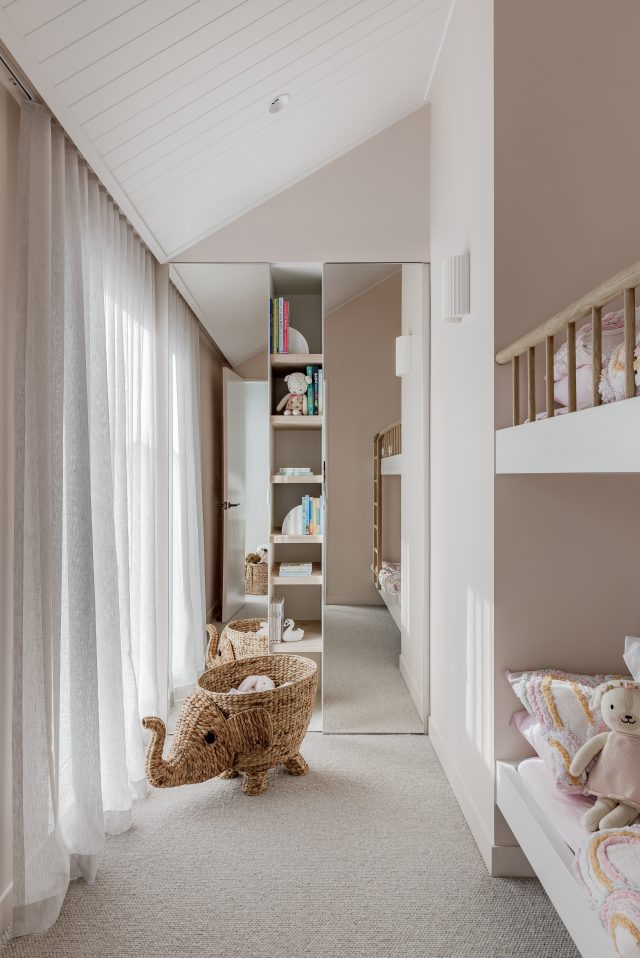
The children’s bedroom and baby’s nursery each incorporate fun and whimsical designs choices, in keeping with the mood of the home. While the master bedroom suite comprises a classic colour combination of oatmeal and royal blue, underlined through a mix of natural textures.
“It is such a joy to be living in our finished home and to see our vision realised. We gained plenty of inspiration from a massive moodboard of amazing projects from Kate Lawrence, Kyal and Kara, The Stables, Josh and Jenna and Thodey Design, just to name a few,” says Drew. “We felt inspired by their beautifully finished interiors, and overall timeless, yet contemporary feel and feel satisfied that we’ve achieved the same in our own home.”
For more information on Gyprock products
For more on Kate Lawrence Interiors and Thodey Design
The post Gloomy Redfern terrace transformed and extended for young family appeared first on The Interiors Addict.
theinteriorsaddict.com


