[ad_1]
If you want to be bold with colour in your home but don’t know where to start, consider these helpful hints to steer you in the right direction.
Interior designer Carlene Duffy shares how to integrate colour into every room as we take a tour through this bold-hued dream home.
(function(videojs) {
var videoId = “6307899609112-72”;
var video = videojs(videoId);
var globalId = “iris_6307899609112_72”;
video.pluginDev(videojs.mergeOptions({}, {
start_up_next: false,
end_up_next: false,
global: globalId,
ssl: true,
thumbs_down: false,
thumbs_up: false
}));
})(window.videojs);
(function(videojs) {
var videoId = “6307899609112-72″;
var durationElement = document.createElement(‘div’);
durationElement.className=”vjs-overlay-duration”;
var durationFragment = document.createDocumentFragment();
durationFragment.appendChild(durationElement);
var video = videojs(videoId);
video.overlay({
overlays: [{
align: ‘bottom’,
content: durationFragment,
showBackground: false,
start: ‘loadstart’,
end: ‘play’
}]
});
video.on(‘loadstart’, updateVideoDurationOverlay);
video.ready(function() {
var isOverlayActive = true;
video.on(‘play’, function() {
if (isOverlayActive) {
isOverlayActive = false;
video.overlay({
overlays: []
});
}
});
updateVideoDurationOverlay();
});
function updateVideoDurationOverlay() {
var myPlayer = this;
if (myPlayer.mediainfo && myPlayer.mediainfo.duration) {
var duration = secondsToMMSS(myPlayer.mediainfo.duration);
durationElement.textContent = duration;
}
}
function secondsToMMSS(totalSeconds) {
var minutes = Math.floor((totalSeconds) / 60);
var seconds = totalSeconds – (minutes * 60);
// remove any decimals
seconds = Math.round(seconds);
var result = minutes + “:” + (seconds < 10 ? "0" + seconds : seconds);
return result;
}
})(window.videojs);
A warm entrance
This home offers a colour journey that unfolds as you make your way through.
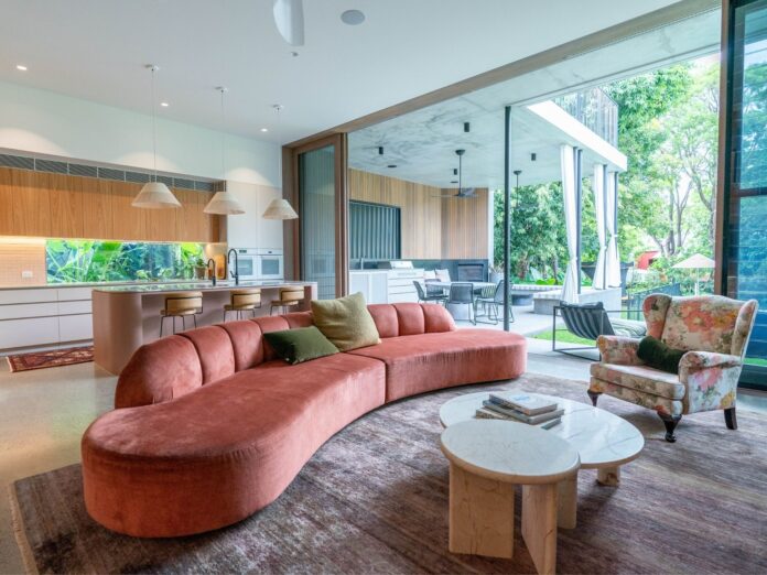
The ground floor is warm and inviting — “like an afternoon glow” — and the colour palette changes as you move upstairs and beyond.

Warm tones, like dusty pinks, ochres and rust-coloured reds, plus plenty of timber helps to create an inviting vibe in the open-living ground floor.
You can even use colour in unexpected places. For instance, the kitchen features a custom-coloured island bench.
The setting sun tone of the island bench was colour developed by Carlene using the Taubmans Coloursmith app, which she called ‘Golden Hour’. The Coloursmith app allows you to take photos of anything you like, hone in on a particular hue and have it made into a custom paint colour. It’s an easy way to locate colours you love and bring them into your home.
Paint the ceiling the same colour as the walls
Upstairs, Carlene used a lot of green in the living and bedroom spaces.

While the living area utilises different shades of green to accent different features, the bedroom uses the same sage green colour across all the walls and the ceiling.
“Don’t be afraid to paint the ceiling the same colour as the wall, even if it’s a bold colour,” Carlene encourages. “A white ceiling in [the bedroom] just would have been stark against the richness of the green.”
Create flow with half-strength colours
There’s no need to shop for a completely different shade for different walls or rooms in your home.

Carlene suggests creating continuity by using a half-strength of the same colour to theme adjoining rooms, ceilings and different features of a room.
“It creates cohesion but also a sense of light and shade,” she confirms.
Highlight features with different colours
In one bedroom, Carlene used a slightly deeper version of the wall colour on the ceiling to emphasise the unique details of a pressed metal ceiling. This subtly enhanced this gorgeous feature.

This is also another example of ways to veer away from a white or contrasting ceiling. While many believe a white ceiling will make the room look bigger or brighter, it can instead interrupt the flow and have a jarring effect.
Carry colour themes throughout separate but nearby spaces
The tones of this home get cooler the further in you go through it. Carlene created two blue bedrooms and carried a similar tone through the bathroom. She tied the rooms together by using similar-coloured soft furnishings, like cushions and decor.

“There are a lot of colours in this home, but because they’re transitioned gently throughout the overall outcome is cohesive and calm,” she explains.
You don’t have to paint every space the same colour, but think in ‘zones’ or consider how you can tie adjoining rooms together through highlights (or lowlights) and complementary decor.
The post Carlene Duffy’s top colour tips for your home appeared first on realestate.com.au.
[ad_2]
www.realestate.com.au


