
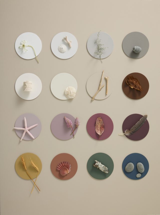
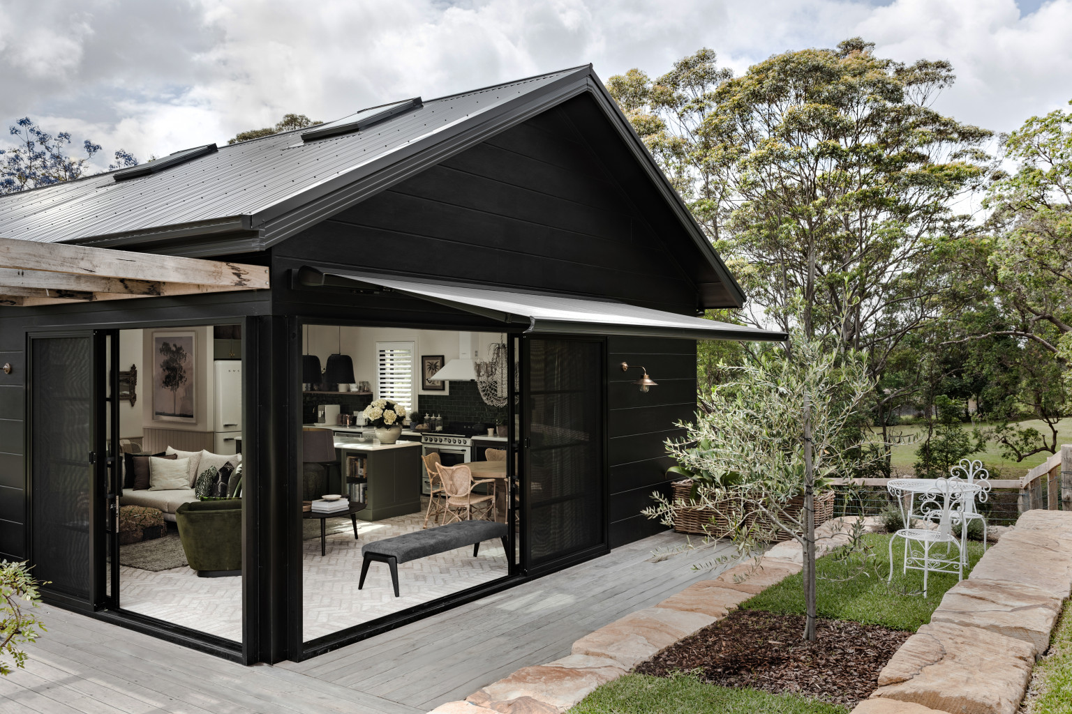
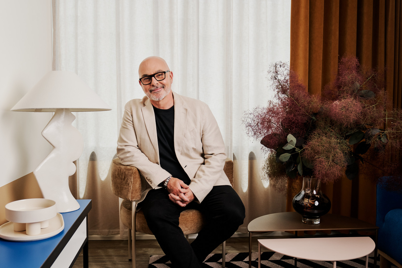
An enduring love of the ever-changing landscape of his own home has inspired interior design expert and Wattyl brand ambassador, Neale Whitaker, to create a colour collection for Autumn/Winter that brings the essence of nature’s autumnal hues into the living areas of our homes. Designed as a seasonal extension of his Spring/Summer 2023 palette, this collection is a warmer, richer, earthier iteration of the original, with a slight bias towards landscape hues rather than coastal.
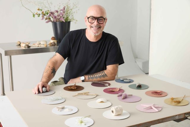
“I live in the Shoalhaven region, where the coast meets the country, so I am constantly inspired by nature’s ever-evolving seasonal colour palette. To me, the colours of the local landscape are as impressive as those of the ocean and beach – so for this new palette I have focused on the subtle seasonal changes in elements such as bushes and flowers, sand, driftwood and shells. I think this palette perfectly captures those subtleties and their endless variations – it feels so uniquely Australian to me.”
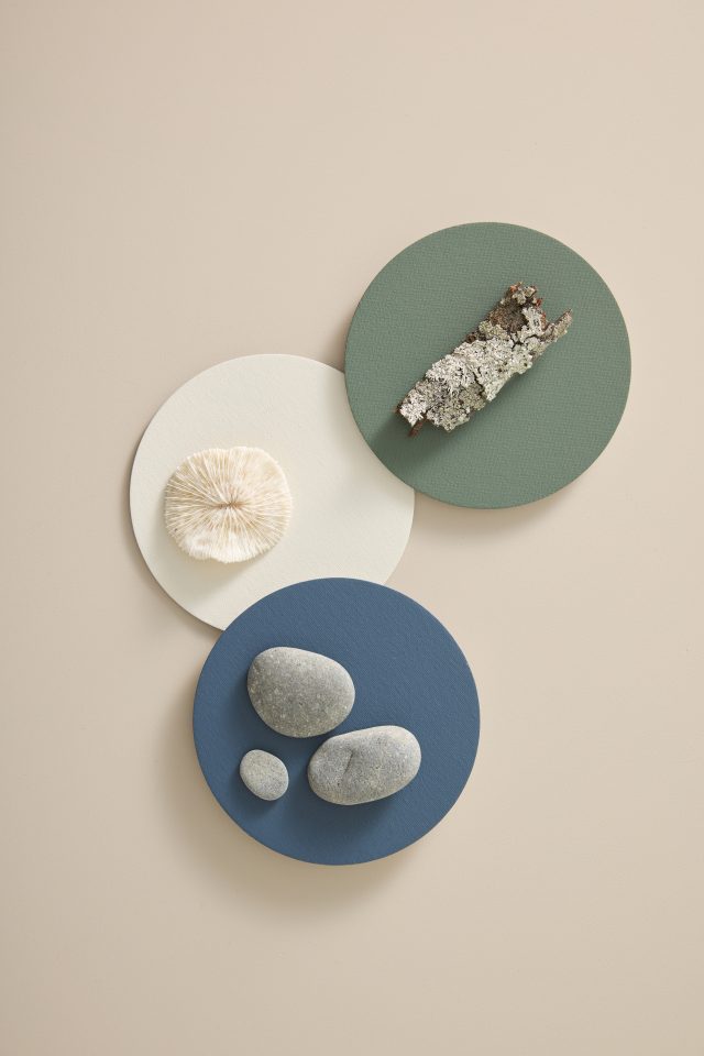
One key feature of this new collection is that all of the hues work well together, and can be used to create a variety of moods and ambiences, irrespective of style or architecture. There are, however, some natural partners within the palette that work particularly well with different areas of the home.
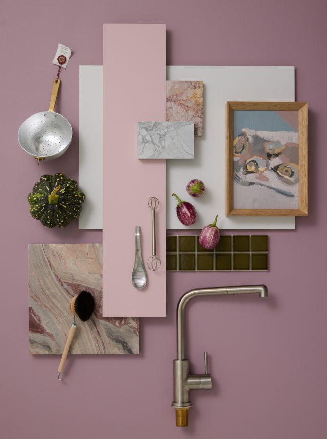
COOK: “These hues create a fresh, contemporary palette for a kitchen.”
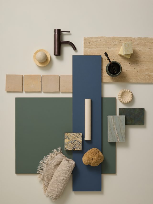
BATHE: “A palette that brings a moody, coastal feel to a bathroom.”
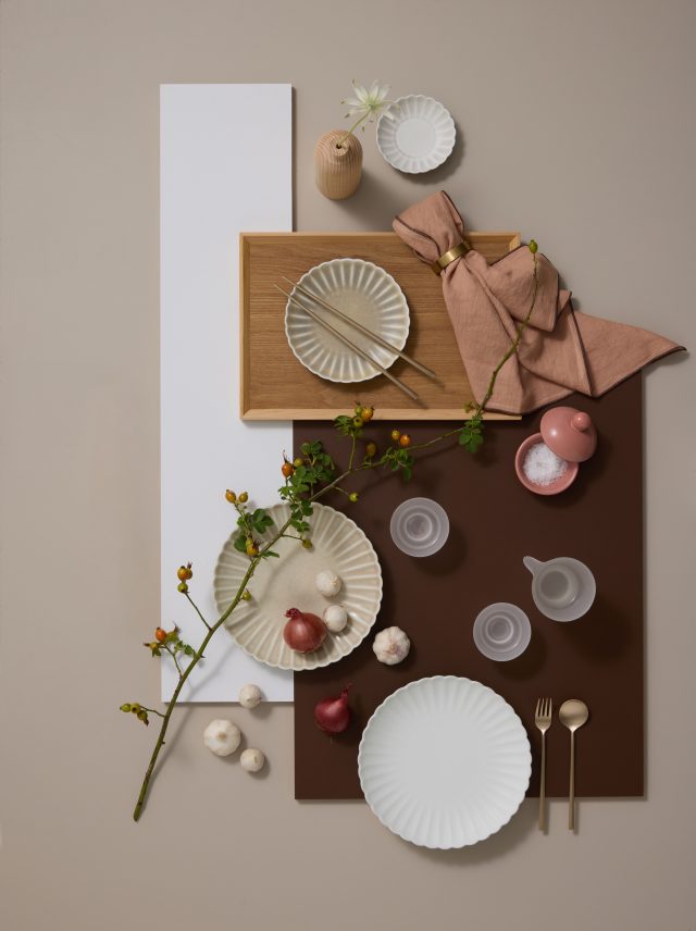
DINE: “Warm, earthy hues to enrich the dining experience.”
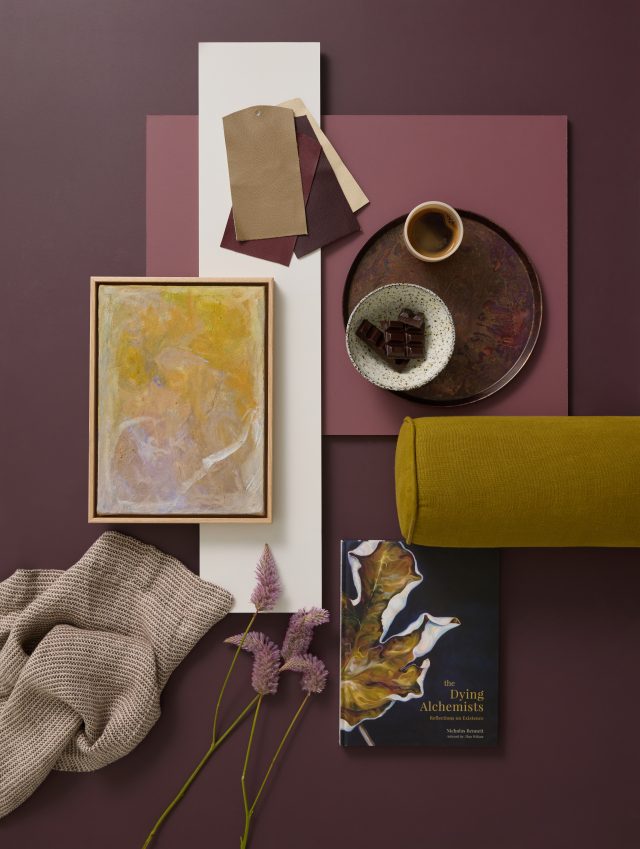
RELAX: “Colours to add depth and warmth to a living space.”
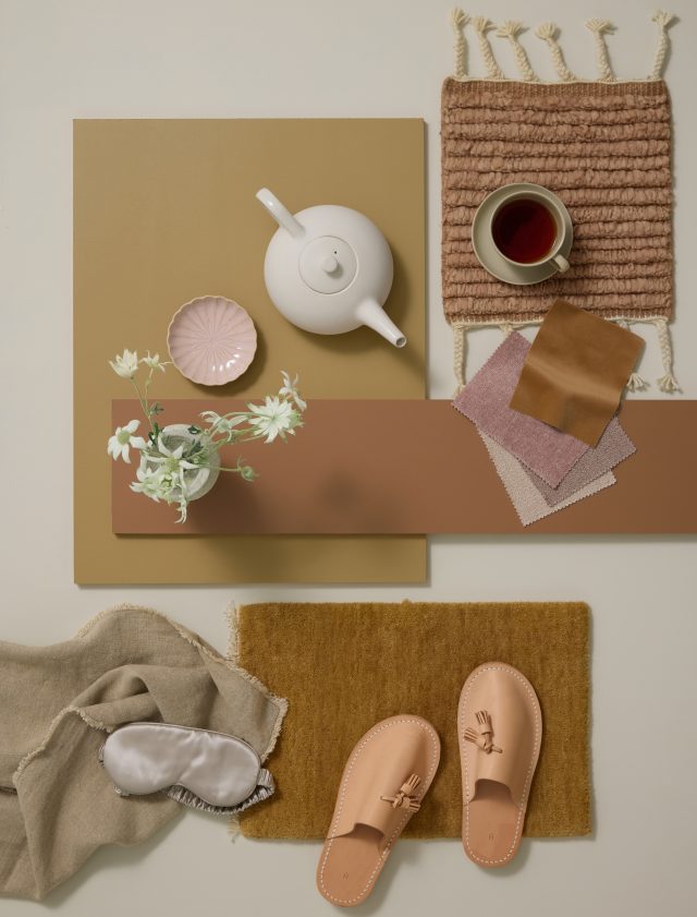
SLEEP: “A beautifully warm, neutral palette for a bedroom.”
There are a total of 16 colours, each selected to inspire and aid the consumer in introducing a sense of warmth and comfort for the cooler months. “Adding colour through painted surfaces is hands-down the most effective way of creating mood,” says Neale. “And having drawn these colours from nature, they will never feel inappropriate or dated.”
While colour is a focus for Wattyl, sustainability and the reduction of environmental impact remains a top priority. Wattyl I.D. Advanced interior paint features an ultra-low VOC formula of less than 1g/L (one of the lowest VOC interior paints on the Australian market) – for better indoor air quality post painting.
For more on Wattyl
The post Bring autumn into your home with Neale Whitaker’s latest colours appeared first on The Interiors Addict.
theinteriorsaddict.com


