[ad_1]
Browsing the images of any designer home, it’s not uncommon for mere mortals to find themselves wondering where all the clutter and brick-a-brac fits — those unsightly signs of everyday life! ODO founding director Samson Tiew can fill you in on the secret. “It’s all tucked away behind hidden doors,” he laughed.
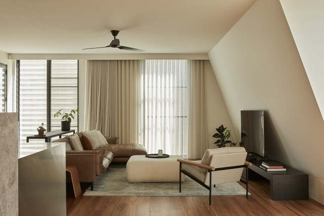
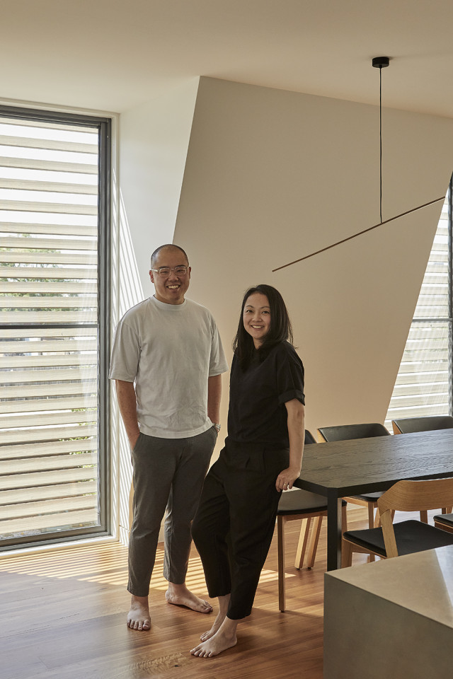
In fact, the architect can testify to this first hand, having recently completed his own three-bedroom home in Richmond in Melbourne’s inner east, where he lives with his wife, educational toy designer Beatrice Tiew, and their three children.
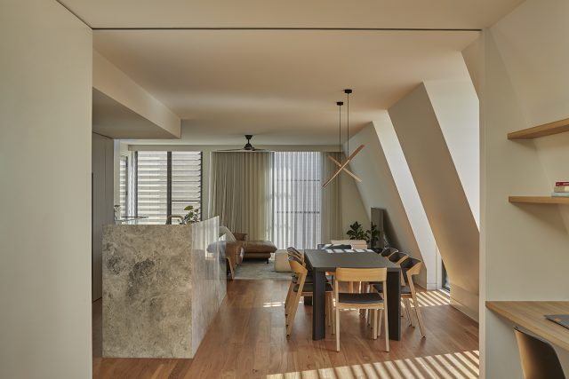
Affectionately coined ‘Two Fold House’, the name stems from the duality of the project, from the subdivision of its original property into two homes (the other for his sister), as well as the functionality of the design, which maximises clean lines, hidden doors and “hardworking” walls, to divide work and play within the 198 sqm home, creating an ultimate sense of calm and tranquillity amid the hustle of family and city life.
“As a designer, I do feel a responsibility to present a sophisticated home that can entertain guests in a way that reflects my craft. But as a father, I also know that life is all about those other noisy, messy moments. It was important to us that our family home could do both, which is where the ‘twofold’ nature of our home really began,” Samson said.
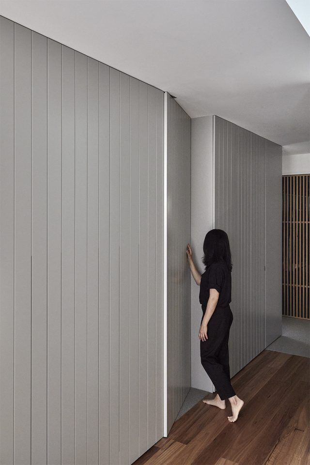
“There are many thoughts and surprises that come with the design. The integrated joinery doors tuck things away, and the walls work really hard — there is always another facet or element to reveal itself within the house. Evoking a sense of functionality, but also play, we wanted to dive a bit deeper and create more layers to be discovered.”
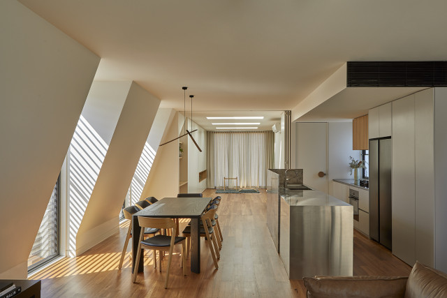
Beyond the kitchen and living room, sliding bi-fold doors cast a dividing line across the open plan space. Vertical detailing hides the joints in the door so that once closed, a continuous, minimalistic wall instantly transforms the room from very much lived in to ready to entertain guests.
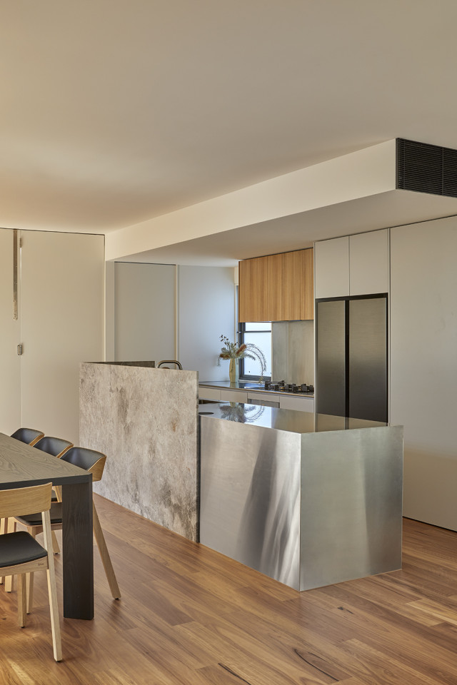
With the wall creating a simplified, timeless canvas for the shifting seasons of family life, Samson has been careful not to over-stylise the home, opting for a muted palette. Locally-sourced blackbutt flooring softens stainless steel details exemplified in the kitchen bench, a mess-free surface that brings another utilitarian functionality to the family home.
The juxtaposition between repose and play is also carried into the division of the top and bottom floors. On the ground floor, entry shrouds and bay windows contribute to well-insulated bedrooms to create calming spaces that are cool in summer and warm in winter. Upstairs, attic windows break up walls from the inside, with windows maximising the openable area for cross-ventilation, circulation and city views. Upstairs, a rooftop terrace awaits. The result is light, airy and energising.
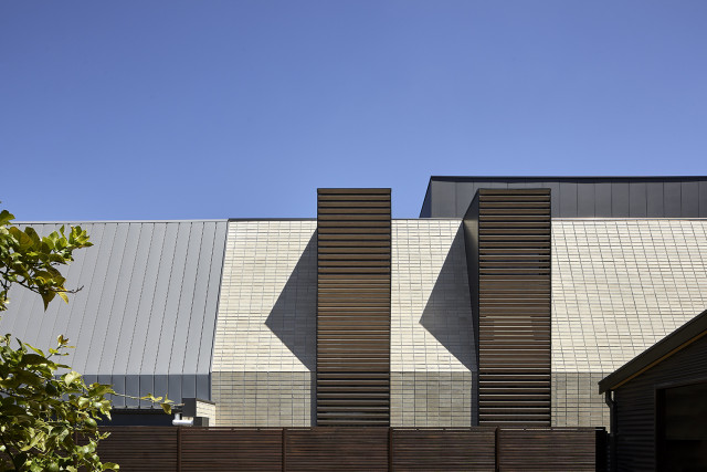
Outside, the unconventional approach to design has led to significant innovation. In keeping with the motif of the fold, a pentagonal brick facade has been clad with a stacked brick material rather than conventional brick bonds. Through collaborative efforts with PGH Bricks & Pavers, the designer has used a new system to lay the bricks on an angle. A beige colour palette creates an earthy appeal that takes inspiration from the surrounding streetscape and limits any detraction from the site context.
The twofold nature of this family home extends to the subdivision of the original site. The couple embarked on the project with Samson’s sister, who lives in the house at the site’s street frontage. Samson and Beatrice’s home sits behind, relying on shared access to car spaces and access from a pedestrian walkway behind the street.
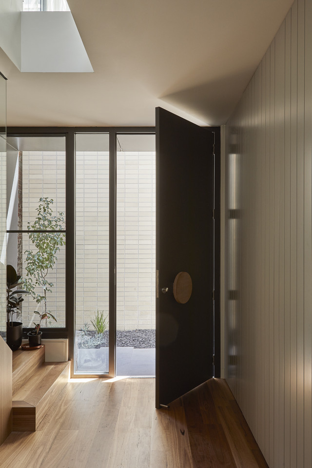
With just a nine-metre street frontage, Samson said it was his experience with larger residential projects that spurred the concept for two efficient, square floor plates, rather than the traditional longhouse model seen in many Melbourne townhouses.
“Sometimes, the general public can be fixated on clarity of land ownership, but then you end up with a compromised layout that doesn’t really work for all lifestyles. At Two Fold House, we have embraced the ambiguity of ownership and shared space to arrive at an outcome that’s more liveable,” he said.
“Shared common areas are normal in apartment buildings, with shared hallways and car spaces being accepted, but when it comes to blended property, people tend not to consider the possibility of doing that. Coming from a background in larger projects, it was a natural reflex to explore this functionality further.”
For more on One Design Office (ODO)
For more on PGH Bricks & Pavers
The post Architect’s new family home brilliantly separates work and play appeared first on The Interiors Addict.
[ad_2]
theinteriorsaddict.com


