[ad_1]
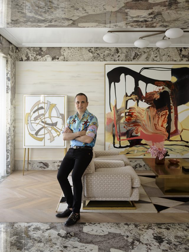
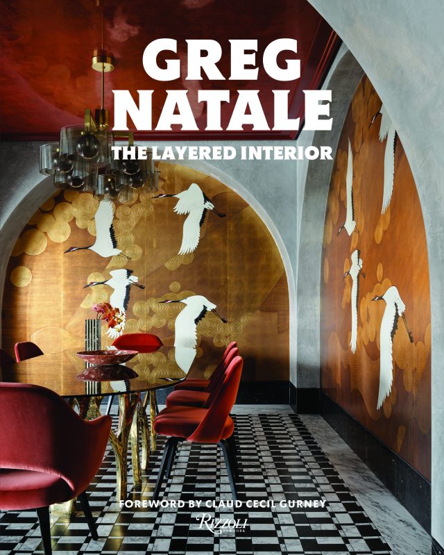
The extraordinary Greg Natale has released his third book The Layered Interior. The following is an extract from the book.

The language of interior design has many layers. We talk a lot about furniture and accessories—the sofas we sit on, the cushions we sink into, the ornaments we choose to inject our personal style. But so much of a house’s character comes from the interior architecture—the floors under our feet, the walls that surround us, the hallways we traverse, the portals and doors we walk through. These different framing elements and the intriguing spaces in between have much to say, and their materiality can define the narrative of a house.
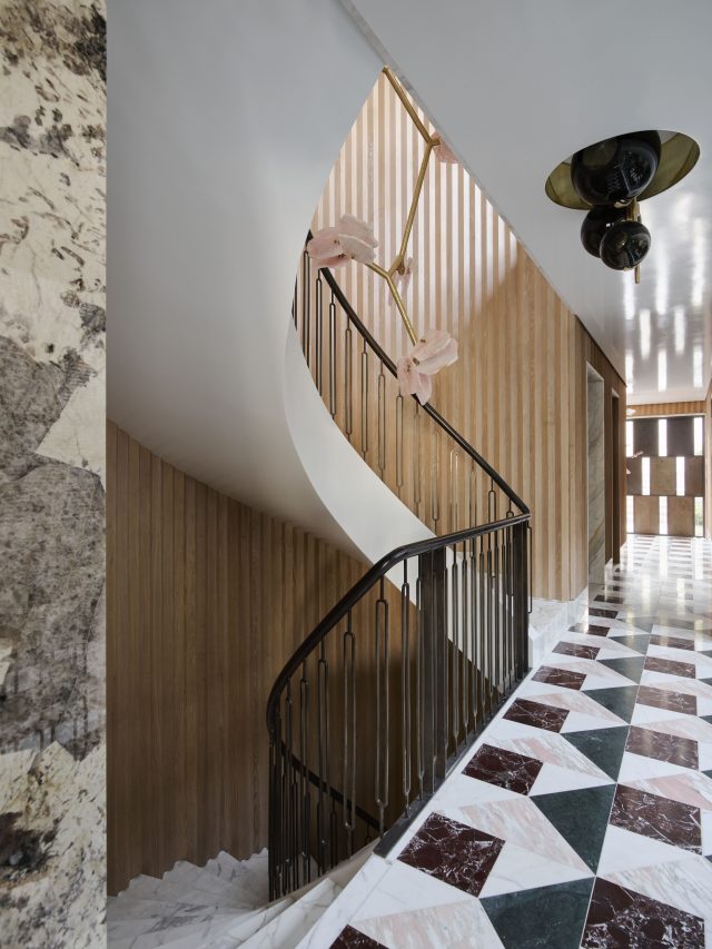
When you step through the oversized bronze doors of this remarkable contemporary villa in the harborside Sydney suburb of Mosman, you experience a moment that encapsulates the essence of the design in more ways than one. First, there are the floor tiles. Outside the doors, large slabs of marble in shades of burgundy, pink, and ivory are laid in a classical Palladiana mosaic style. Inside, the combination of marble tiles shifts to a geometric pattern of burgundy, pink, green, and ivory. Those four colors set the scene for the palette of the four-story, five-bedroom house, and marble plays a significant role throughout as one of its most expressive materials.
But there is more at play in this vignette.The pattern of the interior tiles reveals an art deco influence, which continues in the triangular fluting on the timber walls. Then there is the brutalist style of the glass mirror hanging on one wall. And lastly there are those statement doors with their large bronze and glass panels, inspired by Italian rationalism.
These three styles were my main influences for the design of this grand house. How they came to work together was a response to the structure of the building itself, the owners’ brief, and my European sojourns.
Travel is always a doorway to fresh inspiration, and prior to this project I was fortunate to have enjoyed several trips to Italy and France. One of the most significant experiences for me was visiting Milan’s Villa Necchi Campiglio, built in the 1930s at the height of the Italian rationalist movement. I fell in love with its blend of pared-back classicism and modernity, and the beauty of its marble and granite floors and portals, timber-paneled walls, and metal doors.
Those features came to mind when I began the interior design of this house, which centered on merging the classical and the contemporary. The building may have been modern but still had elements like a pitched roof and eaves, and rather than a minimalist style the owners wanted some traditional attributes like cornices and a design full of warm tones. He had a fondness for art deco, she liked late ’70s furniture, and both requested blond oak floors. My travels inParis led me to incorporate the chevron pattern of the floorboards that appear in some bedrooms and living areas.
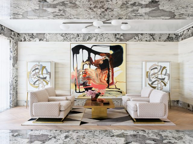
But it was the introduction of marble and granite that unifies the design of this house. Modern builds can be blank canvases and all-white spaces can overwhelm, especially in large rooms. To me, the unique colors and patterns of stone not only help to break up those spaces and add detail and warmth, but they also bring their own sense of history. In a“forever” house like this, for the couple and their two older children who come to stay on and off, the marble and granite in the floors, walls, portals, and furniture create a new design history, layering the classical over the modern. The fact that there are twenty-eight different types of stone in this house makes that history more interesting.
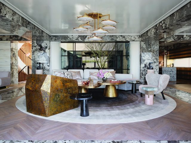
With the view of the sparkling harbor beyond, the huge open-plan living, sitting, and dining area owes its sense of grandeur to the granite that defines the spaces. In generous strips that run along the floorboards and up the walls, in substantial beams that wrap around white lacquered ceilings, its gray, ivory, and black veins provide a beautifully decorative frame. Within that, the palette is made up of neutrals, gold and white in shapely pieces that range from the curve of a cream wool sofa to the solidity of a brass brutalist chair. Artworks at each end of the space echo the lines of the granite and create their own dialogue with the furniture in the room, which is a mix of vintage, contemporary, and custom designs.
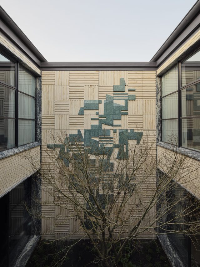
In the adjacent kitchen, under a pink Murano pendant light, late ’70s touches appear in the metal stripes of the island cabinetry and the pantry with its square timber paneling, a finish that features on cabinetry in the house. These brutalist elements take their cue from a courtyard at the center of the house, surrounded by bronze-framed glass windows and spanning two floors. To amplify the silhouette of a Japanese maple tree in the courtyard, I designed a sculpture on the wall behind, using fluted travertine panels overlaid with a form in green marble that suggests the tree’s shadow. The delicate old tree and the bold new sculpture make a powerful pairing.
A spiral staircase continues the neutral palette with its ivory marble steps and fluted timber walls, while the pink accents that appear upstairs begin here, in a stunning quartz pendant light. On the first floor, the bedrooms, ensuites, and study zones are arrayed around the courtyard, linked by timber fluting on the ceiling. The master bedroom and ensuite, situated above the living area and enjoying that same incredible view, are serene spaces that are rich in materiality yet still restrained in style. In the bedroom, beige leather-paneled walls offer a luxurious setting, with marble featuring in the bedhead, bedside tables, skirting, and trim.
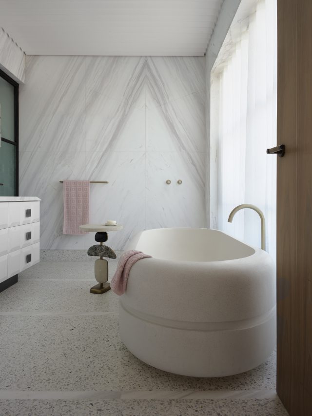
Pink tones appear in the furnishings, lights, and art deco–inspired rug, while the pinky gray lines of Greek marble in the ensuite create a striking display. The influence of Italy returns in the gray terrazzo floor—lined, Villa Necchi–style, with strips of marble—and in the sculptural ’70s look of the custom bath, which was inspired by street furniture I saw in southern Italy. Again, classical and contemporary combine to great effect.
The rich burgundy and green of the marble entrance tiles play their part on the lower floors. In the family room near the front door, burgundy marble walls melt into a stucco ceiling to create a moody space that is intensified by black-stained floors, a black sofa and light, and a vintage brass console. Burgundy continues on the floor below in a series of rooms that form their own apartment within the house. Here, across the same Palladiana tiles of the entrance, the rich red hue appears in a velvet sofa and a marble bar, even extending to a marble barbecue on the terrace outside.The scheme is lightened by vast white coffered ceilings, a feature that I integrated throughout the house to increase the sense of height and drama.
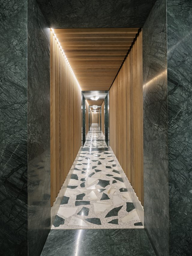
Green marble makes its mark on the next floor down, in a different arrangement of Palladiana tiles but also in the portals of a mesmerizing tunnel that leads from the house’s other entrance to the garage. That lush mossy green was inspired by the couple’s Aston Martin cars and, accompanied by timber-fluted walls, brings another sophisticated layer to the design.

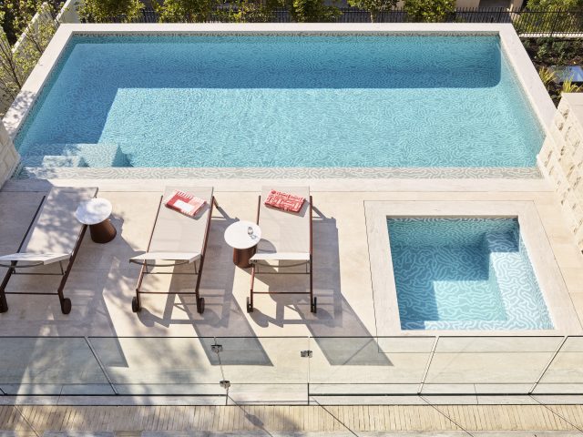
A final glimpse of the house through its rear door sees another defining moment. The same bronze and glass used for the front entrance open onto that lovely green marble of the floor and walls, while a set of stairs lead up to the pool. The stairs are paved in Roman bricks, a favorite of modernist architect Frank Lloyd Wright, which I saw in his famous Robie House in Chicago. Another trip, another inspiration, but still with a little Italy at its heart, drawing classicism and modernism together with love.
The Layered Interior (published by Rizzoli) is available now. Photography by Anson Smart.
Purchase a signed copy of the book here

The post A remarkable contemporary Mosman villa by Greg Natale appeared first on The Interiors Addict.
[ad_2]
theinteriorsaddict.com

