[ad_1]
Dulux colour forecaster and stylist Bree Leech put the brand’s Flourish palette to the test recently with an autumnal inspired makeover that proves the power of colour. Flourish is part of the 2022 Dulux Colour forecast and it pairs warm and natural shades including Dulux Basic Coral and White Dune Quarter with the bold, rich tones of Dulux Murray Red and Discretion. All in all, it’s a striking result. Especially when you consider the clever use of burgundy (Murray Red) – a colour not seen since the feature walls of the 1990s!
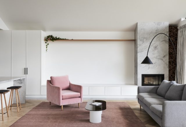
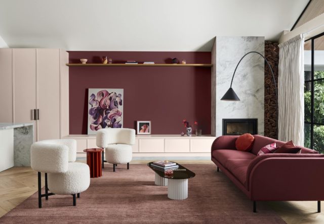
To help showcase the colour palette, Bree overhauled a modern, open plan living and dining space by incorporating soft pinks, warm whites and rich reds – all of which built on the room’s existing features.
“The space is a beautiful, light-filled modern extension in a family home with great architectural details – we wanted to showcase this by using the natural, muted tones from the Flourish palette on the wall as a tonal backdrop to the stronger accent colour and then punctuate the interior with bold, daring colours in the decor to create a more distinct look and feel,” says Bree.
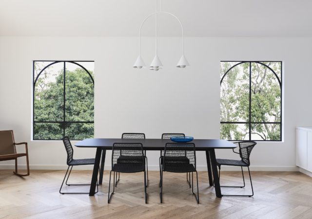
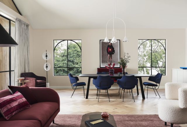
When applying colour, Bree recommends starting with a tonal palette that connects with your main furniture pieces. “To add an edge to the interior, select some smaller statement pieces that feature bold colours and interesting finishes, such as natural stone and coloured glass, to provide contrast, however, still complement and harmonise your overall colour scheme.” She also highlighted bold colour in the room’s artwork and soft furnishings. In these spaces, blue, black and cream really serve to add contrast within the spaces.
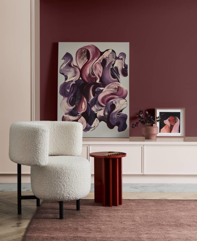
Autumn colour tips from Dulux colour expert Andrea Lucena-Orr
- Autumn palettes tend to consist of warm hues – both neutral and rich tones – and you can layer beautiful variations of these colours to add depth to your space.
- Consider the intent of the space. Softer warm hues of pinks and earthy reds can create a light and cosy atmosphere whilst selecting the deeper hues of blues and greens can create a calm and moody space.
- Ensure you love the colour(s) before you make your final decision. As we know, colours can differ greatly due to lighting and surrounding colour, so make sure you sample your colours before you commit to a purchase.
- If you want to replicate the Flourish palette, test a a couple of key colours you initially gravitate towards and leave them up on your walls for 2-3 days to ensure the colour(s) work in your space and under different lighting conditions, both natural and artificial. You can also add some other colours from the palette in the shape of furnishings and décor items.
- For an autumnal bedroom look, bring more depth into the scheme by adding the gorgeous Dulux Murray Red to your bedroom walls with Clay Pipe Half and Discretion tones as inspiration for your bed linen.
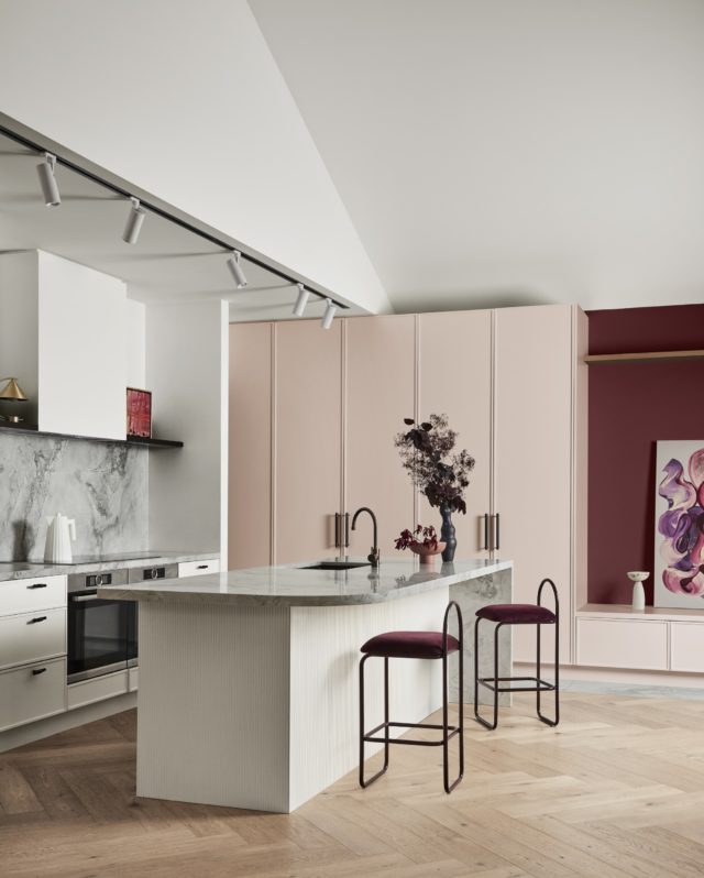
Photographer: Lisa Cohen | Stylist: Bree Leech
For more on Dulux

The post 90s revival: Is burgundy paint the latest interior trend? appeared first on The Interiors Addict.
[ad_2]
theinteriorsaddict.com


