We love this Melbourne reno by ex House Rules star and interior designer Carolyn Burns-McCrave. She took a tired 70s two-bedroom villa and rejigged its floorplan to give her clients, who bought it as an investment, two extra bedrooms and a second bathroom! Amazingly though, the much-improved home feels like it’s always been this way.
“I love the way the house flows from one space to the next, feeling as though this is the way it has always been,” she says. “Taking a house from two bedrooms and one bathroom to three bedrooms, a study and two bathrooms is the kind of value I love to create for my clients. By keeping the timber detailing and windows, the home still retains its charm and character, but the finishes and colours make it contemporary. I like to think we got the balance right.”
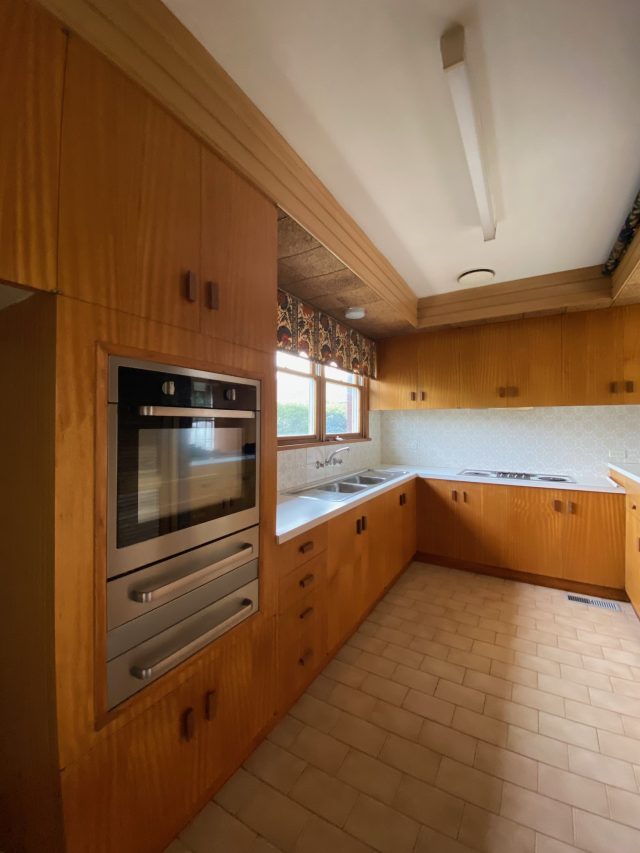
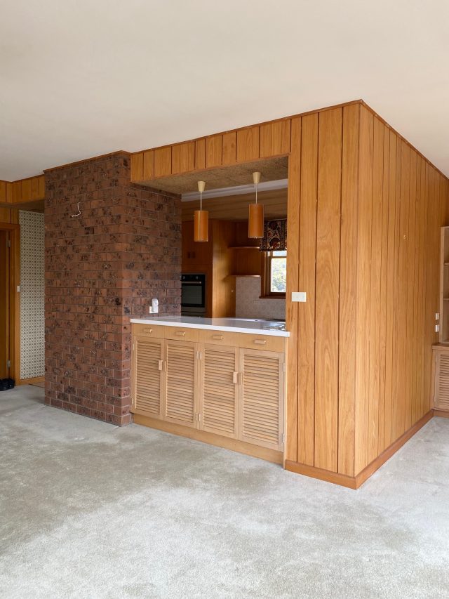
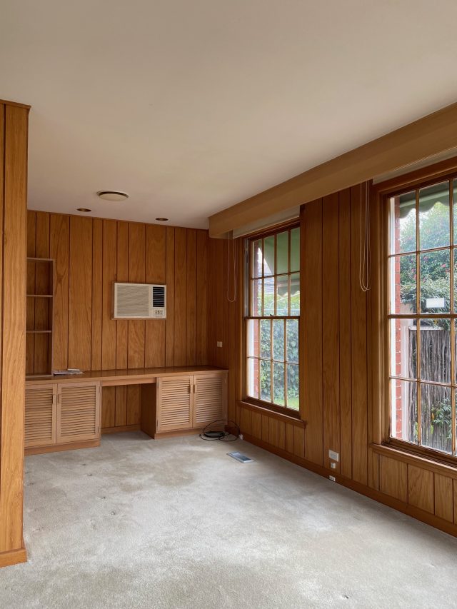
It’s hard to believe this was once a two-bedroom, one-bathroom red brick villa, in Melbourne’s Carnegie; one of two on a very generous block. It had a separate, large formal living room just off the entry hall and an enclosed kitchen within a wraparound dining and family room at the rear. “Built in the 1970s, the home was in absolutely immaculate condition (scroll to the end to see the before photos). It had been so well maintained and cared for we were able to retain a lot of the timber trim work, wall paneling and timber colonial paned windows.”
Carolyn had worked with these clients before on their family home, and they bought this next property as an investment. “Our initial discussions included imagining the types of folks we thought would love to live in this home and tailoring the interior to appeal to as many people as possible, from a young family to empty nesters,” she says.
“We already had a great working relationship. That trust proved to be immensely valuable when determining the brief because I was given free reign to rework the floorplan to maximise the potential of the home in terms of increasing the bedrooms and bathrooms, and to create a modern yet classic interior. When I worked with this couple on their own home, I was able to deliver all of their requirements without the need for an extension, so my challenge was to do the same thing here. Efficient and inspired spatial planning is, I believe, the most important part of any renovation and I really enjoyed making this villa live larger.”
The biggest problems were the very dated 1970s interior and the lack of amenity. The floorplan didn’t work for today’s style of living, with a huge amount of space given over to multiple living spaces but only two bedrooms and one bathroom.
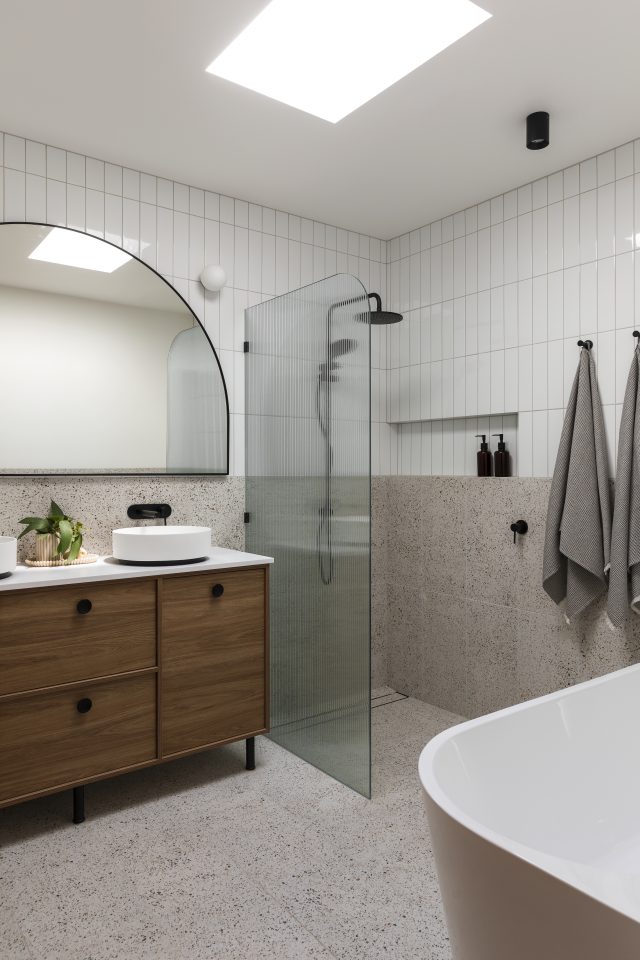
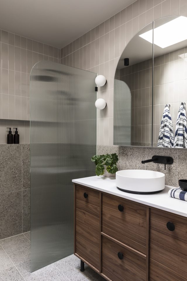
“I took the huge formal living room and turned it into a master suite with a generous bedroom with access to the courtyard, a walk-in robe and a chic ensuite with terrazzo look tiles, a walk-in shower with reeded glass screen and rich timber vanity. The space is flooded with light from a skylight above and feature wall lights complete a vanity area with arched medicine cabinets for additional storage.”
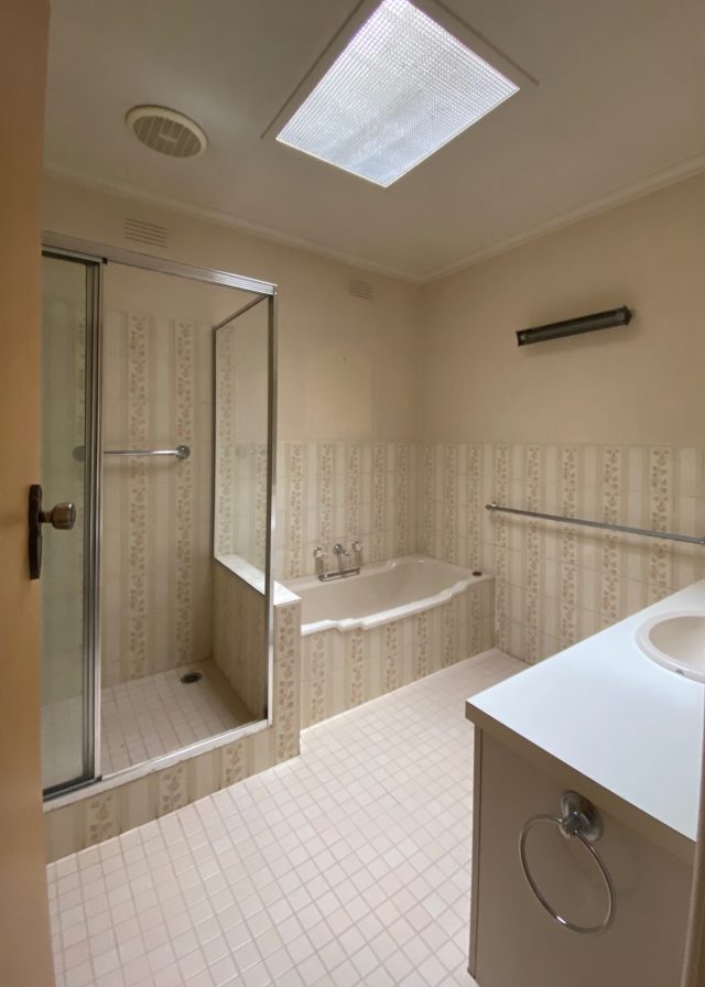
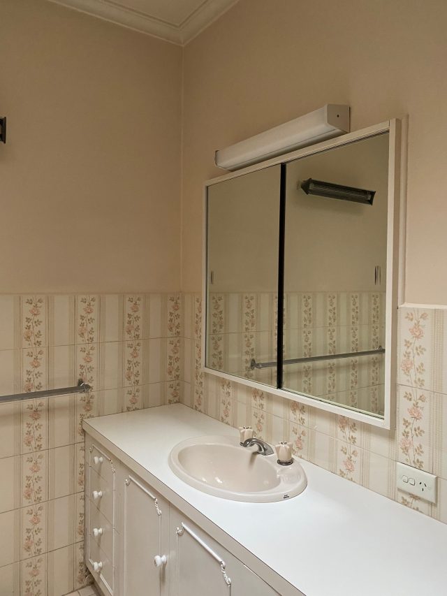
The family bathroom occupies the same space it did, close to the two original bedrooms that were reworked to delete a walk in robe but gain a small fourth bedroom or perfect home office/playroom. “The bathroom now sports a double vanity opposite the entry – much nicer than looking at the old shower on entry. There is now a large walk-in shower and I tucked the freestanding tub along the old vanity wall. Keeping the finishes neutral, with a focus on visual texture, changes in gloss levels and rich timber joinery, a large skylight above adds ample light and a bit of drama. A separate powder room with basin is nextdoor.”
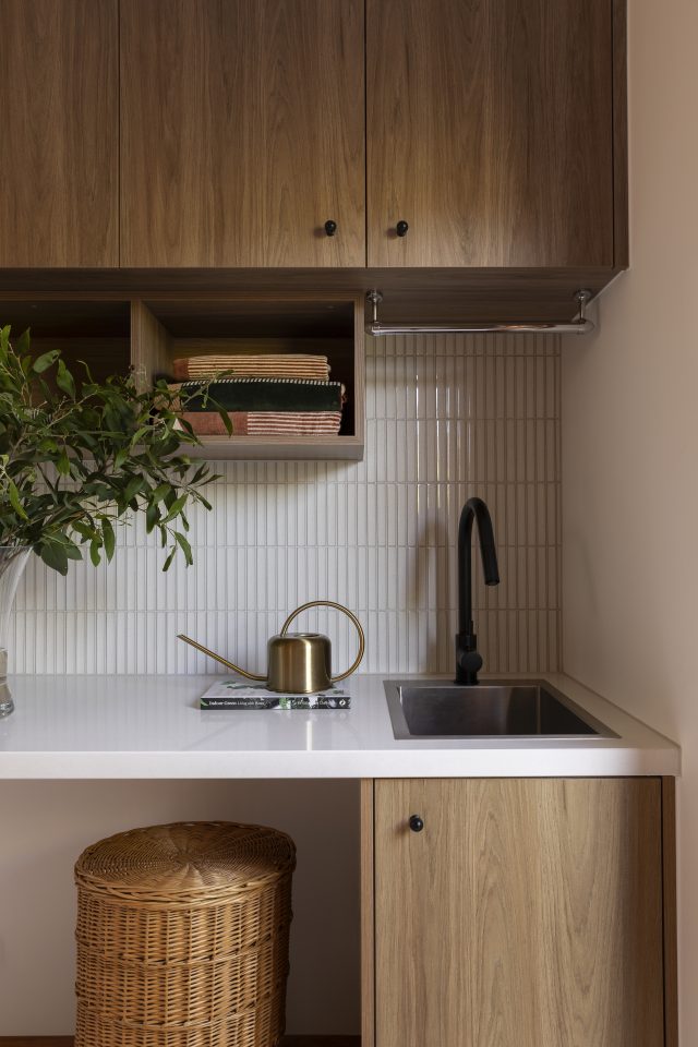
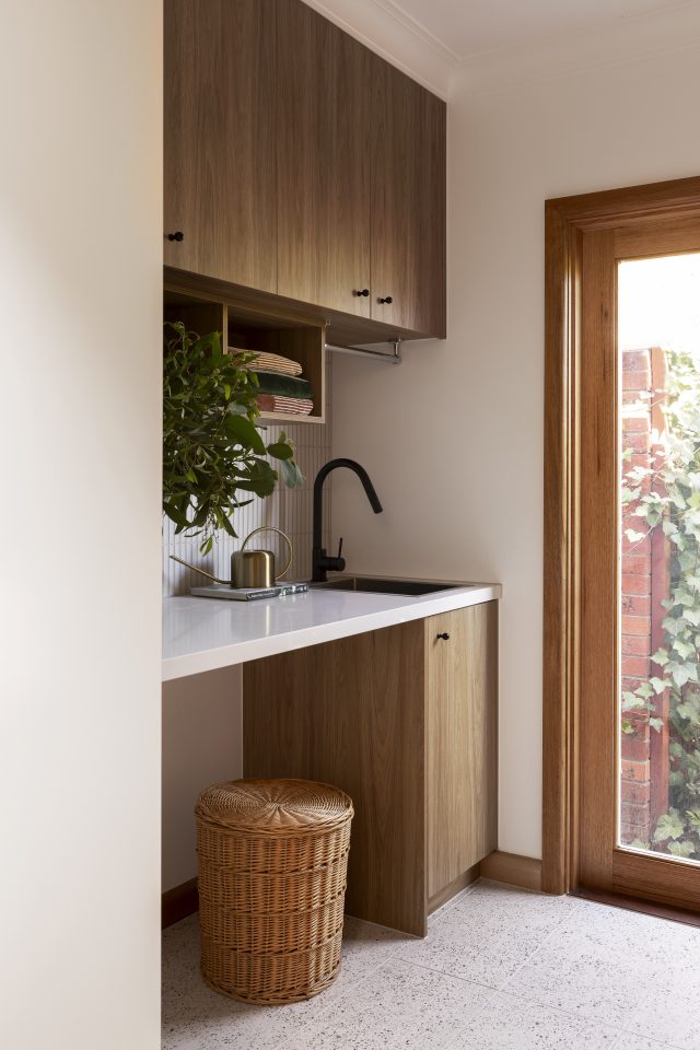
The access to the original laundry came off the kitchen, so Carolyn moved the door to the hallway and stole some space to bump the fridge cavity and pantry of the new kitchen into the oversized laundry. “By moving the door to the middle of the room, opposite a door to the side yard, clothes line and garage, I was able to run joinery down both sides of the room, resulting in a whole wall of floor-to-ceiling storage and a long run of benchtop with space for a washer and dryer under the bench.”
Maximising storage was a running theme throughout the project. like retaining a huge linen cupboard in the entry hall and adding extensive built-in robes to the bedrooms.
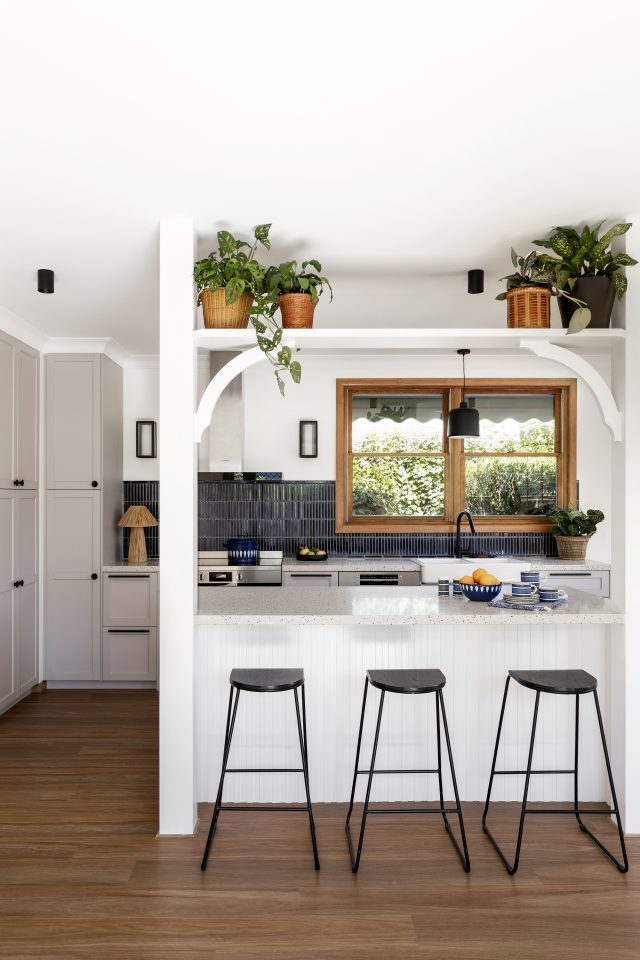
The generous kitchen/dining at the rear of the villa had windows to the north, east and west. However, it was boxed in with dark brick pillars and there was no external access to the garden to the north. Carolyn opened up the whole space, allowing the kitchen to become the heart of the home, flanked by a generous dining and living area, with sunlight streaming in all day long, and new sliding doors creating access to the rear yard.
“Taking the kitchen walls down left us with a structural post in the middle of the space. I built the island bench and breakfast bar around it, adding a second dummy post with a feature plant shelf spanning between the two. When life gives you lemons, design a feature so that it looks intentional! Laminex Surround scalloped paneling wraps around the island bench. I wanted a painted finish here so that it would be easy to apply a fresh coat of paint between tenants and keep the space looking fresh.”
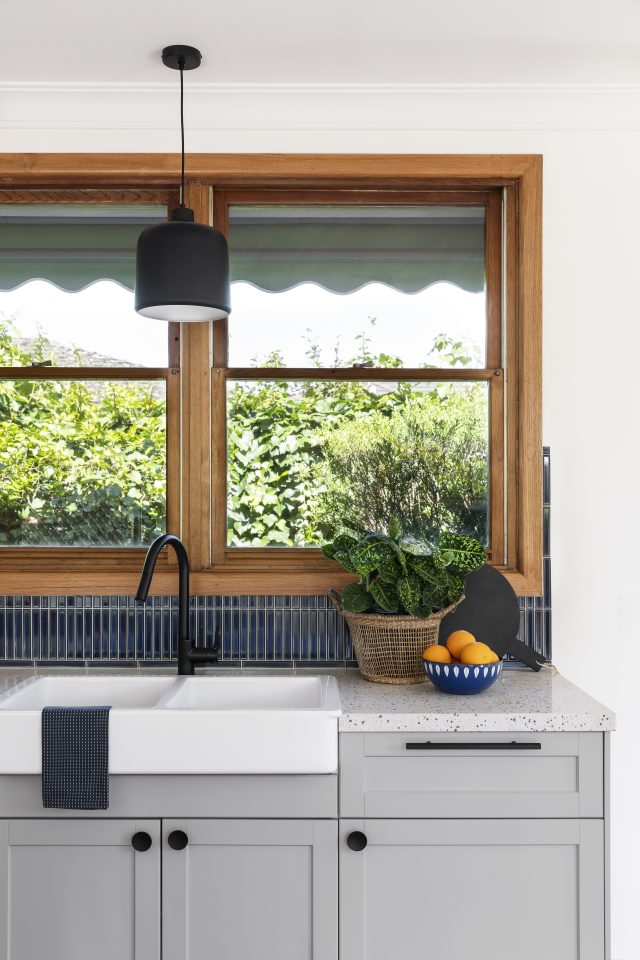
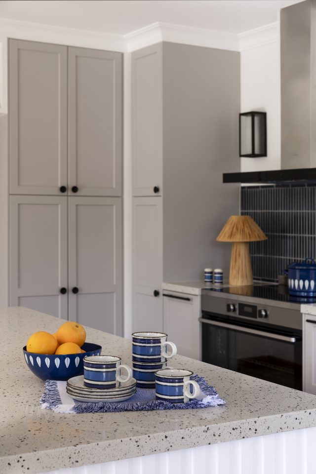
The kitchen cabinet doors and drawer fronts are Ikea, as is the butler’s sink. Inexpensive finger tiles in a deep navy for the splashback are laid both vertically and horizontally so that they finish perfectly below the rangehood with no cut tiles.
Carolyn, who started her career working for design industry heavyweight Andrew Parr at SJB, says the biggest value add was in using the existing footprint better. “I firmly believe that you don’t always have to build it bigger, but design it better. By repurposing the formal living room as a master suite, and carving out space for a home office or playroom, the floorplan now works for how we live today. All of the finishes were chosen with budget in mind but my clients were on board with using quality appliances, lighting, fixtures and fittings so that the feel of the space was one of quiet luxury.”
It was a dream job for Carolyn from start to finish, so much so that when the second villa on the block became available, her clients bought it and she got to do it all again!
Carolyn has been an interior designer for 26 years, and run her own business for the past 18. Although based in the outer east of Melbourne, she can work on projects anywhere, recently designing her sister in law’s house in Ireland!
She also enjoyed working on the Channel 7 renovation show House Rules for eight years as the interior design expert and mentor. “I believe it’s important to remember that as a designer, it’s not about my taste. My projects start and finish with the client and what makes their heart happy. The trick is to find out what that is. I strive to be an enabler; someone that empowers my clients to push their boundaries and discover what they truly need and want from their home, and then give them the very best version of that.”
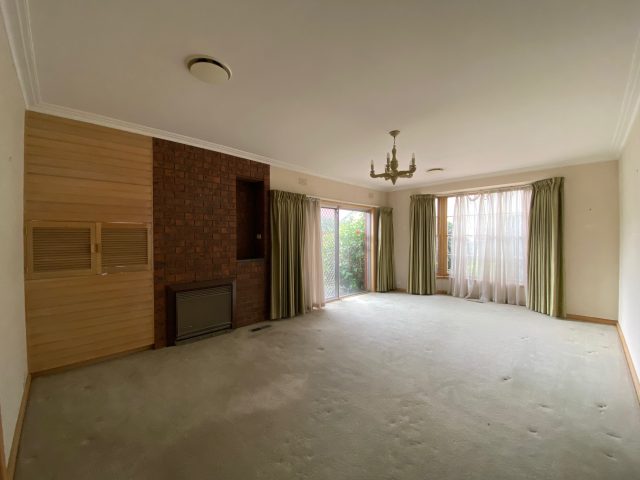
The befores: a seventies time capsule
Builder: Northstar Homes | Cabinetmaker: Welmac Cabinets | Buyer’s advocate: Leigh McConnon | Photographer: Martina Gemmola | Styling: Carolyn Burns-McCrave.
Follow Carolyn on Instagram
The post 1970s 2-bedder gains 2 extra bedrooms and keeps its character appeared first on The Interiors Addict.
theinteriorsaddict.com


