[ad_1]

Creating the perfect color scheme for your home can be a daunting task, but understanding the color wheel and its applications can make this process much more accessible. In this comprehensive guide, we will delve into the color wheel, its different color combinations, and how to use it effectively to create beautiful and harmonious interior designs.
Introduction to the Color Wheel

The color wheel is a visual representation of the spectrum of colors and their relationships with one another. It is a simple yet powerful tool that can help you create stunning color schemes for your home. By understanding the color wheel’s structure and learning how to use it, you can transform your interior design and make informed decisions about color combinations.
Basics of the Color Wheel
The color wheel is divided into 12 segments, representing the following colors:
- Primary Colors: Red, yellow, and blue – these are the fundamental colors from which all other colors are derived.
- Secondary Colors: Orange, green, and violet – these are formed by mixing equal parts of two primary colors.
- Tertiary Colors: Red-orange, yellow-orange, yellow-green, blue-green, blue-violet, and red-violet – these are created by combining a primary color with a secondary color adjacent to it on the wheel.
The color wheel also distinguishes between warm and cool colors. Warm colors, such as reds, yellows, and oranges, evoke feelings of energy, excitement, and coziness. In contrast, cool colors, including blues, greens, and purples, create a sense of calmness, serenity, and tranquility.
How to Use the Color Wheel for Interior Design

Image: decoart
Using the color wheel, you can create various color schemes that enhance the beauty and atmosphere of your home. Let’s explore some of the most common color schemes and how they can be applied in interior design.
1. Monochromatic Color Scheme

Image: BHG
A monochromatic color scheme involves using different shades (adding black) or tints (adding white) of a single hue to create a subtle and harmonious palette. This approach can result in a sophisticated and cohesive look that is both calming and visually appealing.
To create a monochromatic color scheme:
- Choose a base color that you love and want to feature prominently in the room.
- Experiment with different shades and tints of the base color, incorporating them into various elements such as walls, furniture, and accessories.
- Use a variety of textures and patterns to add visual interest and avoid a monotonous appearance.
2. Analogous Color Scheme

Image: centsational style
An analogous color scheme consists of colors that are adjacent on the color wheel, such as orange, yellow, and green. This combination creates a visually pleasing and relaxing atmosphere, with a touch more contrast than a monochromatic scheme.
To create an analogous color scheme:
- Select a dominant color to serve as the primary focus of the room.
- Choose one or two neighboring colors on the color wheel to act as accent colors.
- Distribute the colors throughout the room, ensuring that one color does not overpower the others.
3. Complementary Color Scheme

Image: BHG
Complementary colors are opposites on the color wheel, such as blue and orange or red and green. When used together, these colors create a vibrant and energetic atmosphere, striking a balance between two contrasting hues.
To create a complementary color scheme:
- Pick a main color from the color wheel as the dominant hue in the room.
- Look across the color wheel to find the complementary color that will serve as an accent.
- Use both colors in the room, making sure to balance their presence and maintain visual harmony.
22 Beautiful Bedroom Color Schemes
26 Amazing Living Room Color Schemes and Tips
30 Best Living Room Color Ideas Schemes
What Color Makes the House Look the Biggest?
4. Split Complementary Color Scheme

A split complementary color scheme combines one main color with two complementary colors, creating a bold yet balanced effect. This approach offers a less intense contrast than a traditional complementary scheme, making it suitable for rooms that require a little more subtlety.
To create a split complementary color scheme:
- Choose a primary color as the main focus of the room.
- Identify the complementary color on the color wheel, then select two adjacent colors to serve as accents.
- Distribute the colors throughout the room, allowing the primary color to dominate while using the accent colors sparingly.
5. Triadic Color Scheme
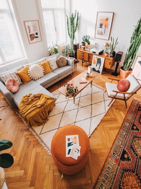
A triadic color scheme involves using three colors that are evenly spaced on the color wheel, such as turquoise, fuchsia, and yellow-orange. This combination creates a lively and adventurous palette with vivid contrasts that remain balanced and harmonious.

Image: BHG
To create a triadic color scheme:
- Select three colors from the color wheel, ensuring they are evenly spaced apart.
- Determine which color will be the dominant hue in the room, and use the other two colors as accents.
- Experiment with different shades, tints, and intensities of the chosen colors to create the desired effect.
Color Theory in Interior Design
Color theory is the application of art and science in interior design, utilizing the color wheel to understand how colors interact, evoke emotions, and influence mood. By considering color theory when selecting color schemes for your home, you can create spaces that are visually appealing, emotionally resonant, and perfectly suited to their intended purpose.
The Impact of Color on Mood
Colors can have a significant impact on our emotional responses and overall mood. For example:
- Greens are calming and soothing, making them ideal for bedrooms and relaxation spaces.
- Yellows are uplifting and energetic, perfect for kitchens and other high-activity areas.
- Reds are passionate and daring, while soft pinks are sweet and delicate – both can be used to create striking focal points in various rooms.
Understanding these color associations can help you make informed decisions when selecting color schemes for different spaces within your home.
Additional Tips for Using the Color Wheel
When using the color wheel to design your home, keep the following tips in mind:
- Balance warm and cool colors: Don’t limit your palette to all warm or all cool colors. Include elements that offer contrast, using one color to dominate and set the overall tone of the room.
- Consider the room’s purpose: Think about the intended use of each space and how color can influence its atmosphere. For example, choose calming colors for a bedroom, while opting for more energetic hues in a living room or kitchen.
- Experiment with shades, tints, and tones: Vary the intensity, lightness, or darkness of colors to create depth and visual interest in your color schemes.
With a solid understanding of the color wheel and its applications in interior design, you can confidently create stunning, harmonious color schemes for your home. Whether you’re looking to evoke specific emotions, create a particular atmosphere, or simply make a bold visual statement, the color wheel is an invaluable tool for achieving your interior design goals.
The post Master the Art of Interior Design with the Color Wheel appeared first on Decoholic.
[ad_2]
decoholic.org


