[ad_1]
Picking a colour scheme can be daunting. How do you know what will look good in your room and what are the best colour combinations? Understanding how to use the colour wheel is a great place to start. It’s a failsafe way of choosing colours that sit well together, so your home turns out just as beautifully as you’d pictured.
By learning how to use the colour wheel, you will start to understand – and speak – the language of colour. This makes it much easier to describe what it is you’re really looking for. If you go into a DIY shop asking for blue paint, there’s a good chance you’ll come out feeling overwhelmed with choice (and swatches). But if you know beforehand that it’s a dark, saturated blue paint you’re after, the whole process will be a lot quicker, simpler, and more enjoyable, too.

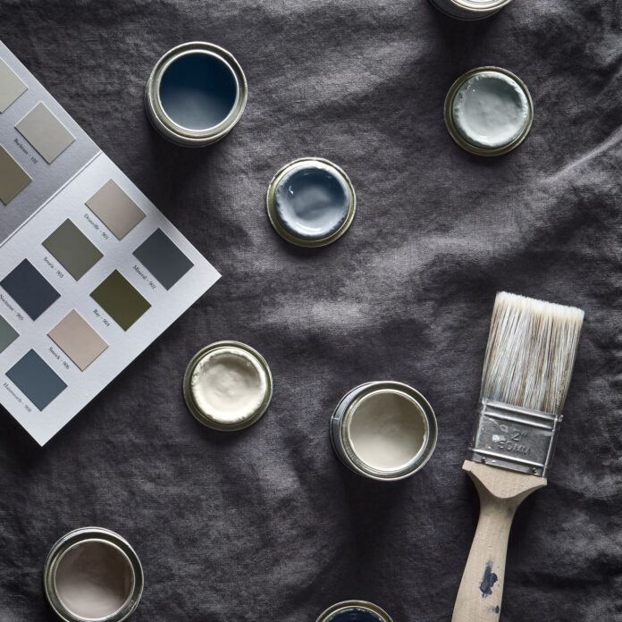
Image credit: Cox & Cox
While some of the colour palettes are tried and tested, others may well surprise you. Familiar with the phrase red and green should never be seen? Think again. We’ve put together an easy guide to get you up to speed, and boost your colour confidence in the process.
What is the colour wheel?
We’ve established the colour wheel is important, but what exactly is it? We like to think of it as a map for colour. It’s basically a visual representation of where colours sit on the spectrum and the relationship between them all.
The wheel that’s used by today’s interior designers actually derives from Sir Isaac Newton’s first circular illustration for colour in 1666. It’s made up of 12 hues, half of which are warm colours (reds, oranges and yellows) and the other half cool colours (lilacs, blues and greens).
These 12 hues are made up of primary colours (red, blue and yellow), secondary colours (made by mixing two primaries together – green, orange and purple) and six tertiary colours (made by mixing a primary with a secondary; red-orange, yellow-orange, yellow-green, blue-green, blue-purple and red-purple).
How does the colour wheel work?
When deciding how to decorate a room, you first need to have a colour in mind. That part is easy, but if you’re stuck look around for inspiration for colour ideas such as living room colour schemes and bedroom colour schemes. Next, in order to make that colour work to your taste and style, you’ll need to decide on a scheme. Not so easy. This is where the how to use the colour wheel comes in.
By looking at the location of your chosen colour on the wheel, you can work out how it relates to others by where they sit on the wheel, too. With just one quick glance, you can clearly see the colours that work well together and, perhaps more importantly, those that absolutely don’t. Colours are categorised into groups: harmonious, contrasting and tonal, and there’s more on that below.
While the colour wheel is without doubt a handy tool, designers like to make the point that there are no hard and fast rules when it comes to colour and interiors.
‘While it’s often a good starting point, the colour wheel should be treated as a concept, not a rulebook,’ says interior designer Ann Marie Cousins of AMC Designs. ‘It’s good to be individual. You have to follow your instincts to create a home you love.’
What are harmonious colours?

Image credit: Future PLC
Harmonious colours (also known as analogous colours) sit next to each other on the colour wheel. They are the most widely used in interior design, and it’s easy to see why. The name ‘harmonious’ says it all. Choosing adjacent colours is a simple way of creating a harmonious scheme that’s easy to live with.
The contrasts between colours next to each other on the wheel are very subtle – red, red-orange and orange, for example. For this reason, a little extra thought is necessary to avoid creating a room that lacks vitality. A typical harmonious scheme is made up of three colours: one dominant colour and two accents.
‘One dominant colour from the palette is used across the largest areas, walls, ceiling, large rugs, for example,’ says says Michael Rolland, interiors expert and MD of The Paint Shed. ‘A secondary colour is then used across upholstery, window dressings and bedlinen. This leaves the accent colour, used sparingly to create a pop, usually through accessories such as frames and throw pillows.’
This clever design tactic is also referred to as the 60-30-10 rule. The numbers refer to the percentages used for each colour. Allow 60% of coverage for your dominant colour, 30% secondary and 10% for your accent. This makes it even easier to ensure a beautifully balanced scheme overall.
What are contrasting colours?

Image credit: Future PLC
Contrasting colours are those that sit directly opposite each other on the colour wheel. They are also sometimes referred to as complementary colours. If it’s drama you’re after, a contrasting colour scheme is the one for you. Examples include red and green, yellow and purple and blue and orange.
‘Using contrasting colours makes for an eye-catching room with maximum impact’, says interior designer Ann Marie. ‘A great starting point is colour blocking. Try painting your walls in two different colours or opt for one colour on your wall and another for furniture.’ Be creative with living room paint ideas to add personality and character to your space.

Image credit: Future PLC/
It’s worth bearing in mind that while the colour wheel is a useful tool for identifying contrasting colours, we still need to be a little mindful of how we go about using them within our homes.
‘A complementary palette makes colours appear brighter, making it a great option if you’re after a vibrant and bold interior. However, if you’re after a more understated take on the scheme, it’s a good idea to offset contrasting colours with neutral shades to avoid it becoming too overpowering’, says Katie Thomas, founder of KTM Design.
What are tonal colours?

Image credit: Future PLC
Tonal colours are different shades of one colour. A tonal scheme, also sometimes referred to as a monochromatic scheme is arguably the simplest of the colour recipes you can use for decorating. Not to be confused with monochrome meaning black and white, monochromatic schemes includes only different tones (lighter and darker) of the same colour. Start here if you’re unsure about contrasting combinations.

Image credit: Benjamin Moore
Decorating with tonal colours will most likely result in a fairly uniform scheme. However, there are easy ways to add extra dimension to the room. Using light and dark variations of your chosen colour is the most obvious way. Vary textures to differentiate the colours and make them look more interesting. Then add pops of natural colour with materials like timber and stone – and plants, too.
What’s the difference between hue, tint and shade?
In order to fully understand how to use the colour wheel, it’s important to familiarise yourself with the language – and get it right. These three words are most often used when discussing colour. However, they’re most often confused, too. Despite being used interchangeably, they mean three very different things.
- Hue: Forming the outer edges of the colour wheel, the primaries, secondaries and tertiaries, a hue is a colour in its purest form. As you can imagine, they’re pretty bold, which is why they’re usually lightened or darkened for most decorating schemes.
- Shade: A shade is created by adding black to a colour to darken it, making it deeper and richer.
- Tint: A tint is created by adding white, making the colour less intense.
What is colour psychology?
Learning how to use the colour wheel is part of a wider understanding of colour, also known as colour psychology. While the wheel is a tool used to determine colours that complement each other visually within a room, colour theory encompasses how these chosen colours may reflect – and affect – mood, feelings and emotions, too. By understanding the basics, you can create a room that not’s not only perfectly balanced, but truly reflects your personality.
So surrounding ourselves with colours that we like is guaranteed to make us feel good? Not always. While our colour preferences play a huge part in how we decorate our homes, colour psychology suggests we should be factoring in the nature of the room we’re decorating – what we do in it, how we want to feel in it, etc – and choose colours accordingly.
Colour psychologist Lee Chambers advises against using red in a living room. ‘Although red promotes energy and socialising, the vibrance can quickly become overwhelming, irritating and ultimately stop you from finding that restful rhythm after a long day,’ he says.
The post How to use the colour wheel: an easy guide to creating a balanced scheme appeared first on Ideal Home.
[ad_2]
www.idealhome.co.uk


