[ad_1]

When the owners of this new build in Bedfordshire moved in back in 2017 , their sons were growing up fast and wanted a home that would grow with their needs. It offered lots of space, especially the open-plan layout downstairs and the walk-in wardrobe was a big draw.
‘Having a white canvas as a backdrop didn’t frighten me at all,’ says the owner. ‘I’m very eclectic with my style and I’m not concerned about things clashing. I think I’ve developed my own maximalist style with lots of things, so I was ready to get going.’
The exterior

Image credit: Future PLC/Lizzie Orme
When you purchase a new build, it helps to be able to visualise how it’s going to look as you literally pick everything from scratch before the house is even built.
‘I’m quite creative, so really enjoyed the process of going to the sales office at several stages to choose things like the kitchen, bathroom tiles and carpets,’ says the owner. ‘I wasn’t afraid to ask anyone questions about what was or wasn’t possible. After all, it’s my home and needs to have the major things right from the start.’
The entrance

Image credit: Future PLC/Lizzie Orme
Adding colour to one half of the wall is an impactful staircase idea. The owners also removed the carpet and painted the stairs white to create a light airy space.
The kitchen

Image credit: Future PLC/Lizzie Orme
Despite their love of colour, the owners opted for a light grey kitchen idea with a white marble worktop as they knew it would work with any colour scheme they eventually introduced.
The drinks cabinet was sourced on Facebook marketplace. It was upcycled using a lick of salmon paint to echo the arch from the wall design on the cabinet doors.
The natural wood flooring was a great living room flooring idea as it’s hard-wearing. They also invested in underfloor heating, which is beneficial in an open plan living space.

Image credit: Future PLC/Lizzie Orme
Instead of painting the classic one wall, the owners chose to add a pop of bright colour by painting an arch on the narrow wall near the patio door.
The wall also had a radiator on it, so that went blue too. They also fitted some white living room shelving ideas to add depth to the room and did a similar trick in the sitting room behind the mirror.
‘As much as I thought about painting or wallpapering lots of walls, I really liked the idea of blocks of colour and I’ve used a lot of my own artwork to brighten up the white walls,’ the owner says.
The living room/diner

Image credit: Future PLC/Lizzie Orme
Having built up a huge collection of prints and pictures, the owners have created gallery wall ideas all over the house. Three floors in fact!
‘I feel every image reflects me and my style and the things I love about my family,’ explains the owner. ‘I always tend to go for bright colours and then tone down each room with the odd item of neutral coloured furniture.’

Image credit: Future PLC/Lizzie Orme
The sofa is a soft grey but has been filled with an eclectic mix of cushions. There’s also a mix of different chairs in the dining room, all sourced from eBay. By viewing the house as one whole room, it flows from one space to another.
If you’re always swapping prints around the house, use Command strips rather than nails to fix to the walls to prevent constant filling and painting.
The reading nook

Image credit: Future PLC/Lizzie Orme
‘This is my little reading corner,’ shares the owner. ‘I’ve tons of design and reading books, which help inspire my artwork. The library sign was from a local shop which I love.’
The office/studio

Image credit: Future PLC/Lizzie Orme
‘I love upcycling furniture as the old stuff is always such good quality,’ says the owner. ‘I’ve often made cushions from left over fabrics or sprayed legs of furniture in gold to add some interest. The unit in my office was a dark mahogany shade which I also updated with furniture paint and added some new handles.’
The bedroom

Image credit: Future PLC/Lizzie Orme
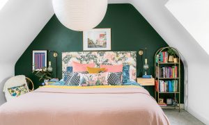
The owners were advised not to paint the newly built walls for at least 12 months to help the walls settle and avoid cracking. However, after 8 months they couldn’t wait and painted the bedroom wall in Deep Green from Valspar.
The bed has been layered with lots of clashing cushions and throws, which really stand out against the painted bedhead wall. The DIY headboard idea has been upcycled with a few metres of fabric from Kitty McCall.
‘She’s one of my favourite designers,’ says the owner, ‘so I’ve included lots of her prints, cushions, and fabrics over the house.’
Rather than bedside table lamps, fitting hanging ones to the wall prevent kids knocking them off when they jump on the bed.
The twins’ room

Image credit: Future PLC/Lizzie Orme
For the twin boys bedroom idea the owners swapped bright floral prints for vinyl wall stickers, bedlinen, and rugs to escape the white walls! The painted triangle is also a fun element.
The bathroom

Image credit: Future PLC/Lizzie Orme
The owners wanted the bathroom to feel clean and natural. They painted it in white and picked out some textured wave effect tiles to add some interest.
Colour has been introduced through towels and accessories. While the rich-coloured faux wood vinyl flooring contrasts the white suite and looks like the real thing.
The post Colourful artwork and clever upcycles have brightened up this white-washed new build appeared first on Ideal Home.
[ad_2]
www.idealhome.co.uk


